# Progress Pie
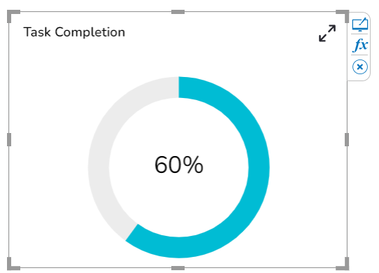
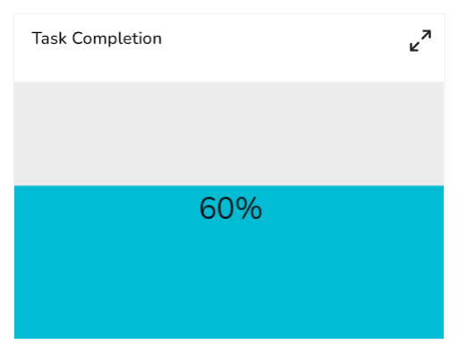
The Progress Pie is used to show the progress towards reaching the goal.
#### Default Chart Image:
#### Properties of the Progress Pie:
* **Background:** The user can enable the shadow, change the shadow color, and transparency of that shadow. Also, the user can change the background color and adjust its transparency.
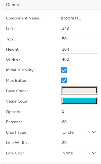
* **General:** The user can change the height, width, top, left. If initial visibility is unchecked, then the chart won’t be visible at the first preview. The user can set the ‘Base Color’ as the component color and ‘Value color’ for the value. The transparency can be controlled. Chart type can be either Circle or Horizontal Bar or Vertical Bar.
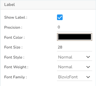
* **Label:** The user can adjust the font properties.
* **Subtitle:** The user can adjust the font properties of the subtitle in this section.
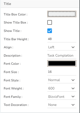
* **Title:** The user can adjust the font properties of the title in this section.
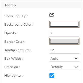
* **Tooltip:** The user can change the Tooltip properties. Adjust the tooltip box size, font size, etc.
#### General Properties:
#### Title Properties:
#### Tooltip Properties:
#### Label Properties:
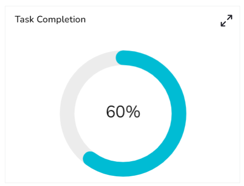
#### Modified Progress Pie after changing its properties:
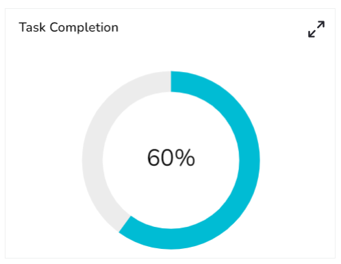
#### Chart type: Round
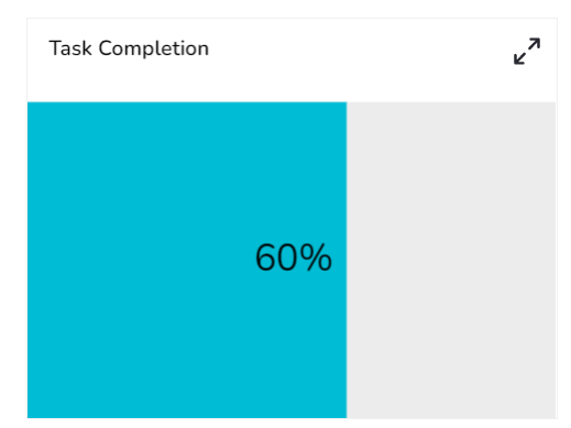
#### Chart Type: Horizontal Bar
#### Chart Type: Vertical Bar
