# Bubble Chart
A Bubble chart visualizes data set in three of four dimensions where the first two dimensions are used as coordinates like X-Axis and Y-Axis. There remaining two are used to represent the color and size of the bubbles. It is used mostly to Plot financial data.
#### Best Situation to use Bubble Chart:
* **Three Data Series:** If the data has three series each containing values, then the user can use a Bubble chart for better representation. Generally, the sizes of the Bubble are determined by the values.
**Default Chart Image:**

**Properties of the Bubble Chart:**
* **Alerts:** The user can enable the color bands it will show the Range Band color according to the range given in the Band properties.
* **Axis Setup:** The user can Enable the Auto axis, the Base Zero value, Horizontal & Vertical marker line, zero marker line and can change the color of lines, increase and decrease the color Transparency by opacity.
* **Background:** The user can change the background color of the chart, can get the border for the chart and can change the border color, can get the reflection of the chart by enabling the shadow option can also change the color and increase & decrease the transparency of the shadow.
* **Export Options:** The user can enable the “Enable Context Menu”, then it is possible to download the reports in different formats if we click on the chart from the preview section. The heading and subheading of that downloaded chart and the name of the downloaded file can be changed from this section.
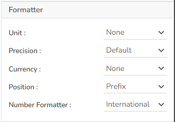
* **Formatter:** The user can change Y-axis values in units to %, T, Lacs, M, etc. Precision if we want the value in decimal format. Currency if we want the value in INR, Pound, USD. Position of the currency if it's in prefix and currency in Rupee then the sign will be seen in left-side if it's in suffix then it will be seen in right-side. Number Formatter if we want it in Indian or international.
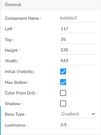
* **General:** The user can change the height, width, top, left, chart type, column type & Line form. In this case, we have changed the Base type to Gradient.
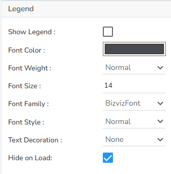
* **Legend:** The user can enable the internal legend if we want to show and can change the font size, color, style, etc.
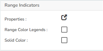
* **Range Indicators:** The user can give the Range color for the bubble by selecting the range color in properties and also, we can enable the range legend and can give the solid colors.
* **Subtitle:** The user can enable the subtitle if we have any second title and also, we can change the Name, Font color, size, style, etc.
* **Title:** The user can change Title Name, Font color, size, style, etc.
* **Tooltip:** The user who wants to show the description of the series can use the tooltip by enabling it.
* **X-Axis:** the user changed the axis name, Font color, Font size, Enable the axis line, and changed the axis color.
* **Y-Axis:** The user changed the axis name, Font color, Font size, Enable the axis line, and changed the axis color.
* **Dataset Series properties:** The user can change the color of each series by selecting any of the series and also, we can Enable the Data Label which shows the Value of each Revenue & Expenses.
**Alerts Properties:**
**Axis Setup Properties:**
**Background Properties:**
**Export Options Properties:**
**Formatter Properties:**
**General Properties:**
**Legend Properties:**
**Range Indicators Properties:**
**Title Properties:**
**Tooltip Properties:**
**X-Axis Properties:**
**Y-Axis Properties:**
#### Properties Tab from the Dataset Pallet:
* Default Properties:
It is possible to get the following variants of the Bubble chart by changing the Properties:
* Bubble Chart with Gradient Base

* Bubble Chart with Plain Base

* Bubble Chart with Ring Base


.png?alt=media&token=63b1845b-7ae0-47d0-84e9-e7daac1fd9eb)


