# Spark Line
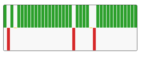
A Sparkline is a small chart that is drawn without axes. It does not contain some chart-specific elements (such as legend, title, etc.). The Sparkline chart can be easily embedded in the text as it performs more like an inline element (rendered inside a span) as opposed to the standard charts, which behave like block elements. The primary purpose attached to the Sparkline Chart is to show a trend of something unique.
#### The best situation to use Sparkline chart:
To show the data trend.
#### Default Chart Image:

#### **Properties of the Sparkline chart:**
* **Background:** The user can change the background color of the chart, can get the border for the chart, and can change the border color, can get the reflection of the chart by enabling the shadow option can also change the color and increase & decrease the transparency of the shadow.
* **Bar:** After changing the chart type to bar in the General properties section, the user can make changes in this section in order to make the bar chart look more meaningful. The user can change the bar spacing, enable the zero-axis, change the colors for positive bar, negative bar, and zero bar. Also, can enable the Auto axis and provide a Min Y-axis range.
* **Formatter:** The user can change units to % or none. The user can set the Precision option to see value in decimal format. The user can display currency value in INR, Pound, USD. The position of the currency symbol can be set as Prefix (if the currency is in INR format) otherwise, it can appear on the right-side as Suffix. Number Formatter can set it in Indian or International.
* **General:** The user can change the height, width, top, left. If initial visibility is unchecked, then the chart won’t be visible at the first preview. Also, possible to select the type of chart between Line, Bar, and Tristate.
* **Line:** After changing the type of chart to the line in the general section user can make modifications in this section in order to make the Sparkline chart more meaningful. Line color and width can be changed. The user can fill the area between the line and x-axis, change its opacity. It is also possible to change the spot color, Minimum-Maximum-Highlight Spot color. Also, the user can change the Highlight Line color. If the user provides values to the minimum and maximum normal values and normal color, the user can see an area marked in the chart that lies between those values. By enabling the Min/Max Data label the user can see the Minimum and Maximum value directly in the chart.
* **Tooltip:** The user can show the description of the series and use the tooltip by enabling it.
* **Tristate:** After changing the type to tristate in general, the user can change the Bar spacing and give different colors to the bar.
#### General Properties:
#### Background Properties:
#### Line Properties:
#### Bar Properties:
#### Tristate Properties:
#### The following variants can be obtained by changing Spark Line properties:
#### Sparkline Line
#### Sparkline Bar
#### Sparkline Tristate


