# Time Series
{% hint style="info" %}
Check out the below given walk-through on how to use the Time Series (Timeline) chart component in Designer module.
{% endhint %}

Timeline chart can be used to evaluate patterns and behavior in data over time. Also called 'Time Series' graphs. They show how values change over a time. Timeline charts display observations on the Y-axis against equally spaced time intervals on the X-axis.
#### Default Chart Image:

#### Properties of the Timeline chart:
* **Axis Setup**: The user can enable the Auto axis, the Base Zero value, Horizontal & Vertical marker line, zero marker line and can change the color of lines, increase and decrease the color Transparency by opacity.
* **Background**: The user can change the background color of the chart, can get the border for the chart and can change the border color, can get the reflection of the chart by enabling the shadow option can also change the color and increase & decrease the transparency of the shadow.
* **Formatter**: The user can change Y-axis values in units to %, T, Lacs, M, etc. Precision if we want the value in decimal format. Currency if we want the value in INR, Pound, USD. Position of the currency if it's in prefix and currency in Rupee then the sign will be seen in left-side if it's in suffix then it will be seen in right-side. Number Formatter if we want it in Indian or international.
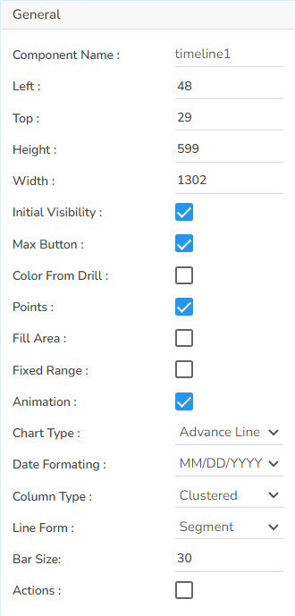
* **General**: The user can change the height, width, top, left, chart type, column type & Line form. In this case, we have changed the chart type to Advance Line, column type to Clustered & line form to Segment.
* **Legend**: The user can enable the internal legend if we want to show and can change the font size, color, style, etc.
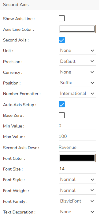
* **Second Axis**: The user can enable the second axis if we want to show any serial value according to the second axis.
* **Slider**: The user can enable the slider to show the reflection box and the series in the slider form.
* **Subtitle**: The user can enable the subtitle to display the second title. The user can change the Name, Font color, size, style for the subtitle.
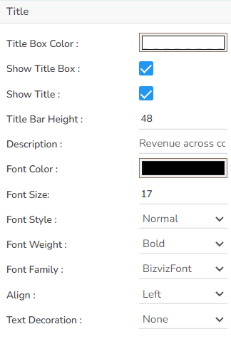
* **Title**: The user can change Title Name, Font color, size, style, etc.
* **Tooltip**: The user can show the description of the series can use the tooltip by enabling it.
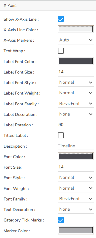
* **X-Axis**: The user can change the axis name, Font color, Font size, Enable the axis line, and the axis color.
* **Y-Axis**: The user can change the axis name, Font color, Font size, Enable the axis line, and the axis color.
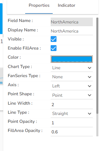
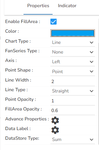
* **Dataset Series properties**: The user can change the color of each bar by selecting any of the series. There is an option to change the column type as well. Select either Line or Column options.
#### General Properties:
#### Title Properties:
#### X-Axis Properties:
#### Second Axis Properties:
#### Properties Tab from the Dataset Pallet:
#### Timeline chart variants by changing the Properties.
#### Clustered Chart with Line Segment

#### Clustered Chart with Line Curve

#### Stacked Chart

#### Overlaid Chart

#### 100% Chart

