Tab Component
Tab component has an option to create multiple buttons that can be associated to the group for displaying the show & hide visibility for the group components.
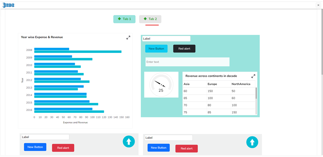
Check out the given demonstration on the Tab component.
Default Component Image
Properties of the Tab Component
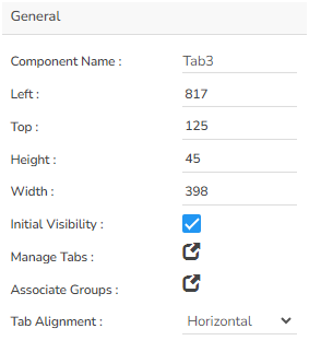
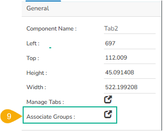
General
User can change the height, width, top, left. If initial visibility is unchecked, then the chart won’t be visible at the first preview. User can mange the tab & associate the group. The Tab Alignment properties field has been provided to set Vertical or Horizontal alignment for a Tab component.
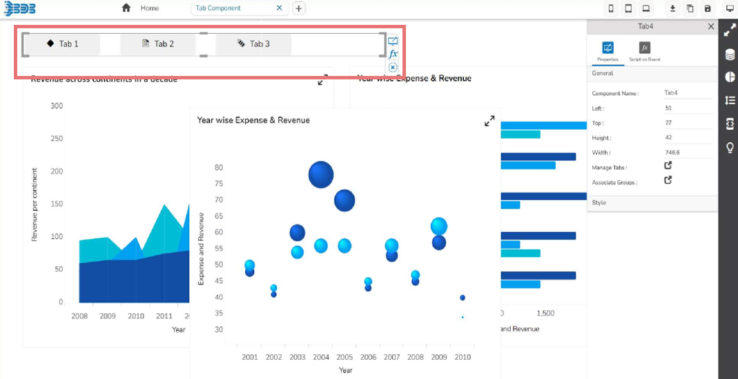
Manage Tabs
The user can add multiple tabs and change the tab names.
The Manage Tabs provides option to show the icons as per requirement.
E.g., bd-diamond will display the normal icon.
The user can select the default tab as displayed in the following image.
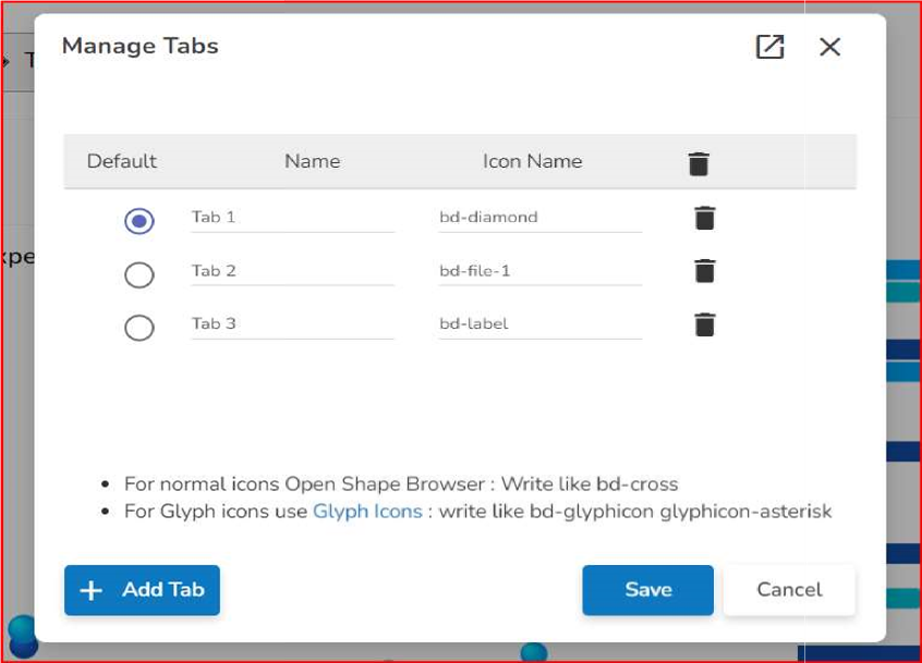
Please Note: The Manage Tabs option is provided inside the General Properties.
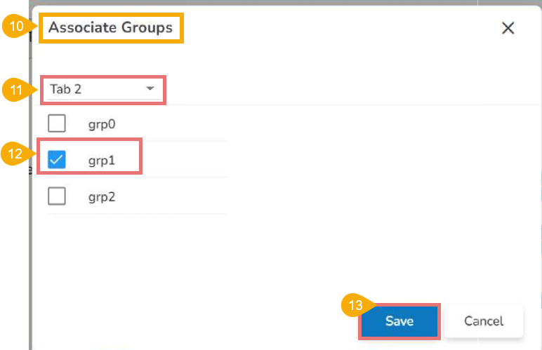
Associate Groups
The Associate Groups option is used to associate groups with charting components to each tab using the drop down as shown in the below given image:
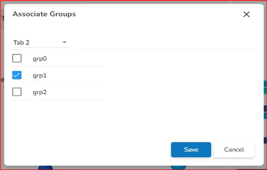
Please Note: The Associate Groups option is provided inside the General Properties.
Style Properties
User can set the background colour and font colour as well as font styling properties in this section. Background Opacity for Tabs is added as well as spacing to provide space between tabs. Selection colour also added as used if required.
Font Size - Set the font size.
Button Radius – Set the Button radius.
Button Width - Button width can be control.
Spacing – Set the spacing between the buttons.
Background Opacity – Set the opacity.
Font Style – Select the font style.
Font Weight – Select the font weight.
Font Family - Select the font family.
Font Color – Set the font color.
Background Color – Set the background color.
Selection Color – Set the selection color.
Border on selection - Enable border on selection
Border color - Set the border color - while click on button buttom will show the line & updated color.
Border width - Set the border width
Content alignment - Set the alignment as center /left/right.

Steps to associate the group with tabs:
Before using the Tab Component, the user has to create groups with components that can be associated to the tabs later.
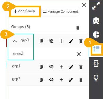
Creating Groups
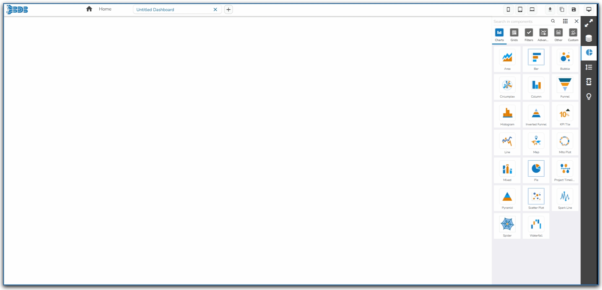
Click on the Manage Dashboard Components option provided in the right side panel of the Dashboard canvas.
Click the Add Group option.
Add each component to its respective group.
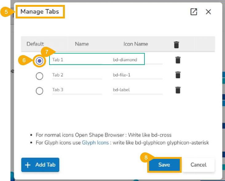
Open the Manage Tabs from the General Properties.

The Manage Tabs window opens.
Select a Tab from the by default selected tabs using the given check box.
Change Tab names (if required) and reference image/icon names as per requirement.
Click the Save option.
Open the Associate Tabs from the General Properties.
The Associate Groups window opens.
Select a Tab from the drop-down menu.
Associate a group for each Tab by using the checkbox.
Click the Save option.
Open the Preview mode for the dashboard.
Click on the Tab, it will display the associated group of component.