List
Check out the below given walk-through on how to use the List filter component in Designer module.

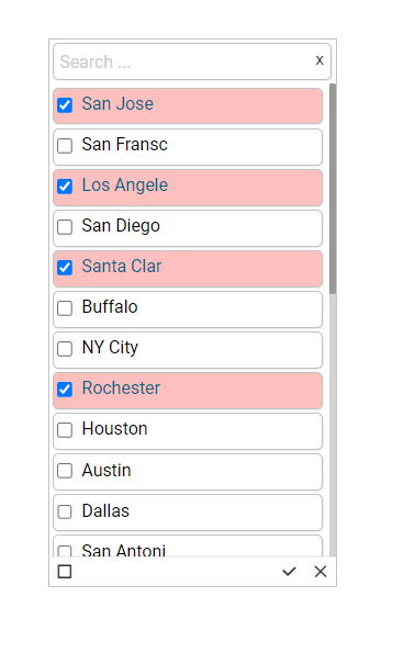
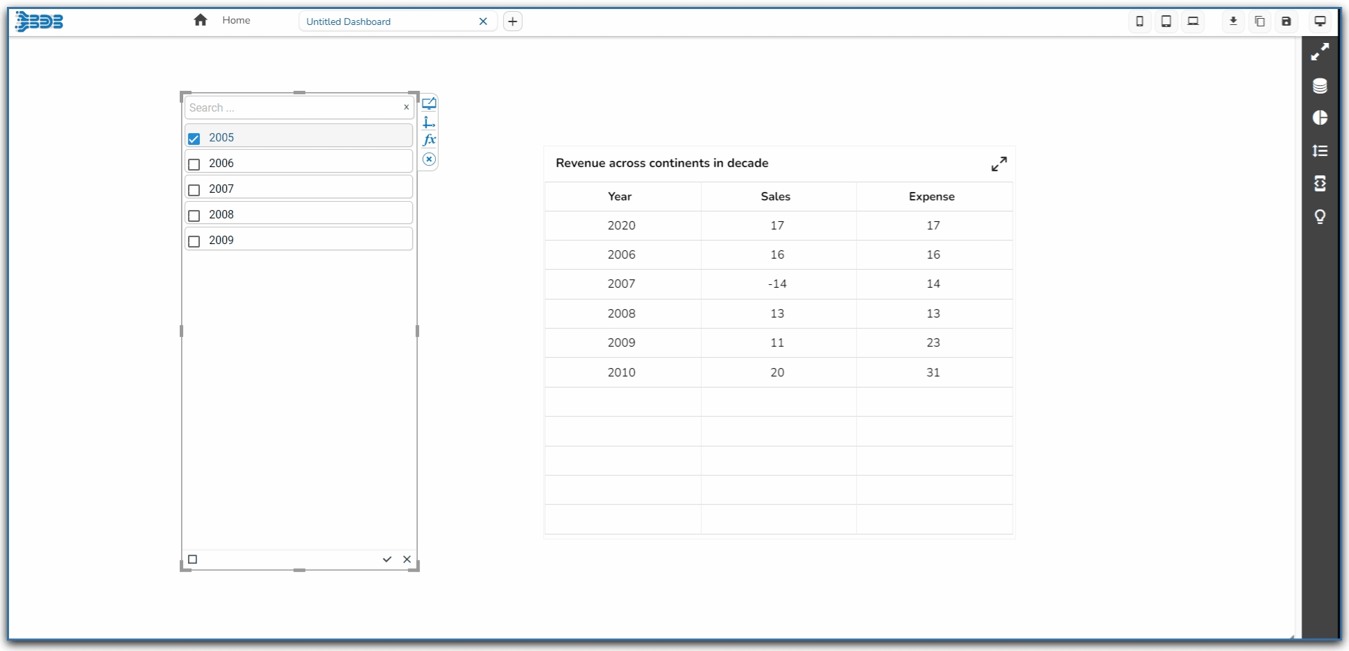
List is a component used to filter data. All available items are displayed as a list. Users can select multiple items simultaneously by holding the CTRL-key. Select items will determine the data that is displayed in any associated chart(s).
Default Component Image

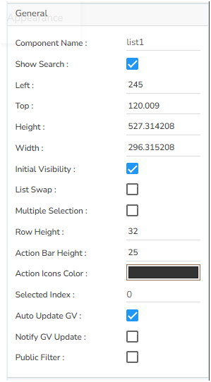
Properties of the List Filter
Background
Here user can set the Background color and adjust its transparency. The user can get the reflection of the chart by enabling the shadow option can also change the colour and increase & decrease the transparency of the shadow.
General
The user can change the height, width, top, left.
If the Initial Visibility is not enabled, then the chart won’t be available for the first preview.
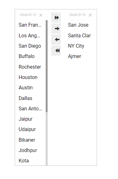
List swap is enabled, so that when the users select the values, they can move it to the second column (selected value list) and if didn’t need a value in the selected list, they can move it to the Initial Column itself.
Selected index can be set, so that cell value is selected initially. Enable the Notify GV Update so that when they change values in this filter, those values get updated in the filter.
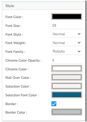
Style
If user set a Rollover Color, then when they move from one cell to another, they can see those cells in that color. Selection color highlights our selected cells. Also, user can adjust the font and border properties.
Title
If user need to see the title, then enable that option. And in description section give a title user want to see along with the filter values.

Modified List filter after changing its Properties