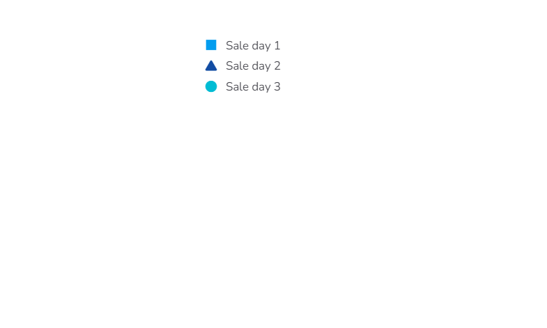
Legend
The Legend component is used along with other charts if the user needs a checkbox legend.
Default Component Image:

Properties of the Legend:
Background: The user can change the background color and adjust its transparency. Also, the border can be provided and the user can adjust its color and radius. The user can get the reflection of the chart by enabling the shadow option can also change the color and increase & decrease the transparency of the shadow.
General: The user can change the height, width, top, left.
If initial visibility is not enabled, then the chart won’t be available for the first preview.
If ‘Show Checkbox’ is enabled, then a check box can be seen along with the legend values.
First, the user needs to make the connection between the legend and the Chart by connecting them in the ‘Associate Chart’ section. The user can adjust legend orientation and shape.
Style: The user can set the background color and font color as well as font style-weight-family etc in this section.
General Properties:

Style Properties:

Modified Legend after changing its properties:
Horizontal Legend:

Vertical Legend:
