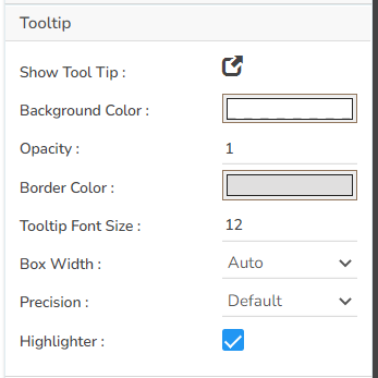
 ### Tooltip
* The user can show the description of the series by enabling the tooltip.
* The user can set and modify background color, opacity, border color, Tooltip font size properties using these properties fields.
* The user can also set the Box width, and select a precision option using the Tooltip properties.
* Use the given checkbox to enable ***Highlighter*** for the tooltip.
### Tooltip
* The user can show the description of the series by enabling the tooltip.
* The user can set and modify background color, opacity, border color, Tooltip font size properties using these properties fields.
* The user can also set the Box width, and select a precision option using the Tooltip properties.
* Use the given checkbox to enable ***Highlighter*** for the tooltip.
 ### Background
* The user can modify the Gradient related properties such as Gradient Rotation, Opacity, Gradient color using these properties fields.
* Change the Background color of the chart, get the border for the chart, and change the border color.
* Enable the shadow option to get the reflection of the chart. The user can also change the color and increase or decrease the transparency of the shadow.

### Title
* The user can enable or disable the Title Box and Title by using this properties field.
* The user can change Title Name, Font color, Font size, Font style, etc.
* By enabling the ***Show Dataset Description,*** the X Axis description will be taken from the mapped data fields.

### Subtitle
* The user can enable the subtitle if it is required.
* These properties fields will help to enable or disable the Subtitle, Provide description if it has been enabled and set the font related properties for the same.
* The users can also set the display alignment of the Subtitle and select any text decoration option from the given drop-down menu.

### **Legend**
* The user can enable or disable internal legend in the chart.
* The Font related properties such as Font Color, Font Weight, Font Size, Font Family, Font Style can be set and modified using this properties fields.
* The user can also select a Text Decoration option for the Legend. Put a check mark in the Hide on Load checkbox to hide the Legend while loading the chart.

### Formatter
* The Number formatter helps to choose whether the user wants it in Indian or International format.
* The user can change Y-Axis values in units such as %, T, Lacs, M, etc.
* The user can set the ‘Precision’ option to get the value in decimal format.
* The Currency option helps to select the currency value in INR, Pound, and USD.
* The Position of the currency displays the selected currency symbol in prefix or suffix.
* For example, if the Currency symbol is rupees and the prefix option is selected, then it will be displayed on the left side. Likewise, the suffix displays the selected currency symbol on the right side.

### Axis Labels
* The user can select or change the Font color, font style, weight, and family of the Axis labels using this properties option.
* The user can select or change the size of the labels as well the marker.

### Axis Setup
* The user can specify whether they need an Auto axis, or want to start the display with Base Zero value.
* The Axis Setup also helps to set the Min and Max values for the Axis.

### **Export Options**
The Export Options also helps to provide heading, sub heading, file name. The user can also select an option for Global Export Type.

By enabling the ***Enable Context Menu*** the user gets a context menu with various export options to download the report in the ***Preview*** mode.
### Background
* The user can modify the Gradient related properties such as Gradient Rotation, Opacity, Gradient color using these properties fields.
* Change the Background color of the chart, get the border for the chart, and change the border color.
* Enable the shadow option to get the reflection of the chart. The user can also change the color and increase or decrease the transparency of the shadow.

### Title
* The user can enable or disable the Title Box and Title by using this properties field.
* The user can change Title Name, Font color, Font size, Font style, etc.
* By enabling the ***Show Dataset Description,*** the X Axis description will be taken from the mapped data fields.

### Subtitle
* The user can enable the subtitle if it is required.
* These properties fields will help to enable or disable the Subtitle, Provide description if it has been enabled and set the font related properties for the same.
* The users can also set the display alignment of the Subtitle and select any text decoration option from the given drop-down menu.

### **Legend**
* The user can enable or disable internal legend in the chart.
* The Font related properties such as Font Color, Font Weight, Font Size, Font Family, Font Style can be set and modified using this properties fields.
* The user can also select a Text Decoration option for the Legend. Put a check mark in the Hide on Load checkbox to hide the Legend while loading the chart.

### Formatter
* The Number formatter helps to choose whether the user wants it in Indian or International format.
* The user can change Y-Axis values in units such as %, T, Lacs, M, etc.
* The user can set the ‘Precision’ option to get the value in decimal format.
* The Currency option helps to select the currency value in INR, Pound, and USD.
* The Position of the currency displays the selected currency symbol in prefix or suffix.
* For example, if the Currency symbol is rupees and the prefix option is selected, then it will be displayed on the left side. Likewise, the suffix displays the selected currency symbol on the right side.

### Axis Labels
* The user can select or change the Font color, font style, weight, and family of the Axis labels using this properties option.
* The user can select or change the size of the labels as well the marker.

### Axis Setup
* The user can specify whether they need an Auto axis, or want to start the display with Base Zero value.
* The Axis Setup also helps to set the Min and Max values for the Axis.

### **Export Options**
The Export Options also helps to provide heading, sub heading, file name. The user can also select an option for Global Export Type.

By enabling the ***Enable Context Menu*** the user gets a context menu with various export options to download the report in the ***Preview*** mode.
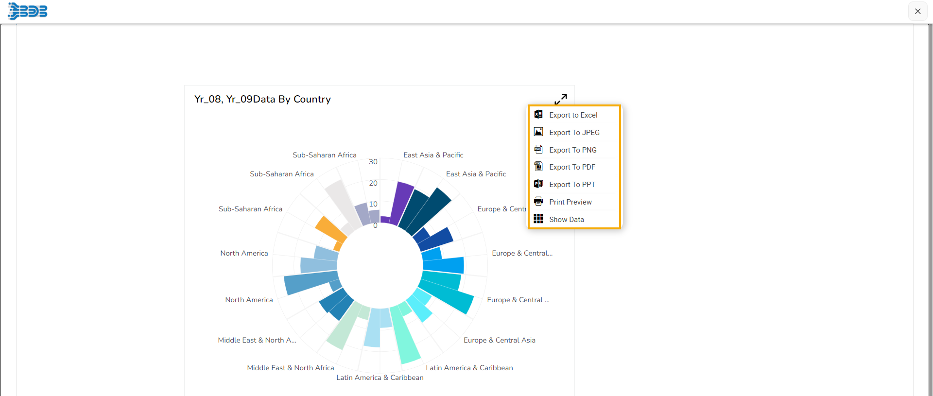
Availing Context Menu in the Preview mode.