
Map Chart
The Map chart is used to position data in a geographical context. Multiple layers are included to cover various information. The users can specify which layer to be marked as an interactive layer as it is the only layer wherein items can be marked.
Best Situations to Use a Map chart
To display widely spread data or processes in the geographical setup.
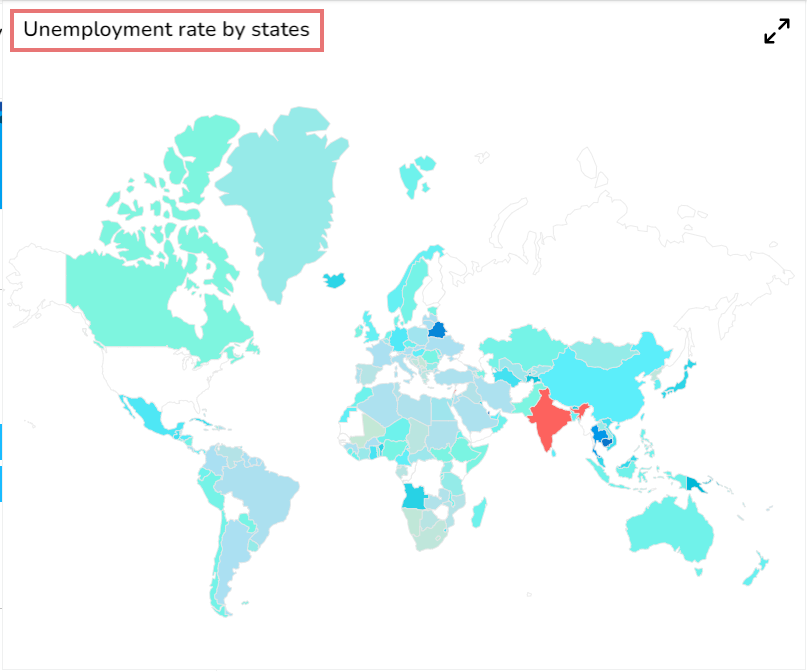
Default Chart Image

Properties of the Map chart
General
The user can also change the geometry type to marker, change the default color, rollover color, and give the color Range, etc. using the General Properties.
The user can change the height, width, top, left, chart type, column type & Line form. In this case, we have changed the Line type to curve, segment, etc.
The user can change the height, width, together with left and right placing of the chart on the canvas.
The user needs to put a checkmark for the Initial Visibility option to avail the preview at the first time.
Use the Max Button to maximize the chart separately.
The user can select the map type out of SVG and leaflet.
The user can select a different map by selecting a continent name e.g., Asia.
Select a Geometry Type option. The supported options are Marker, Line, Polygon, Clustered, Trail, Trip.
The user can enable or disable Points on the lines by using the given checkbox for the Points option.
The user can select a Line form from the drop-down menu option. The supported line types are Curve, Segment, Step, Reverse Step, Horizontal and Vertical.

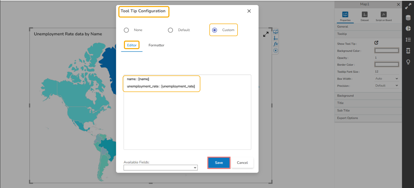
Tooltip
The user can show the description of the series and get a tooltip by enabling it.
Open the Tooltip properties.
Click the Show Tool Tip icon.

The Tool Tip Configuration dialog box appears.
Select the Custom option using the checkbox.
Enter the description you want to display for the Tooltip.
Click the Save option.
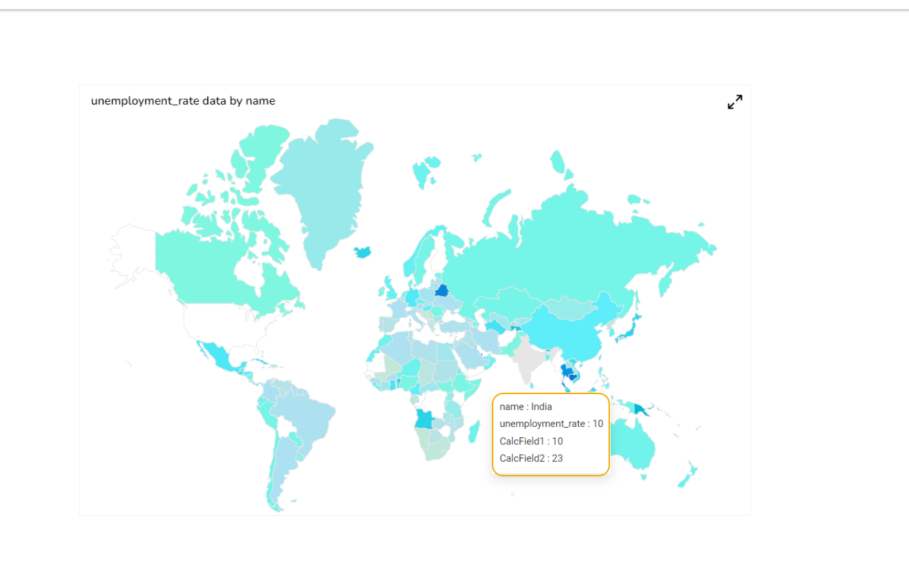
The Customized tooltip appears for the Map chart.
Title
The user can change Title Name, Font color, size, style, etc.
The user can enable or disable the Title Box and Title by using the properties like Show Title Box and Show Title.
Title Bar Height can be also set through the chart properties.
The user can change Title Description, Font color, Font size, Font style, Font Weight and Font Family.
By enabling the Show Dataset Description, the X Axis description will be taken from the mapped data fields.

Subtitle
The user can enable the subtitle if there is any second title the user can modify it.
The user can enable the Show Sub Title if it is required.
These properties fields will help to enable or disable the Subtitle, Provide description if it has been enabled and set the font related properties for the same.
Select various Font related properties such as Font Color, Font Size, Font Style, Font Weight, Font Family.
The users can also set the display alignment of the Subtitle and select any text decoration option from the given drop-down menu.

Background
Users can change the background color of the chart.
These properties fields help to get the border for the chart and change the border color.
Get the reflection of the chart by enabling the Shadow option. The user can change the Shadow Color, increase and decrease the transparency of the shadow as well.
Export Options
The Export Options also helps to provide heading, subheading, file name. The user can also select an option for Global Export Type.

By enabling the Enable Context Menu the user gets a context menu with various export options to download the report in the Preview mode.

Map Chart with SVG Type

Map Chart with Leaflet Type

Leaflet Auto Zoom
The user can use the Auto-zoom functionality to cover all the markers in the map component. This functionality is available in zoom-in map (Leaflet) based on number of markers and their placed positions so that all markers must be visible at that zoom-in level.

Leaflet Trip/Trail – Property - Line Type
The Line Type property is provided in the General tab for the Trip and Trail Geometry type Leaflet maps. The user can show Trip/ Trail map lines in any of the following three categories:
Straight Line
Dotted Line
Dashed Line

Leaflet Trip Type Straight Line Map

Leaflet Trip Type with Dash Line Map

Leaflet Trip Type Dotted Line Map

Please Note:
At present, this feature has been provided to the Leaflet Trip/Trail Geometry Type maps only.
The width of line or dot is fixed for all the supported line types.
Leaflet support for the Glyph and Maki Marker Icons
The Glyph and Maki marker icons are supported in the Leaflet map type chart. The user needs to set m_svgicons variable to false using the SDK script. The following three types of icons are supported in the Leaflet map with the Trip Geometry Type:1. For Marker with custom icons we use Maki Icons https://labs.mapbox.com/maki-icons/2. For custom markers we can use Glyph Icons https://getbootstrap.com/docs/3.3/components/#glyphicons3. For custom markers we can also use font icons like bd-filter, bd-*Please Note:
Currently we provide support for Leaflet Trip Type Non SVG.
To achieve these icons, we have to set m_svgicons variable to false using the SDK script.
A sample script with m_svgicons variable to false is given below:


Display Circle Data Points in the Leaflet charts
The Circle data points in Leaflet charts likely refer to markers that are displayed on the map in the shape of a circle. These markers can be used to indicate a specific location or set of coordinates on the map, and can be customized in terms of color, size, and other visual properties. BDB Designer draws circles considering the first data point as center, provided with an option to configure at which data point circle should render it.
Steps to Configure Circle Data Points & Show Marker through Script
Add a variable to control geometry type as circle.
Draw marker for other data points when Geometry type is circle.
Configure Circle as a data point.
By default, it draws a circle considering the first point.

The user can control the circle data point through script.
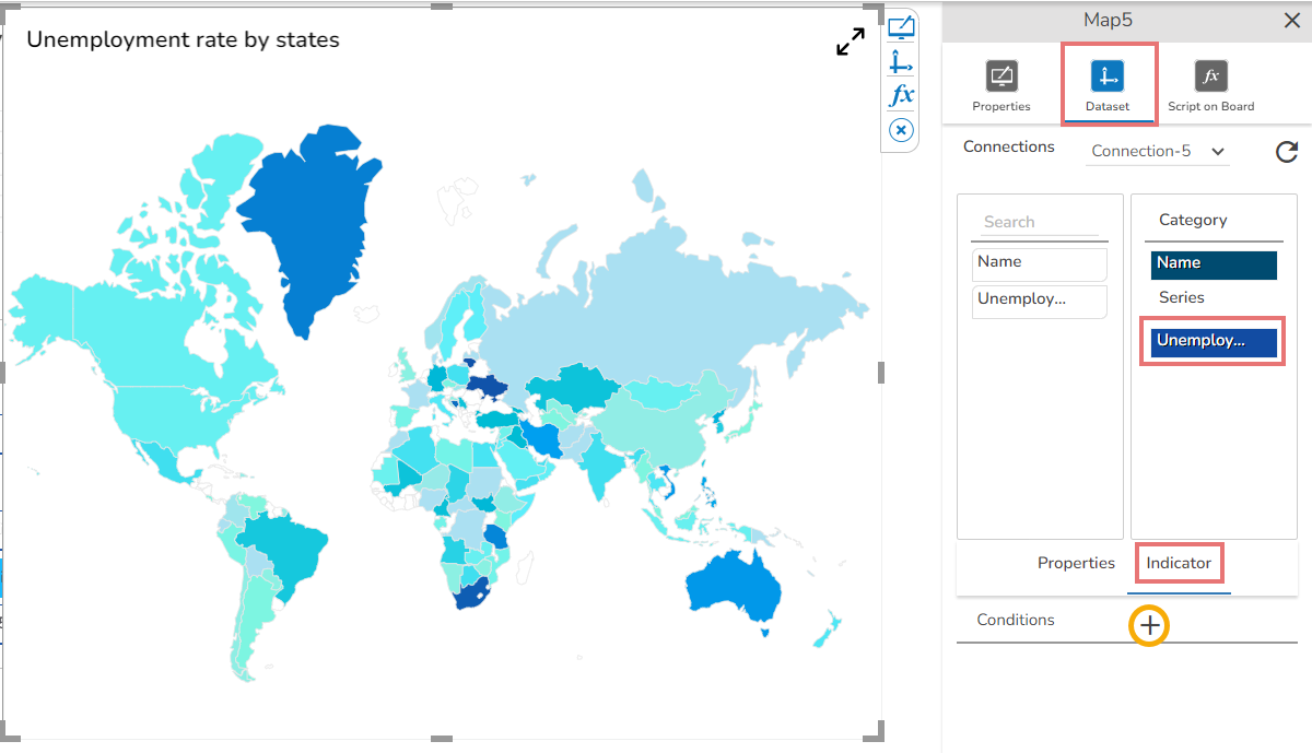
Series Indicator
The Map chart supports Series Color based on the conditions.
Open the Dataset properties for the Map component.
Select a Series.
Open the Indicator tab.
Click the Add New Condition icon.
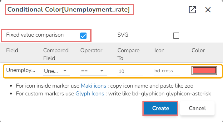
The Conditional Color dialog box opens for the selected series field.
Select one option out of Fixed Value Comparison or SVG.
Complete the required configuration.
Click the Create option.
Open the preview of the Map chart to view the conditional color for the set value.
Sample Data
Download the given sample data and map it as mentioned below to plot your Map chart.
Use the Name column as Category field, and Unemployment-rate column as Series to plot data.
Last updated