
Decomposition
The decomposition tree provides a powerful tool for visualizing data across various dimensions. It allows us to conduct a detailed analysis of data by drilling down into the hierarchical structure. It splits core metrics and identifies key factors that affect these metrics. With the help of artificial intelligence (AI), the decomposition tree can even help identify the next dimension of data to explore based on predefined criteria.
Best Situations to Use a Decomposition chart
When the user has a time series data set with a clear trend and seasonality patterns. A decomposition tree chart can help to break down the time series into its components and make it easier to analyze.
To identify underlying trends and seasonality in your business data.
E.g., a Decomposition chart can help a retailer to accurately forecast sales for a particular product and adjust inventory and marketing strategies accordingly.
Steps to configure Decomposition Chart
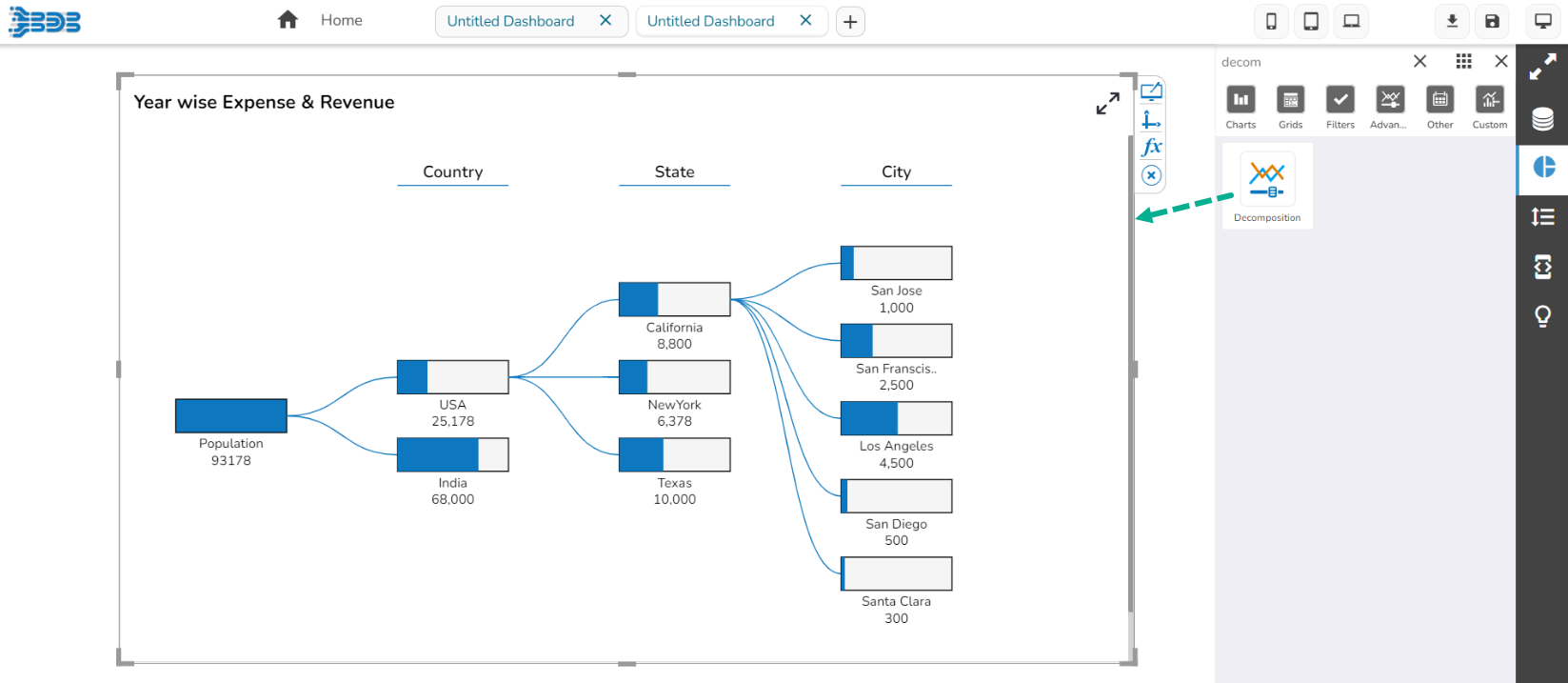
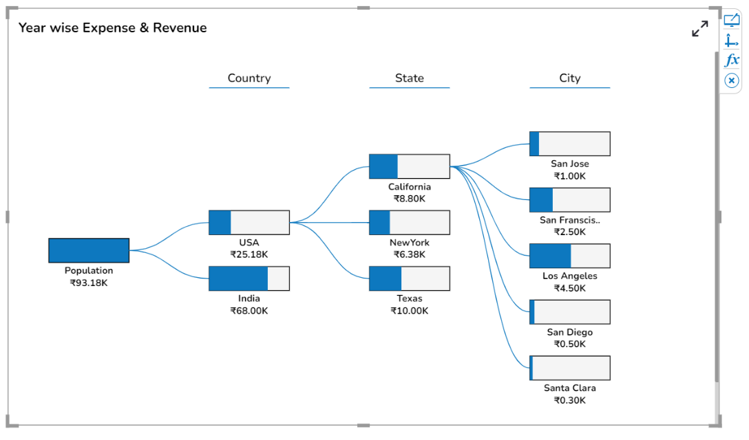
Drag and drop the decomposition chart from the component library. The chart looks as given in the below image on the Designer canvas page:
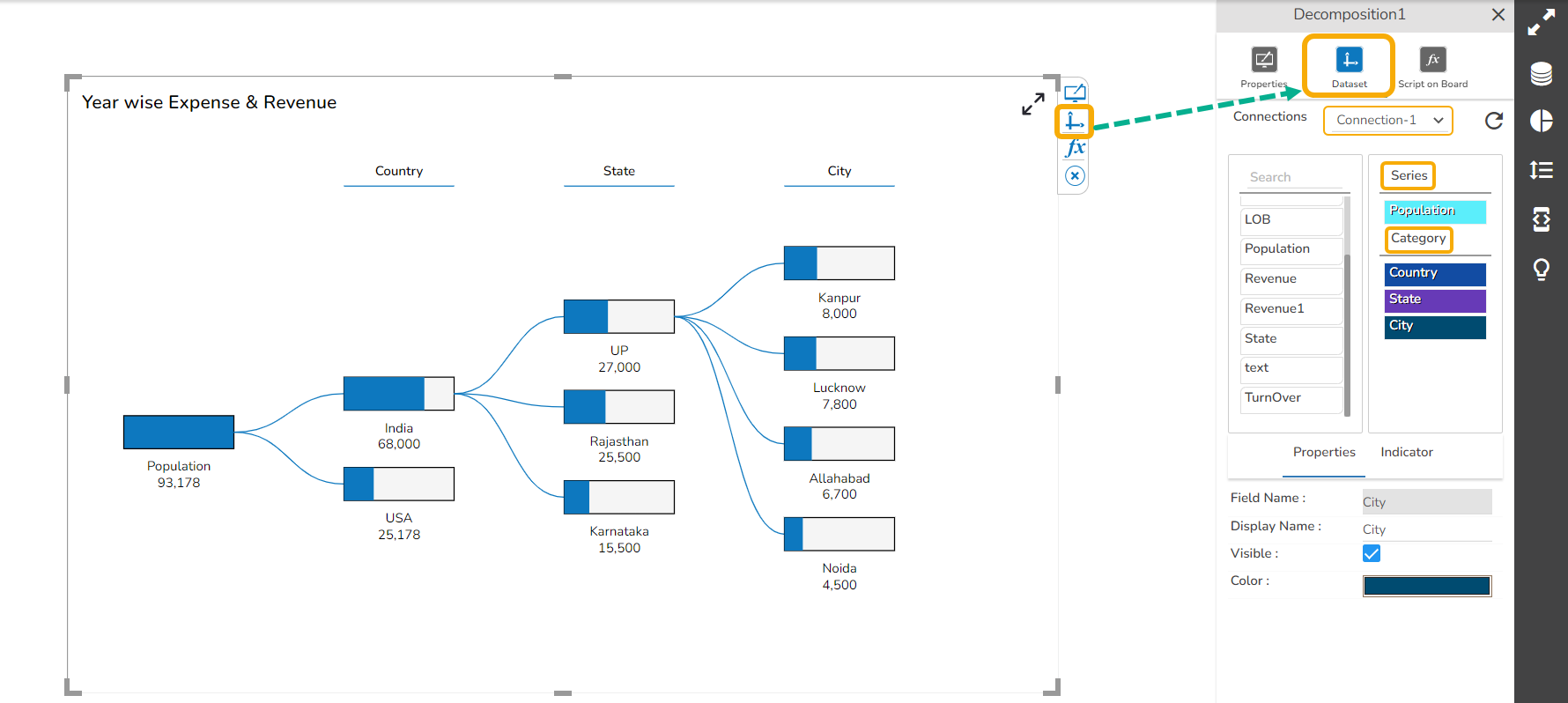
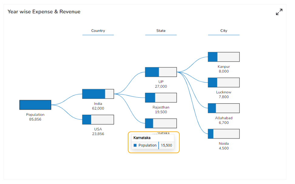
Associate a valid dataset. The sample Dataset used to generate a model chart is given-below:
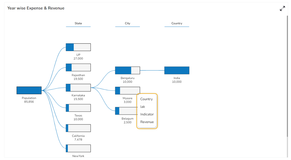
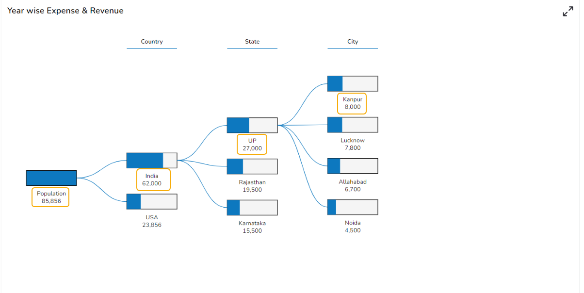
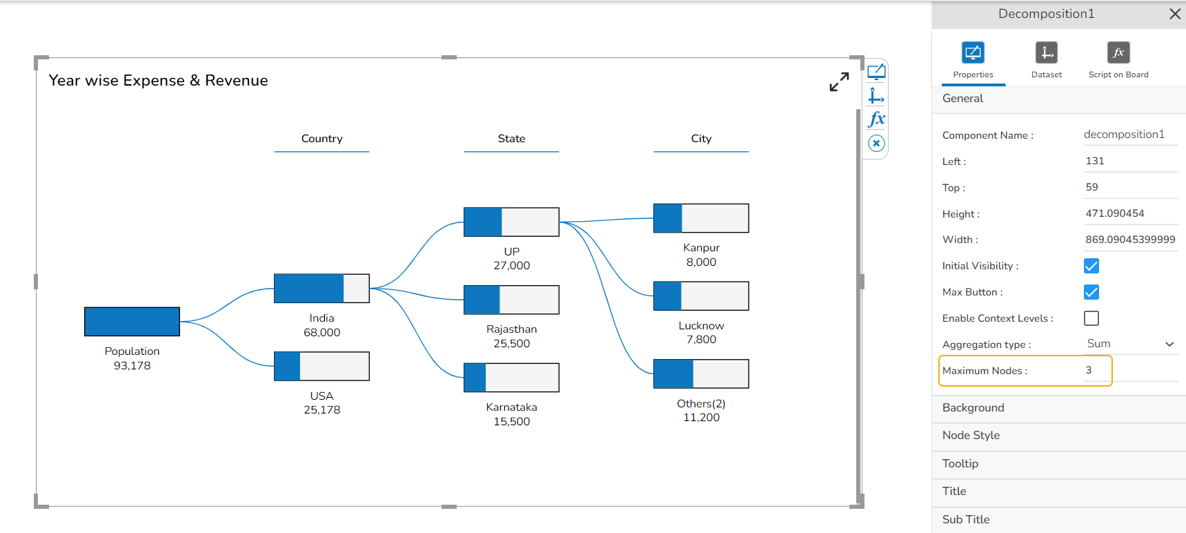
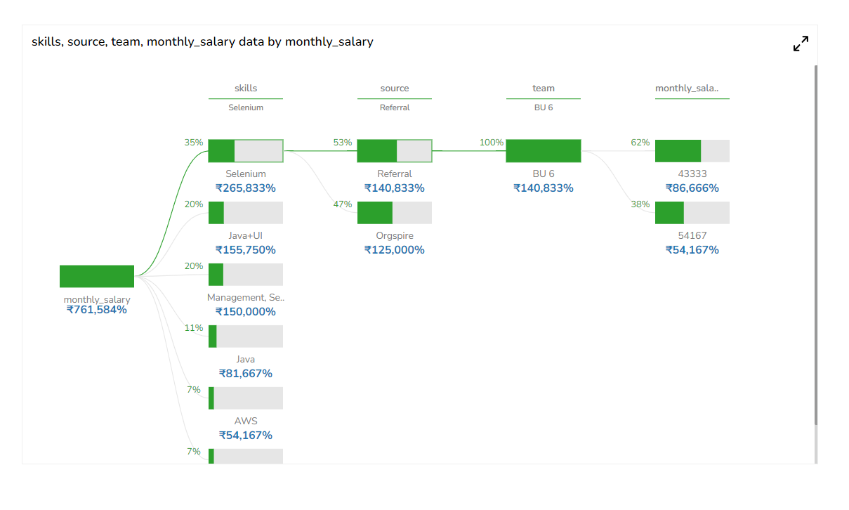
Consider the Series field as Population and visualize population data as per various categories such as Country, State, and City in a hierarchical order.
The total population per country, state, and city is displayed in each node while opening the Preview of the Dashboard.
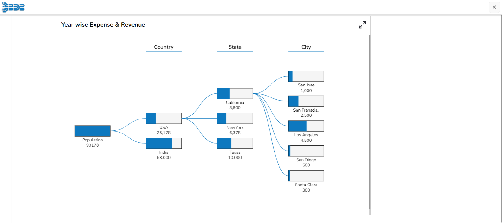
While clicking on one node, other nodes of the particular hierarchy get closed, and all the sub-categories/ children nodes get displayed. E.g., the sub-categories of the USA are displayed in the below-given image:
Properties of the Decomposition chart
General Property
Users can change the height, width, top, and left. If initial visibility is unchecked, then the component won’t be visible at the first preview. Users can manage the max button to minimize and maximize the chart.
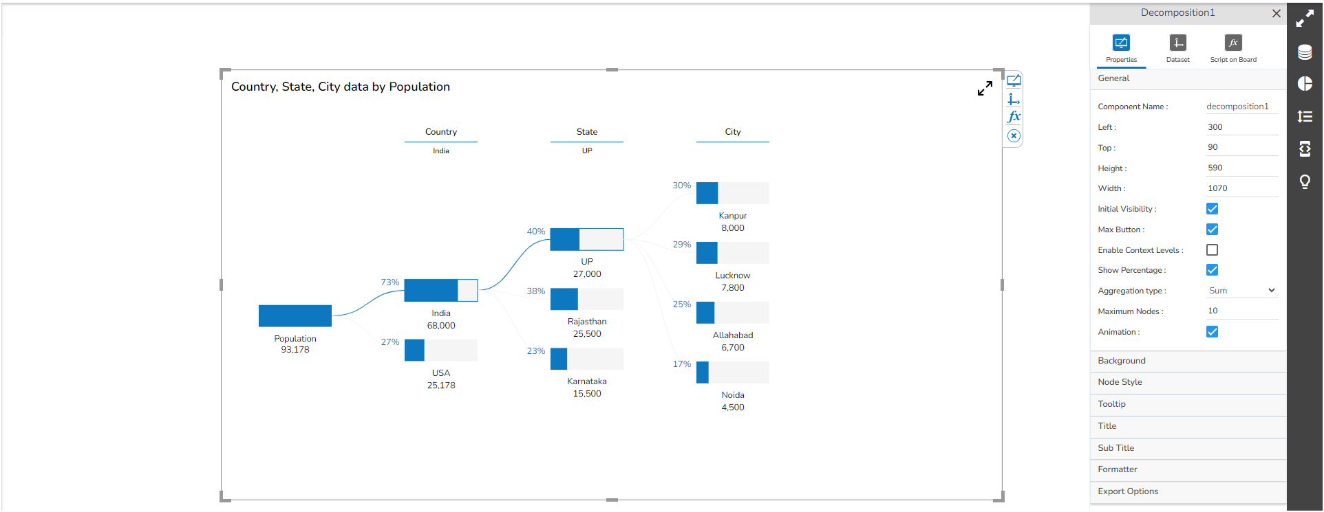
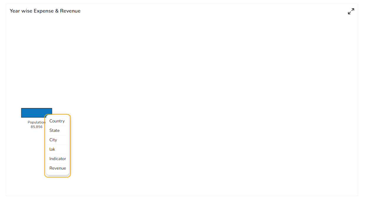
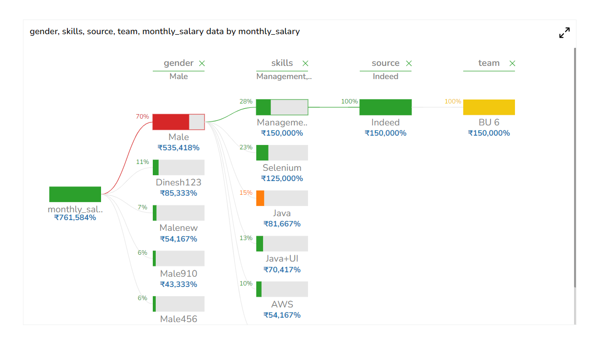
Use a checkmark for the Enable Context Levels property field. Users can select the next hierarchy levels as per requirement.
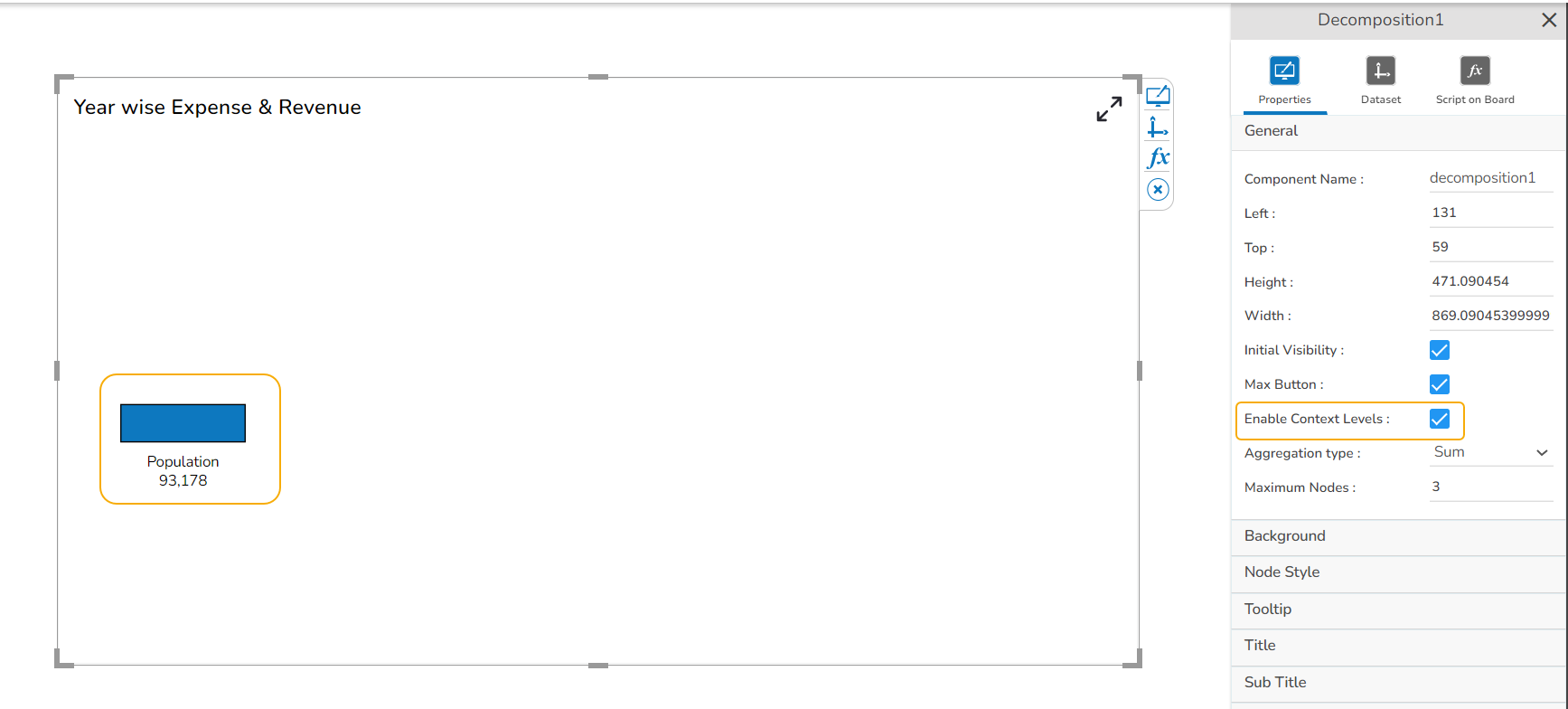
Use a right-click on the node to select the next level.
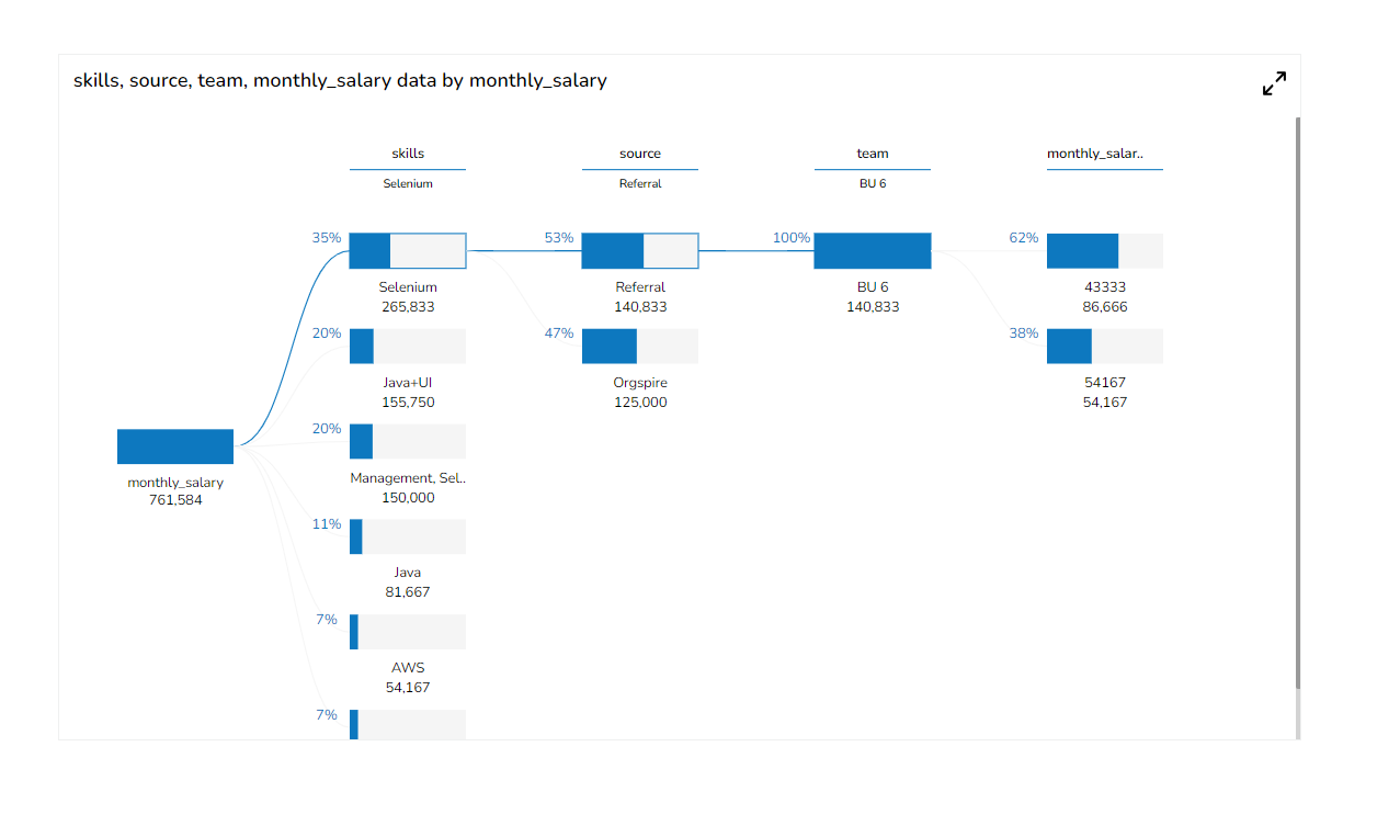
Use a checkmark for the Enable show percentage property field. Users can identify the Node percentage.
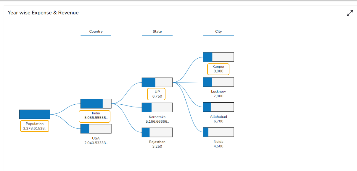
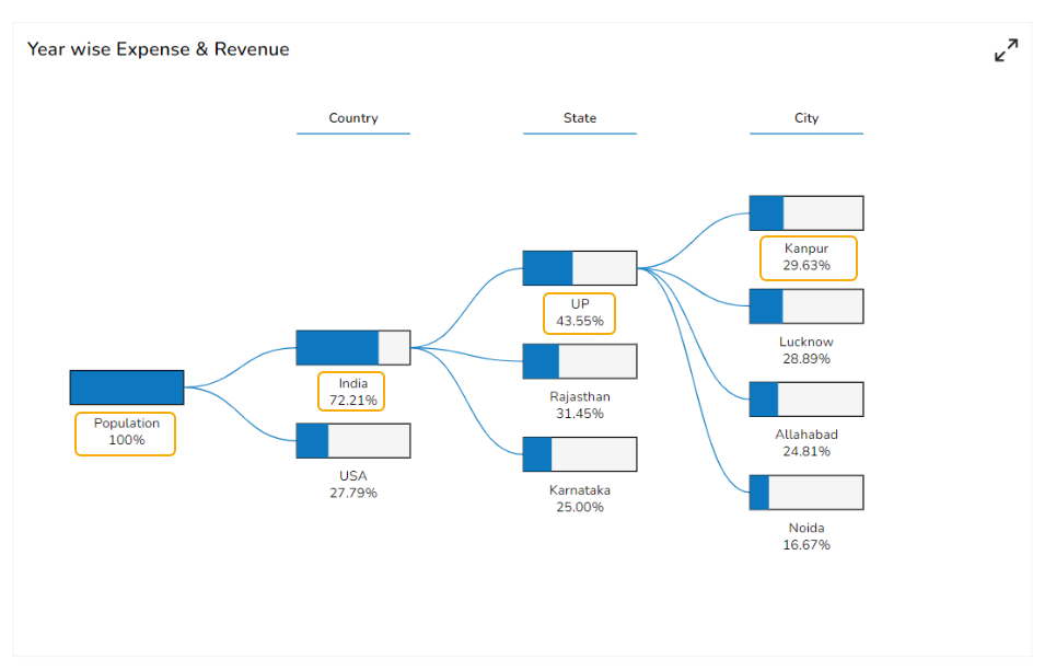
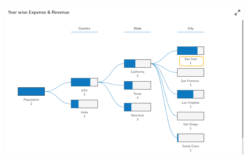
Aggregation Type
The Aggregation type property displays the value of the node based on the selected aggregation.
When the selected aggregation type is sum.
When the selected aggregation type is Mean.
When the selected aggregation type is Percentage.
When the selected aggregation type is Count.
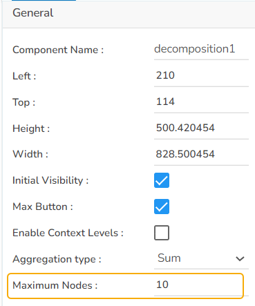
Maximum Nodes
Another property called Maximum Nodes has been provided to control the number of nodes in each hierarchy.
The set value for the Maximum Node field is 10 so if a particular node contains more than 10 children nodes, only 9 children nodes with comparatively more values get displayed as visible nodes, and the remaining children nodes with less value are shown as others.
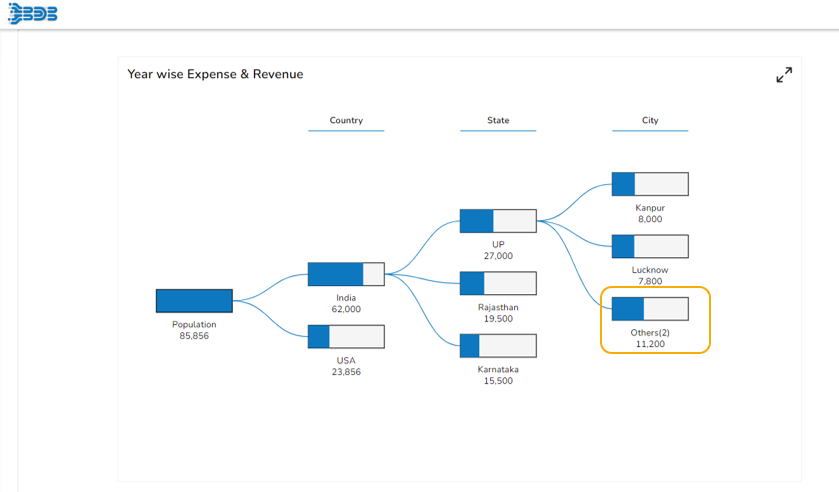
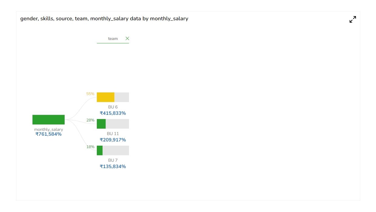
E.g., In the given Decomposition chart the Maximum Nodes are set as 3
The number of Maximum Nodes gets limited to 3 and the nodes with less values get clubbed as Others as displayed in the below-given image:
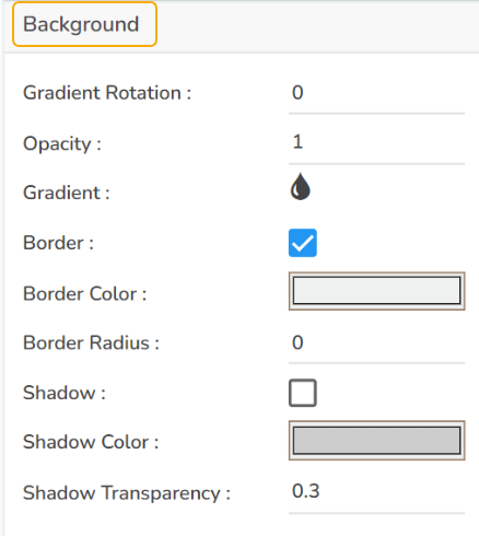
Background Property
Provide the following Background Properties for the Decomposition chart:
Gradient Rotation
Opacity
Gradient
Border
Border Color
Border Radius
Shadow
Shadow Color
Shadow Transparency
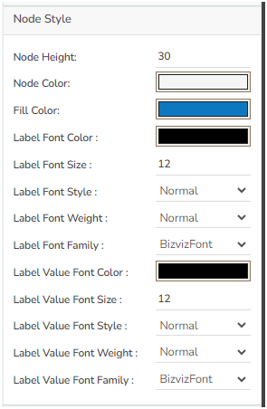
Node Style
Provide Node Style for styling the nodes and their default values.
Node Height: Set the height of nodes.
Node Color: Set the background color of the node.
Fill Color: Control node fill color
Stroke Color: Set the Border color of the node.
Label Font Color: Select a color for the Fonts.
Label Font Size: Set the Font Size.
Label Font Style: Select an option out of the given choices from the drop-down menu.
Label Font Weight: Select an option out of the given choices from the drop-down menu.
Label Font Family: Select a Font Family type using the drop-down menu.
Control Node Label font properties.
The following image displays a customized Decomposition chart.
ToolTip
Provided Tooltip property in the property section.
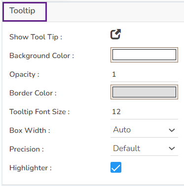
The Tooltip appears for the chart as shown below:
Formatter
Use the Formatter property fields to format the default Decomposition
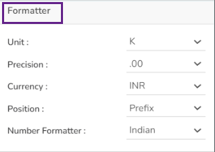
The default chart gets formatted as shown below:
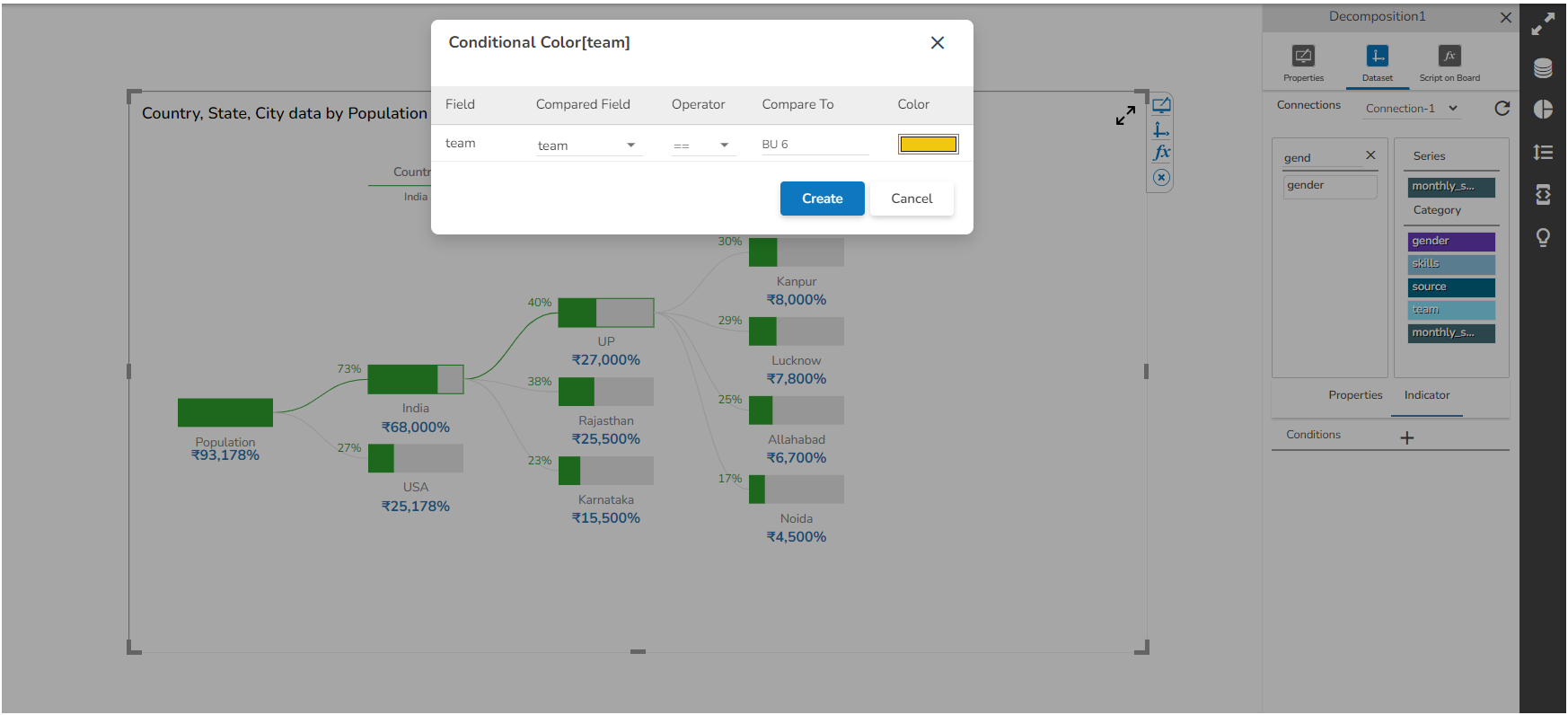
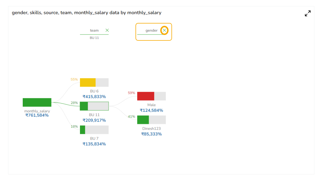
Provided Indicators Conditional color based on series values(series field indicator).
Closing Hierarchy
Provide an option to close particular hierarchy from header when the Context Level is enabled.
The selected hierarchy gets closed.
The Decomposition chart can highlight the selected node of each hierarchy and display the selected node name below the hierarchy text.
Sample Data
Download the given sample data and map it as mentioned below to plot your Decomposition chart.
Select the Timeline column as Category, and the other columns as Series.