
Spider Chart
Spider chart is also known as Radar chart which is used to plot values of each category along the axis which starts at the center of the chart and extends up to the end of the radius. It is a two-dimensional chart type designed to plot one or more series of values arranged in the form of spokes.
Check out the below given walk-through on how to use the Spider chart component in Designer module.

Best Situations to Use a Spider chart
To analyze performance areas in an organization.
To compare allocated values and spending analysis in different departments.
Default Spider Chart Image

Properties of the Spider chart
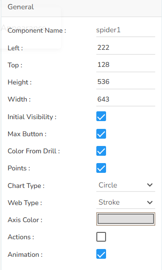
General
The user can change the height, width, top, left. If initial visibility is unchecked, then the chart won’t be visible at the first preview. If the max button is unchecked, then they can’t maximize the chart separately. Chart type can be changed between Polygon and Circle. Also, web type can be changed between Fill and Stroke.
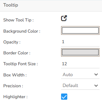
Tooltip
If the user wants to show the description of the series can use the tooltip by enabling it.
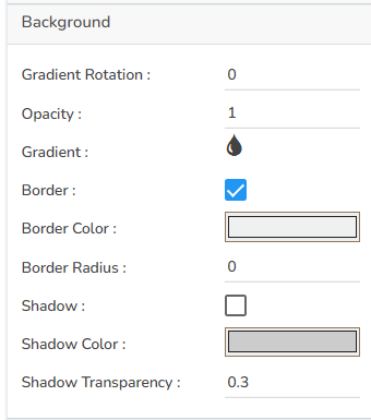
Background
The user can change the background color of the chart, get the border for the chart, and change the border color. The user can get the reflection of the chart by enabling the shadow option to change the color and increase or decrease the transparency of the shadow.
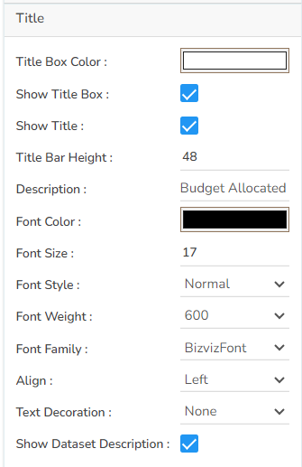
Title
The user can change Title Name, font color, font size, font style, etc.
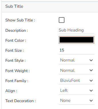
Sub Title
The user can enable the subtitle if the user has any second title and also change the name, font color, font size, font style, etc.
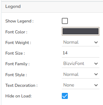
Legend
The user can enable the internal legend to show it and change the font size, font color, font style, etc.
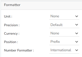
Formatter
The user can change units to % or none. The user can set the Precision option to see value in decimal format. The user can display currency value in INR, Pound, USD. The position of the currency symbol can be set as Prefix (if the currency is in INR format) otherwise, it can appear on the right-side as Suffix. Number Formatter can set it in Indian or International.
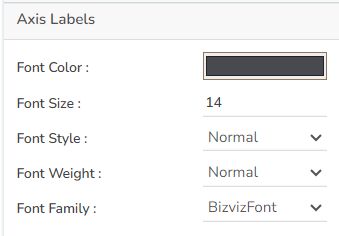
Axis Labels
The user can change the category label properties as well as the axis label values. It is able to change the font color, size, style, weight, and font family.
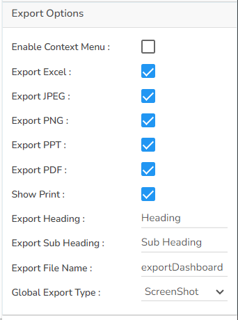
Export Options
The user can enable the ‘Enable Context Menu’ to download the reports in various formats by clicking on the chart from the preview section. The user can change the heading and subheading of the downloaded chart, and the name of the downloaded file from this section.
Different Variants of Spider charts
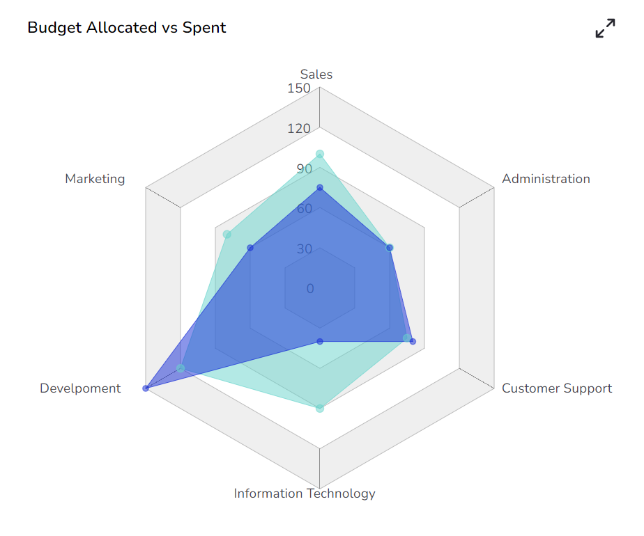
Spider chart with Polygon Chart type and Web type Fill
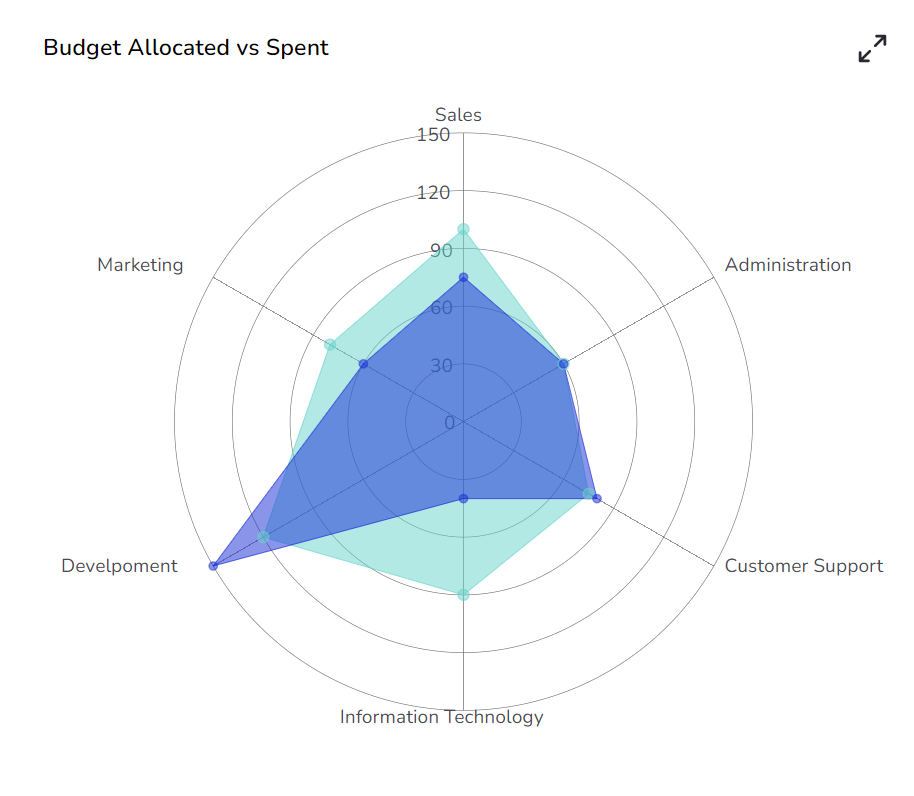
Spider chart with Circle Chart type and Web type Stroke
Please Note: The user needs to set the opacity for the series field approximately 0.5 to get the proper plotting of the selected data.
Sample Data
Download the given sample data and map it as mentioned below to plot your Spider Plot chart.
Select the Department column as Category field and Allocated_Budget as well as Actual_Spending columns as Series fields to plot the data.