Bar Charts are useful for comparing classes or groups of data. They are one of the most commonly used types of graph because they are simple to create and very easy to interpret. Several variations are included in the standard bar chart like stacked bar charts, grouped bars chart, and horizontal bar charts.
Best Situations to Use Bar chart
To interpret small data sets.
User can perform observations over a period.
Examples: Quarterly sales of an organization, Percentage of change in sales or revenue.
Variations of this chart
Use stacked bar charts: Where multiple categories can be clubbed together on top of each other, which makes addressing multiple questions easy.
Use bars side by side: Where comparison between multiple categories becomes easier instead of toggle between charts.
Add color for quick insight: Displaying the bars with colors will make users to pay quick attention to important tasks.
Plotting data on both axis: Data can be plotted both on positive and negative axis for identifying the trends
Default Visualization of the Chart
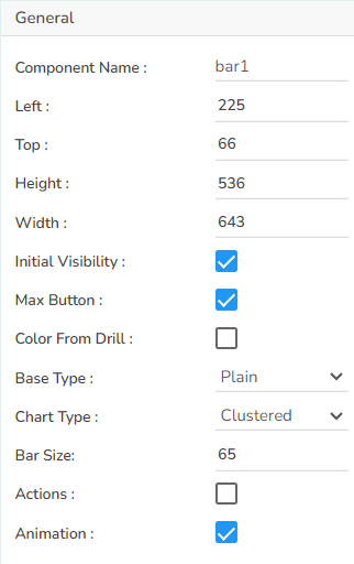
Properties of the Bar Chart
The user can change the height, width, top, and left values, chart type, column type, Line form. In this case, the user has changed the Chart Type to Clustered and the Base Type to Plain.
The user needs to put a checkmark for the Initial Visibility option to avail the preview at the first time.
The user can also change the height, width, top, left, points, chart type, Line form.
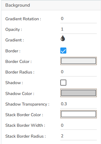
The user can modify the Gradient related properties such as Gradient Rotation, Opacity, Gradient color using these properties fields.
Change the Background color of the chart, get the border for the chart, and change the border color.
Enable the shadow option to get the reflection of the chart.
The user can also change the color and increase or decrease the transparency of the shadow.
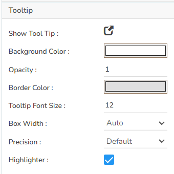
The user can show the description of the series by enabling the tooltip.
The user can show the description of the series and get the tooltip by enabling it.
The user can set and modify background color, border color, Tooltip font related properties using these properties fields.
The user can enable or disable the Title Box and Title by using this properties field.
The user can change Title Name, Font color, Font size, Font style, etc.
By enabling the Show Dataset Description, the X Axis description will be taken from the mapped data fields.

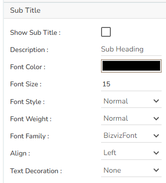
The user can enable the subtitle if it is required.
These properties fields will help to enable or disable the Subtitle, Provide description if it has been enabled and set the font related properties for the same.
The users can also set the display alignment of the Subtitle and select any text decoration option from the given drop-down menu.
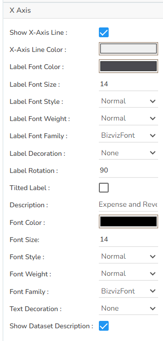
The user can change the axis name, Font color, Font size; enable the axis line, and change the axis color of the X Axis.
The user can also rotate (tilt) the title label by using this properties option.
By enabling the Show Dataset Description, the X Axis description will be taken from the mapped data fields.
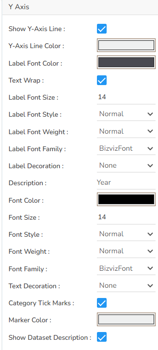
The user can change the axis name, Font color, Font size; enable the axis line, and changed the axis color of the Y Axis.
By enabling the Show Dataset Description, the Y Axis description will be taken from the mapped data fields.
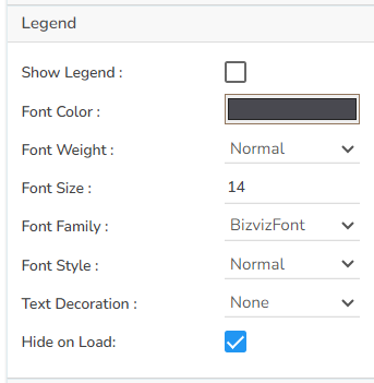
The user can enable or disable internal legend in the chart.
The Font related properties such as Font Color, Font Weight, Font Size, Font Family, Font Style can be set and modified using this properties fields.
The user can also select a Text Decoration option for the Legend.
Put a check mark in the Hide on Load checkbox to hide the Legend while loading the chart.
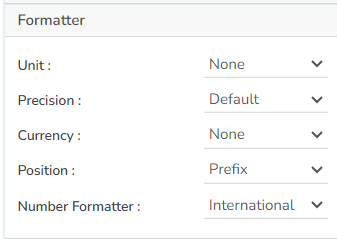
The Number formatter helps to choose whether the user wants it in Indian or International format.
The user can change Y-Axis values in units such as %, T, Lacs, M, etc.
The user can set the ‘Precision’ option to get the value in decimal format.
The Currency option helps to select the currency value in INR, Pound, and USD.
The Position of the currency displays the selected currency symbol in prefix or suffix.
For example, if the Currency symbol is rupees and the prefix option is selected, then it will be displayed on the left side. Likewise, the suffix displays the selected currency symbol on the right side.
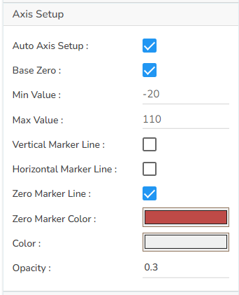
The user can enable or disable the Auto Axis Setup from this properties field.
The user can select Base Zero to begin the chart plotting from base zero.
Set and modify the Min and Max values.
Enable the Horizontal and Vertical marker Line together with Zero Marker Line.
The user can select and change color of lines (Marker line & Zero Marker line), increase and decrease the color Transparency by opacity.
The Export Options also helps to provide heading, subheading, file name. The user can also select an option for Global Export Type.
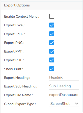
By using a checkmark for the Enable Context Menu the user gets a context menu with various export options to download the report in the Preview mode.
Context Menu with Export options in the Preview mode Dataset Series properties
The user can change the color of each series by selecting any of the series and enable the Data Label which shows the Value of each Revenue & Expenses.
Modified Dataset Pallet Properties

Various Variants of Bar Chart
It is possible to get the following variants of the Bar chart by changing the Properties.
Clustered Charts
Clustered Chart with Plain Base
Clustered Chart with Rectangle Base
Clustered Chart with Chevron Base
Clustered Chart with Gradient1 Base
Clustered Chart with Gradient2 Base
Clustered Chart with Gradient3 Base
Sacked Chart with Plain Base
Stacked Chart with Rectangle Base
Stacked Chart with Chevron Base
Stacked Chart with Gradient1 Base
Stacked Chart with Gradient2 Base
Stacked Chart with Gradient3 Base
Overlaid Charts
Overlaid Chart with Plain Base
Overlaid Chart with Rectangle Base
Overlaid Chart with Chevron Base
Overlaid Chart with Gradient1 Base
Overlaid Chart with Gradient2 Base
Overlaid Chart with Gradient3 Base
100% Chart with Plain Base
100% Chart with Rectangle Base
100% Chart with Chevron Base
100% Chart with Gradient1 Base
100% Chart with Gradient2 Base
100% Chart with Gradient3 Base
Download the given sample data and map it as mentioned below to plot your Bar chart:
Use the Year column as Category field and the other columns as Series to plot data as shown in the given examples below:


