KPI Tile
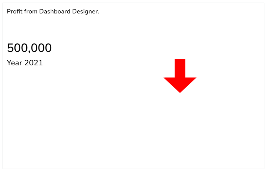
The KPI tile charting component displays the sum of quantity for progressive evolution. KPI is a measurable value that demonstrates how effectively a company is achieving key business objectives. The users can get a quick view of prominent trends, indicators, and values based on the various metrics of the business. Proper use of KPI helps in reducing the number of components used in the dashboard for multiple parameters for better performance. It contains the Sparkline component and Trend in build in it.
Best Situations to Use a KPI Tile
To provide information about the current performance of a company or organization at a glance
Default KPI Tile Image

Properties of the KPI Tile

General
The user can change the height, width, top, and left values.
If initial visibility is not enabled, then the chart won’t be available for the first preview.
The user can change the direction between Horizontal and vertical. Also, the user can change the + trend color, negative trend color, and zero trend color.
This will become useful if we have chosen the indicator type as Trend from the dataset section.
The user can also change the Sparkline border color and fill color. It becomes useful if the user has selected the indicator type as Sparkline.

Background and Style
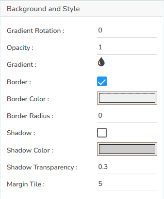
The user can get the reflection of the chart by enabling the shadow option. It is possible to change the color, and increase or decrease the transparency of the shadow. The user can change the background color and change its opacity. The user can also change the Margin tile width.
Users can change the background color of the chart.
These properties fields help to get the border for the chart and change the border color.
Get the reflection of the chart by enabling the Shadow option. The user can change the Shadow Color, increase and decrease the transparency of the shadow as well.
The user can also set the Margin Tile.
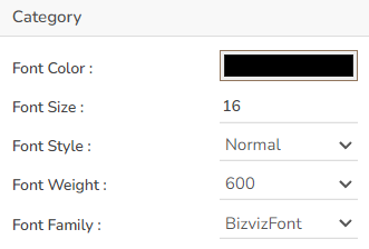
Category
The user can set and modify the various properties of the Category field like Font Color, Font Size, Font Style, Font Weight, and Font Family through this section of the KPI chart properties.
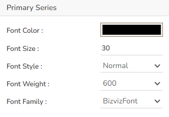
Primary Series
The user can set and modify the Font Color, Font Size, Font Style, Font Weight, and Font Family ac. for the primary category (first series field) through this section.
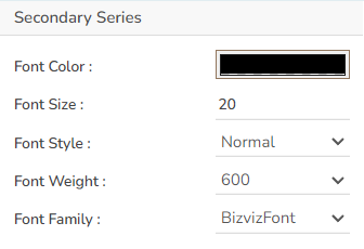
Secondary Series
The user can set and modify the Font Color, Font Size, Font Style, Font Weight, and Font Family ac. for the secondary category (second series field) through this section.
Dataset Indicator Properties

KPI Tile Variants
Sparkline

Sparkline with Trend

Trend
Sample Data
Download the given sample data and map it as mentioned below to plot your KPI Tile chart.
Use the Value Field column as Category field, Primary Series and Secondary Series columns as Series, Sparkline and Trend columns as Indicator columns to plot data.
Please Note: The user also needs to set the No. of rows/ columns from the General Properties fields to plot the sample data as displayed in the above-given image. E.g., the current image displays chart with 5 set as the No. of rows/ columns.
Last updated