Input Box
The Textbox component is used to display Text. The text formatting can be customized for this component.
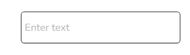
Default Component Image:
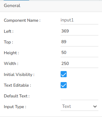
Properties of the Text Box:
General Properties:
The user can change the height, width, top, left. If initial visibility is not enabled, then the chart won’t be available for the first preview.
The Input type can be selected using the drop-down option, the supported Input types are: Text, Number, Email, Password.
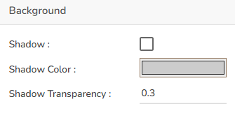
Background Properties:
The user can get the reflection of the chart by enabling the shadow option can also change the color and increase & decrease the transparency of the shadow.
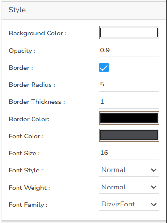
Style Properties:
The user can set the background color and font color as well as font style-weight-family etc. in this section.
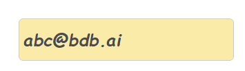
Modified Input Box after changing its properties: