Guided Tour
Guided Tour
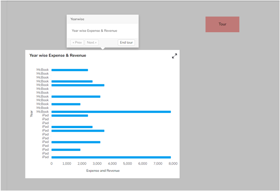
The Guided Tour is used to provide a dashboard tour and informs the user about what each component shows. We can navigate from one component to another, and whenever we want to stop the tour, we can stop it by clicking on the ‘End Tour’ option.
Default Chart Image:

Properties of the Guided Tour:
Background: The user can enable the shadow, change the shadow color, and transparency of that shadow.
General: The user can change the height, width, top, and left values. If initial visibility is unchecked, then the chart won’t be visible at the first preview.
The user can connect the tour component with the report components by using the ‘Associate Tour’ section.
The user needs to search for the available components, give title, content for the guided tour steps, tour position, and duration.
Click the ‘Add to List’ option and save the changes.
Tour type can be either text or image. If the user has selected the image option, then instead of the text box, one image box will come. The user needs to upload an image to display it in the position. Once the image gets uploaded the guided tour will begin by clicking on the uploaded image.
Style: The user can style the text box by changing its font and color properties.
General Properties:

Style Properties:

Report after enabling the Guided Tour:
