
Group Column
Check out the below given walk-through on how to use the Group Column chart component in Designer module.

A group column chart (clustered column chart, stacked column chart) extends the column chart, plotting numeric values for levels of two categorical variables instead of one. Columns are grouped by position for levels of one categorical variable, with color indicating the secondary category level within each group.
Best Situation to use the Group Column chart
To compare various relative values based on a common parameter
Example
If you want to compare your region-wise sales for 2012. A Column chart can easily facilitate that comparison. The Stacked/group chart is beneficial as it can facilitate both comparisons as well as part-to-whole relationship.
Default Chart Image

Properties of the Group Column chart
Axis Setup
The user can enable the Auto axis, the Base Zero value, Horizontal & Vertical marker line, zero marker line and can change the color of lines, increase and decrease the color Transparency by opacity.
Background
The user can change the background color of the chart, can get the border for the chart and can change the border color, can get the reflection of the chart by enabling the shadow option can also change the color and increase & decrease the transparency of the shadow.
Export Options
The user can enable the “Enable Context Menu”, then it is possible to download the reports in different formats if we click on the chart from the preview section. The heading and sub heading of that downloaded chart and the name of the downloaded file can be change from this section.
Formatter
The user can change Y-axis values in units to %, T, Lacs, M, etc. Precision if we want the value in decimal format. Currency if we want the value in INR, Pound, USD. Position of the currency if it's in prefix and currency in Rupee then the sign will be seen in left-side if it's in suffix then it will be seen in right-side. Number Formatter if we want it in Indian or international.
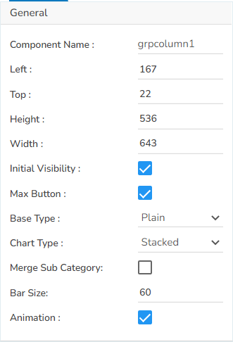
General
The user can change the height, width, top, left, chart type, column type & Line form. In this case, we have changed the chart type to stacked & base type to plain.
Legend
The user can enable the internal legend if we want to show and can change the font size, color, style, etc.
Repeater
This Properties will work when we have a category field and that category value should display in different chart. For Example: If we have a Year for each year, it will generate a different chart.
Subtitle
The user can enable the subtitle to display the second title. The user can change the Name, Font color, size, style for the subtitle.
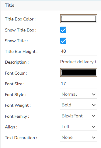
Title
The user can change Title Name, Font color, size, style, etc.
Tooltip
The user can show the description of the series can use the tooltip by enabling it.
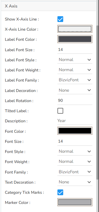
X-Axis
The user can change the axis name, Font color, Font size, Enable the axis line, and the axis color.
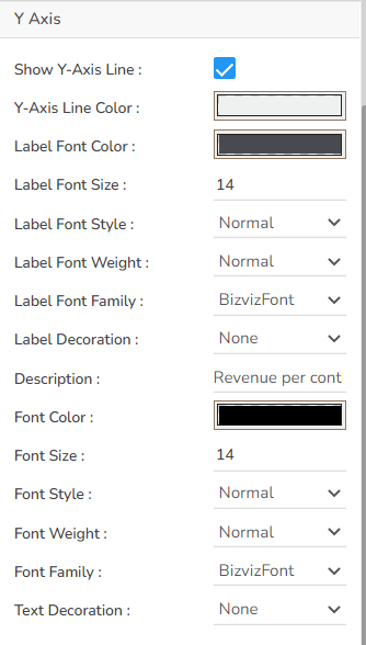
Y-Axis
The user can change the axis name, Font color, Font size, Enable the axis line, and the axis color.
Dataset Series Properties
The user can change the color of each bar by selecting any of the series. There is an option to change the column type as well. Select either Line or Column options.

Group Column chart variants by changing the Properties
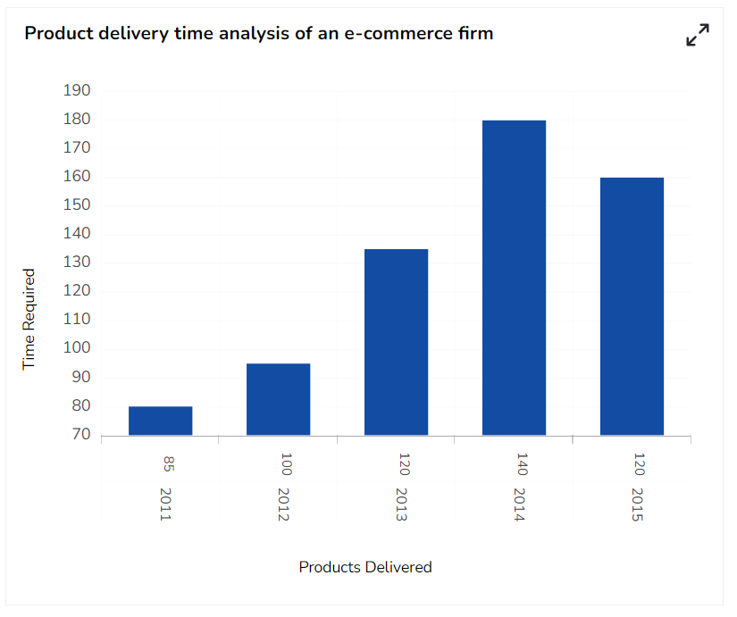
Group Column Chart with Plain base and Stacked Chart

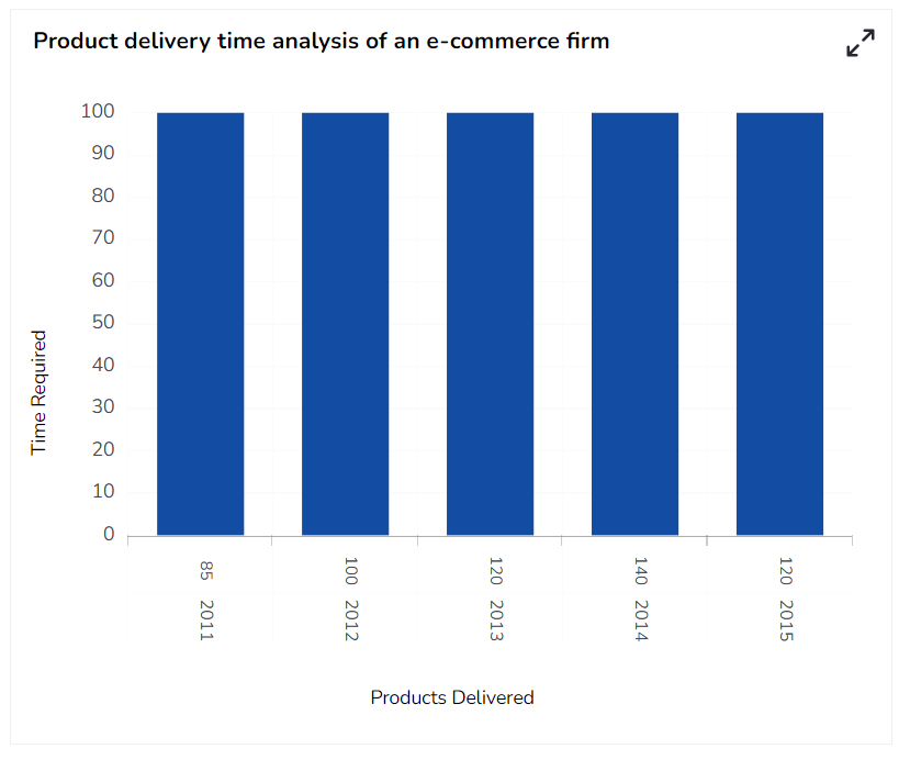
Group Column Chart with Plain base and 100% Chart
Group Column Chart with Plain base and Clustered Chart
Sample Data
Download the given sample data and map it as mentioned below to plot your Group Column chart:
Use the Category column as Category field, Items as Sub-category field, and other columns as Series fields.