
Pie Chart
Check out the below given walk-through on how to use the Pie chart component in Designer module.

The most widely used chart to show proportions, percentages, and categories of information. Users can use the Pie charts mainly to compare various categories. It is better to limit the categories up to 6 or fewer while visualizing them through a pie chart. Generally, Pie charts are used when values or the sum of values meet 100%.
Best Situations to Use a Pie Chart
Top performers and least performers based on the comparison of categories To illustrate break downs within a single dimension To show differences within groups based on one variable.
Variations of this chart
Pie-Doughnut
Doughnut charts behave like a Pie-chart the user can switch the pie-chart to a doughnut.
Default Pie Chart Image

Properties of the Pie chart
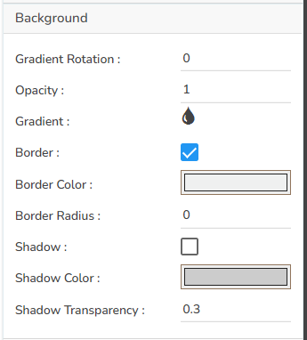
Background
The user can change the background color of the chart, get the border for the chart, and change the border color. Get the reflection of the chart by enabling the shadow option can also change the color, increase or decrease the transparency of the shadow.
Formatter
The user can change units to % or none. Precision if we want the value in decimal format. Currency if we want the value in INR, Pound, USD. Position of the currency if it's in prefix and currency in Rupee then the sign will be seen in left-side if it's in suffix then it will be seen in right-side. Number Formatter if we want it in Indian or international.
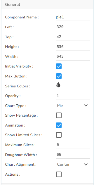
General
The user can change the height, width, top, left. If initial visibility is unchecked, then the chart won’t be visible at the first preview. If the max button is unchecked, then we can’t maximize the chart separately. We can change the color we want to see in the pie in the series color section and change its transparency in the opacity section. Chart type can be Pie, Doughnut, or Semi Doughnut. Can change the number of slices by clicking on the ‘show limited slices’ and by providing its number in ‘Maximum Slices’. Doughnut width can be increased or decreased also change the Chart Alignment. If the ‘Actions’ option is enabled then the user ‘show data’, ‘sort data’, ‘export’ the chart to PNG, PPT, PDF, or excel.
Legend
The user can enable the internal legend if we want to show and can change the font size, color, style, etc.
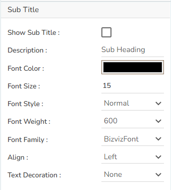
Subtitle
The user can enable the subtitle if we have any second title and also, we can change the Name, Font color, size, style, etc.
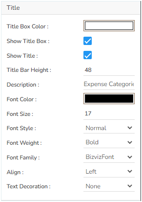
Title
The user can change Title Name, Font color, size, style, etc.
Tooltip
The user can show the description of the series and use a tooltip by enabling it.
Data Set Pallet Properties

Variants of the Pie Chart
Pie-Doughnut
Doughnut charts behave like a Pie-chart the user can switch the pie-chart to a doughnut.

Semi- Doughnut Pie Chart

Sample Data
Download the given sample data and map it as mentioned below to plot your Pie chart.
Use the ExpenseHeads column as Category field and the DollorInMillion column as Series to plot data.
Please Note: The Category field can be any data type line, string, or numeric. But, Series fields can be only numeric data type.