Governed Dashboards
  • About Dashboard Designer
    • What is Dashboard Designer?
    • Why is it used?
  • Getting Started
    • Accessing the Designer Module
    • Overview of Designer Module
      • Homepage
        • Guided Tour
        • Left Menu Panel
          • New
          • Manage
          • Open Dashboard
          • Preferences
          • Save As
          • Help
          • Exit
      • Dashboard Canvas Page
        • Right side Panel
          • Connection Page
          • Chart Container
          • Manage Window
          • Script Window
          • Guided Tour
        • Canvas Properties
          • Global Properties
          • Dashboard Themes
        • Context Menu Properties
  • Create New Workspace
    • Workspace Creation: Complete Flow
    • Creating a Workspace
    • Renaming a Workspace
    • Deleting a Workspace
  • Create New Dashboard
    • Dashboard Creation: Basic Workflow
    • Adding a New Dashboard
    • Create Connection
    • Drag and Drop Charts
    • Associate the Dataset
    • Preview the Dashboard
    • Save the Dashboard
    • User Alert Notification
  • Managing Options for a Dashboard
    • Open Dashboard in Designer
    • Publish a Dashboard
    • Share a Dashboard
    • Dashboard Version Control
    • Action Menu
      • Preview Dashboard
      • Export to Local Disk
      • Rename
      • Delete
      • Moving a Dashboard
      • Information Icon
      • Dashboard as Template
  • Connecting to a Data Source
    • Accessing the Data Connectors
    • Establishing a Data Connection
      • CSV Connection
      • Excel Connection
      • Data Service Connection
      • Data Store Connection
      • Data Sheet
        • Data Sheet Enhancements
      • WebSocket Connection
      • Merged Connection
  • Charts Gallery
    • Charts
      • Area chart
      • Bar Chart
      • Bubble Chart
      • Circumplex Chart
      • Column Chart
      • Funnel Chart
      • Histogram Chart
      • Inverted Funnel
      • KPI Tile
      • Line Chart
      • Map Chart
      • Mito Plot
      • Mixed Chart
      • Pie Chart
      • Project Timeline
      • Pyramid Chart
      • Spark Line
      • Scatter Plot
      • Spider Chart
      • Waterfall Chart
    • Grids
      • Data Grid
      • Paging Grid
      • Data Sheet
      • Scorecard
      • Pivot Grid
    • Filters
      • Checkbox
      • Combobox
      • Hierarchical Combobox
      • List
      • Radio Button
    • Advanced Charts
      • Box Plot
      • Candle Stick
      • Chevron
      • Data Search
      • Decision Tree
      • Group Bar
      • Group Column
      • Heat Map
      • Sankey
      • Text Analyzer
      • Time Series
      • Decomposition
      • Knowledge Graph
      • Tree Map
      • Trellis
      • Word Cloud
      • New Word Cloud
    • Other Charts
      • Box
      • Bullet
      • Date Picker
      • Export
      • Filter Chips
      • Filter Saver
      • Gauge
      • Graphics
      • Guided Tour
      • H-Slider
      • Image
      • Info Button
      • Input Box
      • Label
      • Legend
      • Progress Pie
      • Semi Gauge
      • Stepper
      • SVG Image
      • Text Box
      • Trend
      • URL Button
      • V-Slider
      • Tab Component
      • Inputbox component
      • Button component
    • Custom Charts
    • Common Chart Properties
      • Background
      • Title & Sub-title
      • X & Y Axis Properties
      • Legend Properties
      • Formatter
      • Axis Setup
      • Export Options
      • Copy Paste Chart Properties
  • Dashboard Objects
    • Manage Dashboard Components
    • Dashboard Objects Properties
  • Configurations
    • Filtering the Data
    • Drill Through
      • Drill Highlighter
    • Dataset Properties
    • Indicators in Charts
    • Tooltip(Default & Custom)
    • Data Label
    • Geo Mapping
    • Language Mapping
    • Legend Mapping
    • Alerts in Grids
  • Script Help Section
    • Navigate to Script Help page
    • How to use Scripts?
Powered by GitBook
On this page
  1. Charts Gallery
  2. Other Charts

Info Button

PreviousImageNextInput Box

Info Button

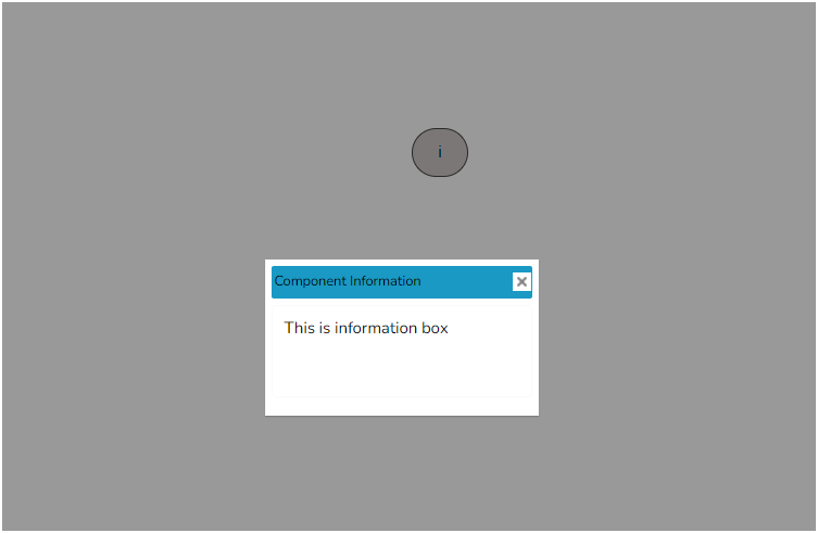
The Info-Button component displays text or an image when clicked. This component can also be used to perform the action(s) when clicked using Java Script.

Default Chart Image:

Properties of the Info-button:

  • Background: The user can enable the shadow, change the shadow color and transparency of that shadow.

  • General: The user can change the height, width, top, and left values. If initial visibility is unchecked, then the chart won’t be visible at the first preview.

  • The user can give a letter or number or symbol to show what they want to see in that icon in the ‘Label’ section.

  • The tooltip displays the information when they hover over that icon. When the user clicks on that icon one window will pop up.

  • In the ‘Display Text’ section, the user can give whatever text they want to see in that window. The title of that window is given in the ‘Title’ section.

  • The width and height of that window can be adjusted from the ‘Window Width’ and ‘Window Height’ sections.

  • Style: The user can change the background color of the icon using the ‘Light color’ section. Title Font Color, Title Font Size, Font Style, Font Weight, and Font Family can be modified by Style properties. Adjust the Window Font Color, Window Font Size, etc.

General Properties:

Style Properties:

Modified Image of the Info Button