
Area chart
An area chart or area graph displays graphically quantitively data. It is based on the line chart. The primary use of area charts is to display trends over a period of time.
Best situation to use area chart
To view the automobile sales of a manufacturer over a period of time.
To view the revenue growth of an organization by quarter wise.
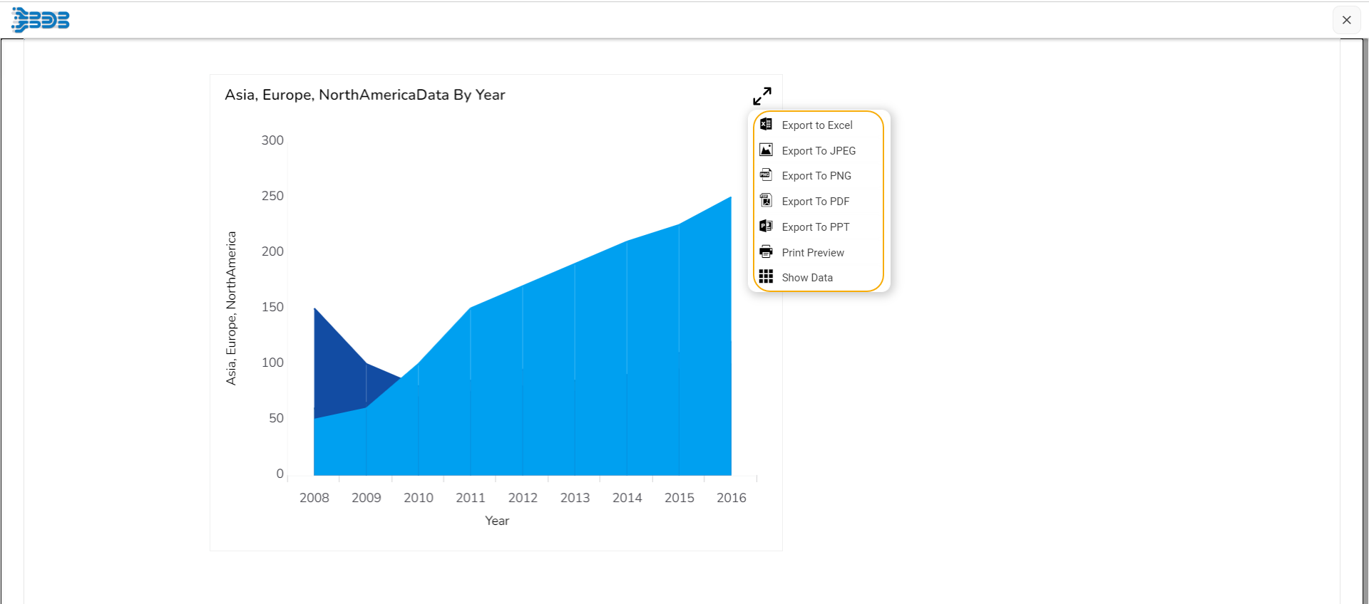
Default Visualization of the chart

Properties of the Area Chart
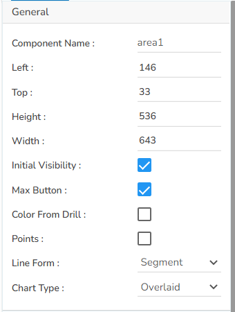
General
The user can change the height, width, top, and left values, chart type, column type, Line form. In this case, the user has changed the Chart Type to Overlaid and the Line Form to Segment.
The user needs to put a checkmark for the Initial Visibility option to avail the preview at the first time.
The user can also change the height, width, top, left, points, chart type, Line form.
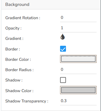
Background
The user can modify the Gradient related properties such as Gradient Rotation, Opacity, Gradient color using these properties fields.
Change the Background color of the chart, get the border for the chart, and change the border color.
Enable the shadow option to get the reflection of the chart.
The user can also change the color and increase or decrease the transparency of the shadow.
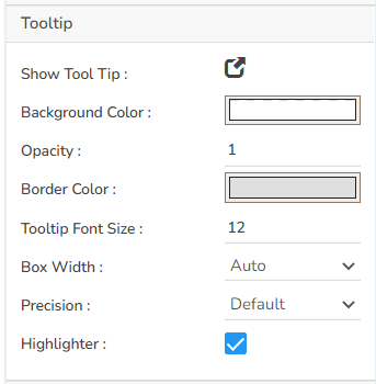
Tooltip
The user can show the description of the series by enabling the tooltip.
The user can show the description of the series and get the tooltip by enabling it.
The user can set and modify background color, border color, Tooltip font related properties using these properties fields.
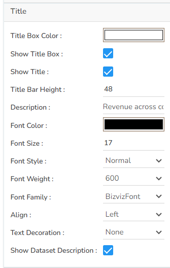
Title
The user can enable or disable the Title Box and Title by using this properties field.
The user can change Title Name, Font color, Font size, Font style, etc.
By enabling the Show Dataset Description, the X Axis description will be taken from the mapped data fields.
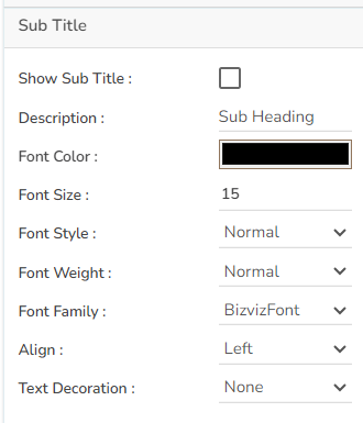
Subtitle
The user can enable the subtitle if it is required.
These properties fields will help to enable or disable the Subtitle, Provide description if it has been enabled and set the font related properties for the same.
The users can also set the display alignment of the Subtitle and select any text decoration option from the given drop-down menu.
X Axis
The user can change the axis name, Font color, Font size; enable the axis line, and change the axis color of the X Axis.
The user can also rotate (tilt) the title label by using this properties option.
By enabling the Show Dataset Description, the X Axis description will be taken from the mapped data fields.

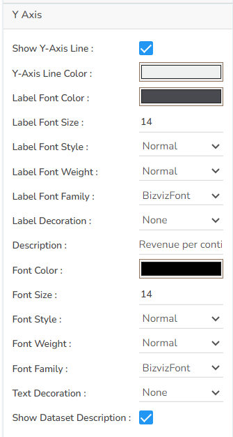
Y Axis
The user can change the axis name, Font color, Font size; enable the axis line, and changed the axis color of the Y Axis.
By enabling the Show Dataset Description, the Y Axis description will be taken from the mapped data fields.
Legend
The user can enable or disable internal legend in the chart.
The Font related properties such as Font Color, Font Weight, Font Size, Font Family, Font Style can be set and modified using this properties fields.
The user can also select a Text Decoration option for the Legend.
Put a check mark in the Hide on Load checkbox to hide the Legend while loading the chart.

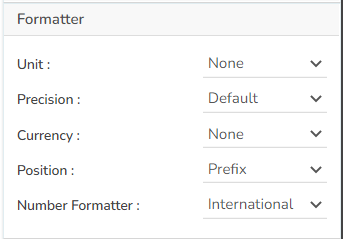
Formatter
The Number formatter helps to choose whether the user wants it in Indian or International format.
The user can change Y-Axis values in units such as %, T, Lacs, M, etc.
The user can set the ‘Precision’ option to get the value in decimal format.
The Currency option helps to select the currency value in INR, Pound, and USD.
The Position of the currency displays the selected currency symbol in prefix or suffix.
For example, if the Currency symbol is rupees and the prefix option is selected, then it will be displayed on the left side. Likewise, the suffix displays the selected currency symbol on the right side.
Axis Setup
The user can enable or disable the Auto Axis Setup from this properties field.
The user can select Base Zero to begin the chart plotting from base zero.
Set and modify the Min and Max values.
Enable the Horizontal and Vertical marker Line together with Zero Marker Line.
The user can select and change color of lines (Marker line & Zero Marker line), increase and decrease the color Transparency by opacity.

Export Options
The Export Options also helps to provide heading, sub heading, file name. The user can also select an option for Global Export Type.
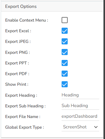
By enabling the Enable Context Menu the user gets a context menu with various export options to download the report in the Preview mode.
Dataset Series Properties
The user can change the color of each series by selecting any of the series. The user can change the Line type to Dot, Dot-Dash, Straight, Dash together with the line width, point shape, point radius, and Display Name i.e. it can display a different name while previewing the dashboard, if Display Name change is selected. We can enable the Data Label which to show the Value of each Year.
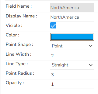
Please Note: The Category field can be any data type line, string, or numeric. But, Series fields can be only numeric data type.
Various Variants of the Area chart
It is possible to get the following variants of the Area chart by changing the Properties.
Overlaid Chart with the Line segment

Overlaid Chart with Line Curve

Stacked Chart

100% Chart

Sample Data
Download the given sample data and map it as mentioned below to plot your Area Plot chart:
Use the Year column as Category field and the other columns as Series to plot data as shown in the given examples below: