
Line Chart
Check out the below given walk-through on how to use the Line chart component in Designer module.

A line chart or line plot or line graph or curve chart is a type of chart that displays information as a series of data points called 'markers' connected by straight line segments. It is a basic type of chart common in many fields. The Line charts connect individual numeric data points to create a sequence of values. They are primarily used to display trends over a period.
Best Situations to Use a Line chart
To view trends in data over a period.
Example: To indicate increasing revenue or varying stock price
Variations of this chart
Mixed Chart- Combine a line graph with column charts to provide visual cues for further investigation.
Example: A column chart representing the numeric score of students combined with the line chart corresponding proficiency score
Default Chart Image

Properties of the Line Chart
General
The user can change the height, width, top, left, chart type, column type & Line form. In this case, we have changed the Line type to curve, segment, etc.
The user can change the height, width, together with left and right placing of the chart on the canvas.
The user needs to put a checkmark for the Initial Visibility option to avail the preview at the first time.
Use the Max Button to maximize the chart separately.
The user can also enable the Show Percentage to show percentage on the chart.
The user can enable or disable Points on the lines by using the given checkbox for the Points option.
The user can select a Line form from the drop-down menu option. The supported line types are Curve, Segment, Step, Reverse Step, Horizontal and Vertical.

Tooltip
The user who wants to show the description of the series can use the tooltip by enabling it.
The user can show the description of the series and get the tooltip by clicking the Show Tool Tip option.
The Tool Tip Configuration window opens.
Select any Tool Tip option. The supported Tool Tip is None, Default, Custom.
Click the Save option.

The user can set and modify Background Color, Opacity, Border Color, Tooltip Font Size related properties using these properties fields.
It is also possible to select Box Width and Precision option from the Tooltip properties.
Use the Highlighter option to get the bar color indication in the tooltip.

Please Note: The Custom option for Tool Tip Configuration opens with the following framework to configure a Tooltip.

Background
Users can change the background color of the chart.
These properties fields help to get the border for the chart and change the border color.
Get the reflection of the chart by enabling the Shadow option. The user can change the Shadow Color, increase and decrease the transparency of the shadow as well.

Title
The user can change Title Name, Font color, size, style, etc.
The user can enable or disable the Title Box and Title by using this properties field.
The user can change Title Name, Font color, Font size, Font style, etc.
By enabling the Show Dataset Description, the X Axis description will be taken from the mapped data fields.

Subtitle
The user can enable the subtitle if there is any second title the user can modify it.
The user can enable the Show Sub Title if it is required.
These properties fields will help to enable or disable the Subtitle, Provide description if it has been enabled and set the font related properties for the same.
Select various Font related properties such as Font Color, Font Size, Font Style, Font Weight, Font Family.
The users can also set the display alignment of the Subtitle and select any text decoration option from the given drop-down menu.

X-Axis
Enable or disable X- Axis line by using the given checkbox.
The user can select a color for the X- Axis line.
The user can select various label properties such as Label Font color, Label Font Size, Label Font Style, Label Font Weight, Label Font Family, Label Decoration, Label Rotation.
The user can also rotate (tilt) the title label by using the given checkbox for Tilted Label option.
The user can also adda description about the X-Axis and set various Font related properties such as Font Color, Font Size, Font Style, Font Weight, and Font Family for the inserted description.
The user can also display or remove Category Tick Marks and choose a color for the marker.
By enabling the Show Dataset Description, the X Axis description will be taken from the mapped data fields.

Y-Axis
Enable or disable Y- Axis line by using the given checkbox.
The user can select a color for the Y- Axis line.
The user can select various label properties such as Label Font color, Label Font Size, Label Font Style, Label Font Weight, Label Font Family, Label Decoration.
The user can also adda description about the X-Axis and set various Font related properties such as Font Color, Font Size, Font Style, Font Weight, and Font Family for the inserted description.
The user can change the axis name, Font color, Font size; enable the axis line, and changed the axis color of the Y Axis.
By enabling the Show Dataset Description, the Y Axis description will be taken from the mapped data fields.

Legend
The user can enable the internal legend to show and change the font size, font color, font style.
The user can enable or disable internal legend in the chart.
The Font related properties such as Font Color, Font Weight, Font Size, Font Family, Font Style can be set and modified using this properties fields.
The user can also select a Text Decoration option for the Legend.
Put a check mark in the Hide on Load checkbox to hide the Legend while loading the chart.

Formatter
The user can change Y-Axis values in units to %, T, Lacs, M, etc. Precision if we want the value in decimal format. Currency if we want the value in INR, Pound, USD. Position of the currency if it's in prefix and currency in Rupee then the sign will be seen in left-side if it's in suffix then it will be seen in right-side. Number Formatter if we want it in Indian or international.
The user can change Y-Axis values in units such as %, T, Lacs, M, etc.
The user can set the ‘Precision’ option to get the value in decimal format.
The Currency option helps to select the currency value in INR, Pound, and USD.
The Position of the currency displays the selected currency symbol in prefix or suffix.
For example, if the Currency symbol is rupees and the prefix option is selected, then it will be displayed on the left side. Likewise, the suffix displays the selected currency symbol on the right side.
The Number formatter helps to choose whether the user wants it in Indian or International format.

Axis Setup
The user can enable or disable the Auto Axis Setup from this properties field.
The user can select Base Zero to begin the chart plotting from base zero.
Set and modify the Min and Max values.
Enable the Horizontal and Vertical marker Line together with Zero Marker Line.
The user can select and change color of lines (Marker line & Zero Marker line), increase and decrease the color Transparency by opacity.

Export Options
The Export Options also helps to provide heading, subheading, file name. The user can also select an option for Global Export Type.

By enabling the Enable Context Menu the user gets a context menu with various export options to download the report in the Preview mode.

Repeater
These Properties will work when the users have a category field and that category value should display in a different chart. For Example: If we have a Year for each year, it will generate a different chart.
The user need to enabled the Repeater option using the Repeater section provided in the chart Properties.
Select a field that is to be used to group by the repetitive charts.
Set the number of columns to be considered for generating this chart.
The user can also set Row Height, Column Margin, and Row Margin for the repetitive charts.

The chart gets displayed grouped by the selected field. In this case, the selected field is Year. Thus, the chart displays year wise data separately.

Dataset Series Properties
The user can change the color of each series by selecting any of the series. The user can enable the Data Label to show the Value of each Revenue & Expenses.

Variants of the Line chart by changing the Properties
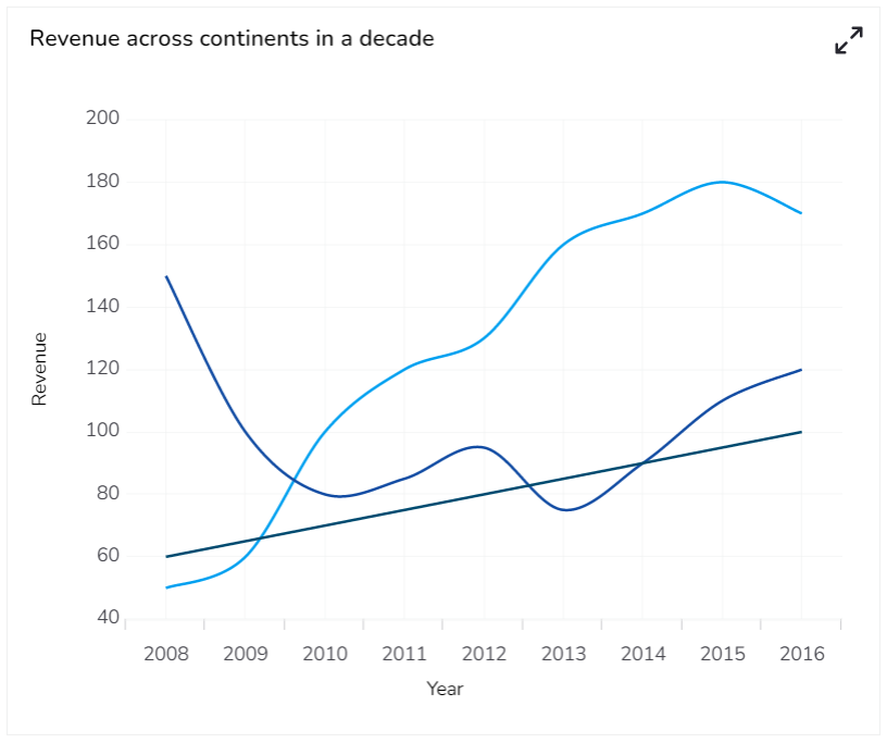
Line Curve Chart

Line Segment Chart

Line Step Chart

Line Reverse Step Chart

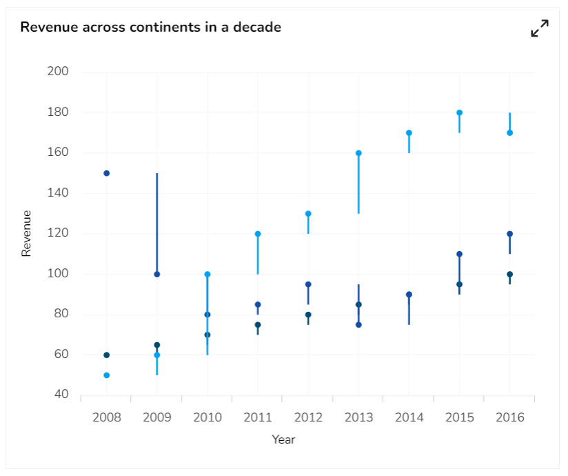
Line Horizontal Chart

Line Vertical Chart
Sample Data
Download the given sample data and map it as mentioned below to plot your Line chart.
Use the Year column as Category field, and other columns as Series to plot data.
Last updated