
Histogram Chart
The histogram is similar to a bar chart but it groups the values into continuous ranges. Each bar in the histogram represents the height of the number of values present in that range. The X-Axis remains a continuous scale in the Histogram chart that makes it different from the Vertical Bar Chart. The Histograms make it easy to grasp where most values fall in a measurement scale, and how much variation is there. It is used to summarize a large amount of data or compare process results with specification limits.
Best Situations to Use a Histogram chart
To summarize massive data sets graphically
To compare process results with specification limits
To communicate information graphically for the most frequent values
Default Chart Image

Properties of the Histogram chart
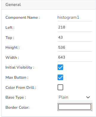
General
The user can change the height, width, together with left and right placing of the chart on the canvas.
The user needs to put a checkmark for the Initial Visibility option to avail the preview at the first time.
Use the Max Button to maximize the chart separately.
The user can also enable Color from Drill using the General properties.
The user can select a Base Type option for the chart. The supported Base Type options are Rectangle, Cylinder, Plain, Gradient 1, Gradient 2, Gradient 3.
User can enable the Border Color for the histogram columns.
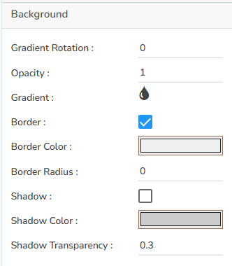
Background
The user can modify the Gradient related properties such as Gradient Rotation, Opacity, Gradient color using these properties fields.
Change the Background color of the chart, get the border for the chart, and change the border color.
Enable the shadow option to get the reflection of the chart. The user can also change the color and increase or decrease the transparency of the shadow.
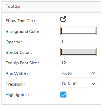
Tooltip
The user can show the description of the series by enabling the tooltip.
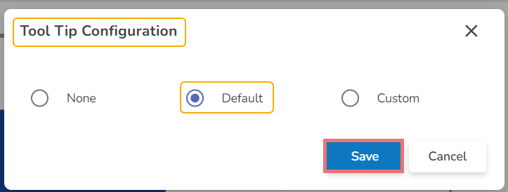
Click the Show Tooltip icon to get the configuration window for tooltip.
The user can select any tooltip by enabling the checkbox given next to the tooltip.
The user can set and modify background color, border color, Tooltip font related properties using these properties fields.
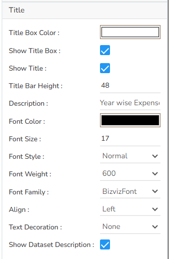
Title
The user can enable or disable the Title Box and Title by using this properties field.
The user can change Title Name, Font color, Font size, Font style, etc.
By enabling the Show Dataset Description, the X Axis description will be taken from the mapped data fields.
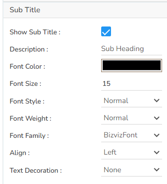
Subtitle
The user can enable the subtitle if it is required.
These properties fields will help to enable or disable the Subtitle, Provide description if it has been enabled and set the font related properties for the same.
The users can also set the display alignment of the Subtitle and select any text decoration option from the given drop-down menu.
X Axis
The user can enable or disable the X Axis line, change the X Axis line color, Label Font Color, Label Font Size, Label Font Style, Label Font weight, Label Font Family, Label Decoration, Label Rotation, description using this properties option.
The user can also rotate or enable title label by using this properties option.
The user can change the Font Color, Font Size, Font Style, enable the axis line, and change the axis color of the X Axis.
By enabling the Show Dataset Description, the X Axis description will be taken from the mapped data fields.

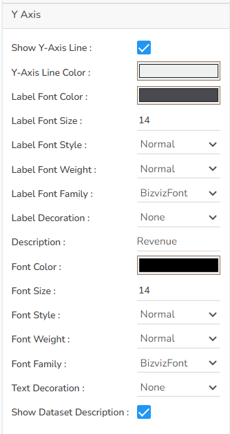
Y Axis
The user can enable or disable the Y Axis line, change the Y Axis line color, Label Font Color, Label Font Size, Label Font Style, Label Font weight, Label Font Family, Label Decoration, Label Rotation, description using this properties option.
The user can change the axis name, Font color, Font size; enable the axis line, and changed the axis color of the Y Axis.
By enabling the Show Dataset Description, the Y Axis description will be taken from the mapped data fields.
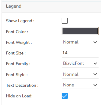
Legend
The user can enable or disable internal legend in the chart. The Font related properties such as Font Color, Font Weight, Font Size, Font Family, Font Style can be set and modified using this properties fields. The user can also select a Text Decoration option for the Legend. Put a check mark in the Hide on Load checkbox to hide the Legend while loading the chart.
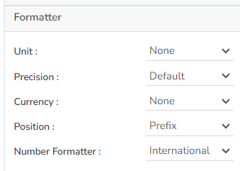
Formatter
The user can change units to % or none. Precision if they want the value in decimal format. Currency if they want the value in INR, Pound, USD. Position of the currency if it's in prefix and currency in Rupee then the sign will be seen in left-side if it's in suffix then it will be seen in right-side. Number Formatter if we want it in Indian or international.
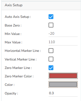
Axis Setup
The user can set auto axis and also provide maximum & minimum value to the axis. The user can enable the zero-marker line, horizontal marker line, and vertical marker line to see it in the chart. The color can be also changed by using the Axis Setup.
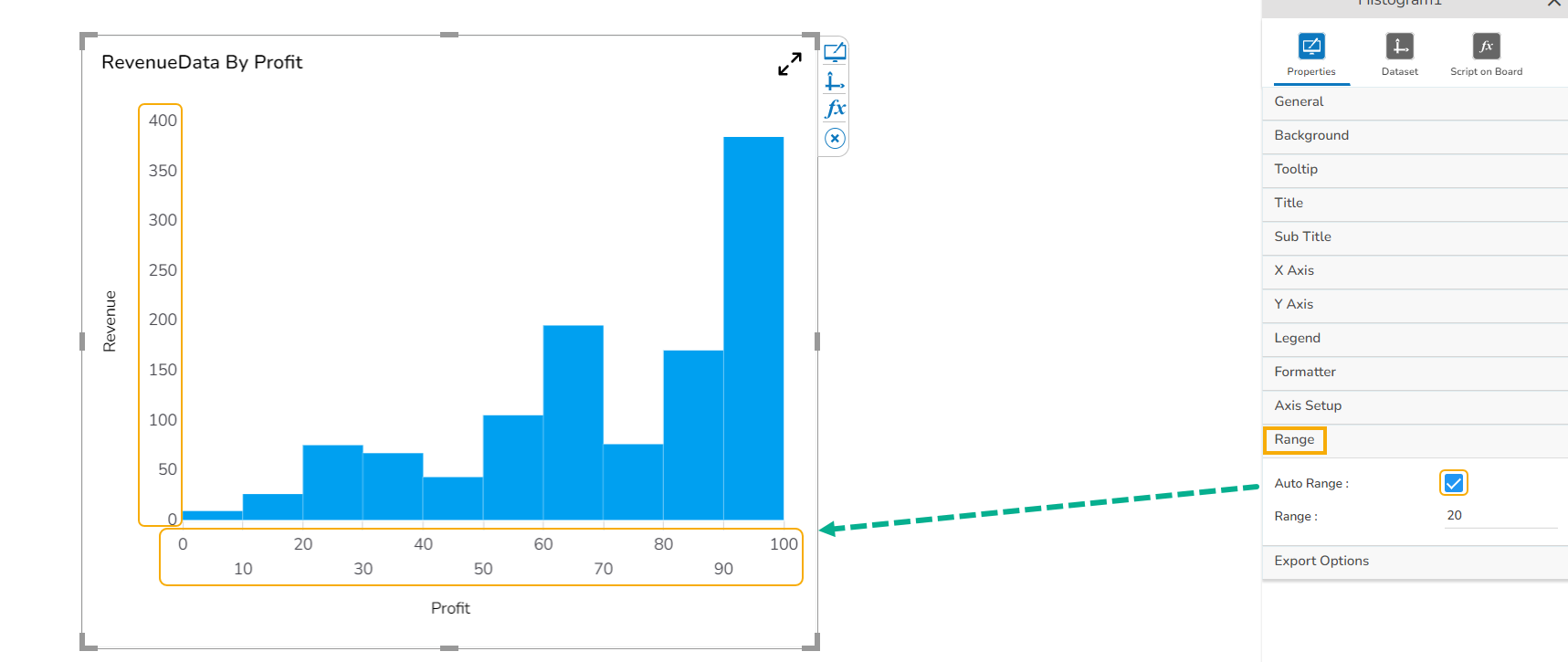
Range
The user can enable the Auto range option or else provide it in the range section.
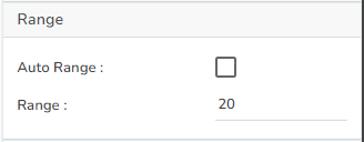
By enabling the Auto Range option the chart displays pre-defined ranges on the X Axis and Y Axis.
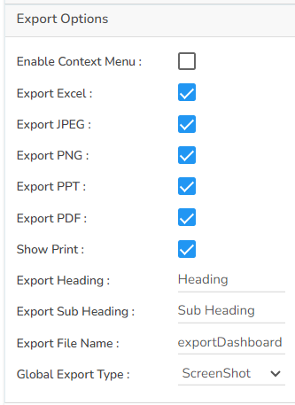
Export Options
The user can enable the ‘Enable Context Menu’ option to download the reports in different formats if we click on the chart from the preview section. The heading and subheading of that downloaded chart and the name of the downloaded file can be changed from this section.
Dataset Property Pallet

Variants of Histogram chart
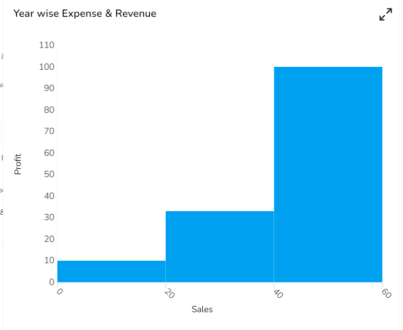
Histogram - Default Chart

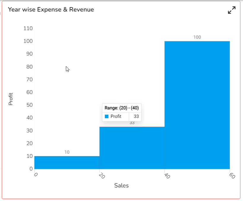
Histogram - Default Chart with Data Labels

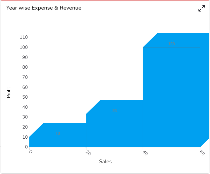
Histogram - Default Chart with Base & Border Color
Histogram - Rectangle Base type
Histogram -Cylinder Base type
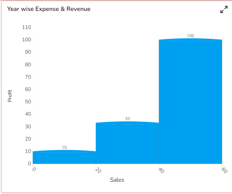
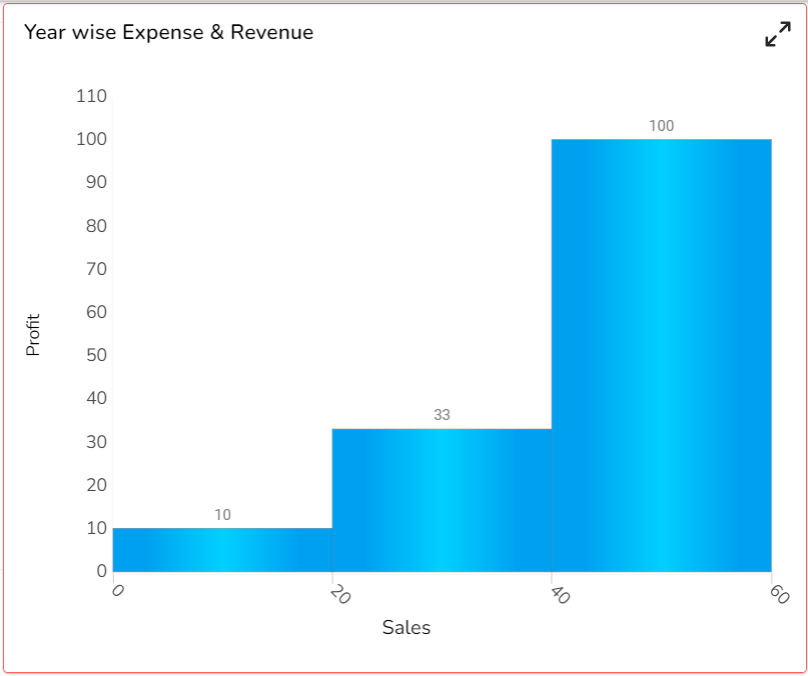
Histogram - Gradient 1 Chart
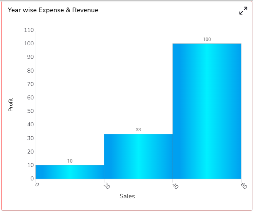
Histogram – Gradient 2 Chart
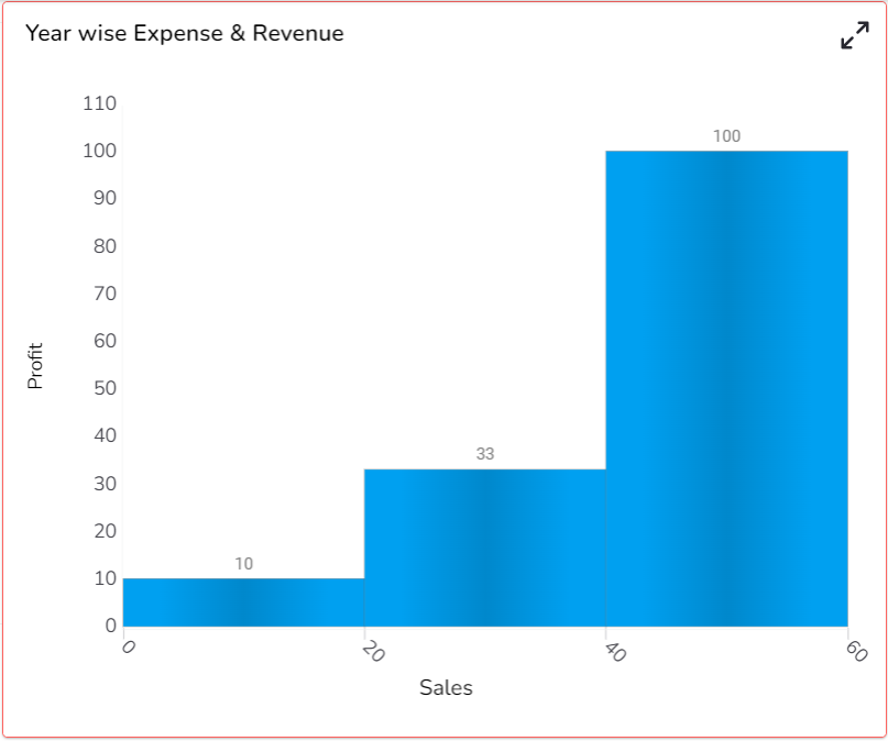
Histogram – Gradient 3 Chart
Sample Data
Download the given sample data and map it as mentioned below to plot your Histogram chart:
Use the Sales column as Category field, and Profit column as Series to plot data.
Please Note: The Category field can be any data type line, string, or numeric. But, Series fields can be only numeric data type.
Last updated