Scatter Plot
Scatter plots are used to analyze patterns in bivariate data. Data is plotted on the horizontal and vertical axis in an attempt to show how much one variable is related to another. They are the best visualizations that give users a sense of trends, correlations, and outliers from the data.
Best Situations to Use a Scatter Plot chart:
To find the Relation between different variables
To find the potential root cause of a problem
Variations of this chart
Add-up Filters: Filters like combo boxes can be added to the scatter plot chart to filter data based on a condition.
Differentiate by Type: Data plotted on the charts may contain different categories. These categories can be identified by assigning different shapes.
Default Component Image

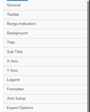
Properties of the Scatter Plot


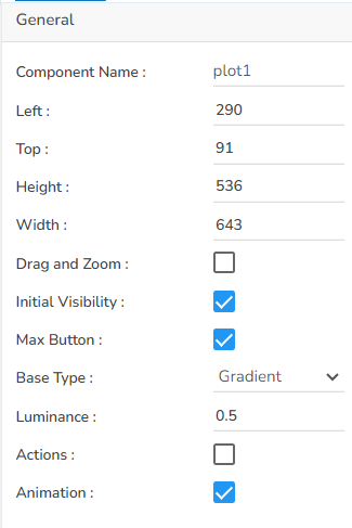
General: The user can change the height, width, top, left. If initial visibility is not enabled, then the chart won’t be available for the first preview. The base type can be adjusted between Gradient and Plain.
Tooltip: Here If the user wants to show the description of the series can use the tooltip by enabling it.
Range Indicators: Either enable Dynamic range option or else provide it in the range section.
Background: The user can get the reflection of the chart by enabling the shadow option can also change the color and increase & decrease the transparency of the shadow. The user can also change the background color, adjust its transparency as well as enable a border and change its color.
Title: Here user can change Title Name, Font color, size, style, etc.
Subtitle: Here user can enable the subtitle if the user has any second title and also, the user can change the Name, Font color, size, style, etc.
X-Axis: The user can show the x-axis line, change the x-axis line color, label color, font size, font weight, font family, description, etc. here. Also, if the user wants to rotate the label, it is also possible.
Y-Axis: The user can show the y-axis line, change the y-axis line color, label color, font size, font weight, font family, description, etc. here. If the user sets the Y-axis threshold and sets the minimum and maximum value, a line will appear in the chart using which they can easily identify which all points are falling under our threshold and which are not.
Legend: The user can enable the internal legend if the user wants to show and can change the font size, color, style, etc.
Formatter: The user can change units to % or none. The user can set the Precision option to see value in decimal format. The user can display currency value in INR, Pound, USD. The position of the currency symbol can be set as Prefix (if the currency is in INR format) otherwise, it can appear on the right-side as Suffix. Number Formatter can set it in Indian or International.
Axis Setup: The user can either set up the base as zero or else set up another minimum value. The user can include horizontal Marker lines as well as Vertical marker lines and change their color.
Export Options: The user can enable the ‘Enable Context Menu’ to download the reports in various formats by clicking on the chart from the preview section. The user can change the heading and subheading of that downloaded chart and the name of the downloaded file from this section.
Dataset Property
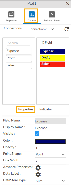
Map a dataset to the dragged Scatter plot component and you can drag the given columns under the X Field. After mapping the data, the user gets Properties and Indicators tab for the Dataset values to get displayed in more effective manner.

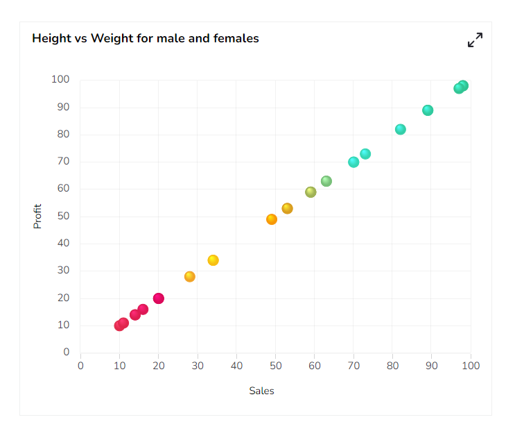
Scatter Plot chart after changing its properties

Sample Data
Download the given sample data and map it as mentioned below to plot your Scatter Plot chart.
Please Note: Use all the given fields as X- Axis. The various colors displayed in the Scatterplot chart indicate different data values.