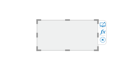
Box
The Box component can be used as a background for several other components.
Default Component Image

Properties of the Box Component
Background
The user can enable shadow, change the shadow color of the chart, and adjust its transparency.
General
User can change the height, width, top, left. If initial visibility is unchecked, then the chart won’t be visible at the first preview. The user can type in the 'Click Value' to see something when they click it.
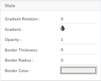
Style
The user can provide two colors in the Gradient section for the gradient rotation. Now, the selected two colors can be moved from top to bottom (initially, they could be moved only from left to right) if the user selects an angle of 90 degrees. It is possible for the user to change the opacity, border thickness-radius, and color.
The user can configure the following Style Properties:
Gradient Rotation: Set a value for the gradient rotation
Gradient: It prompts a menu with colors to choose from.
Opacity: Set opacity for the component.
Border Thickness: Set border thickness for the component.
Border Radius: Set radius for the component border.
Border Color: Select a color from the menu for the component border.
The modified Box appearance gets changed after changing its properties as displayed in the below-given image: