> For the complete documentation index, see [llms.txt](https://docs.bdb.ai/governed-dashboards-3/llms.txt). Markdown versions of documentation pages are available by appending `.md` to page URLs; this page is available as [Markdown](https://docs.bdb.ai/governed-dashboards-3/charts-gallery/other-charts/button-component.md).
# Button component
Button components can be used in the charting applications to enable users to interact with the charts and customize the chart display.
{% hint style="info" %}
Check out the given walk-through on how to use the Button component inside the Designer module.
{% endhint %}
Using the Button component in a Dashboard
## Best Situation to use Button component
Buttons can be used to perform the following actions:
* Toggle different chart types
* Zoom in and out
* Apply filters to the data being displayed
## Default Component Image
## Properties of the Button Component
### **General**
User can change the height, width, top, left. If initial visibility is unchecked, then the component won’t be visible at the first preview. User can manage the label text & click value to drill.
!\[General Properties for Button component
]\(/files/sfS1oMyGtCEvDUhvqk2j)
### **Background**
User can enable Shadow, Shadow Color, and Shadow Transparency by using the Background properties.
* **Shadow – Enable shadow.**
* **Shadow Colour – Set the shadow colour.**
* **Shadow Transparency – Set the opacity.**

### **Style**
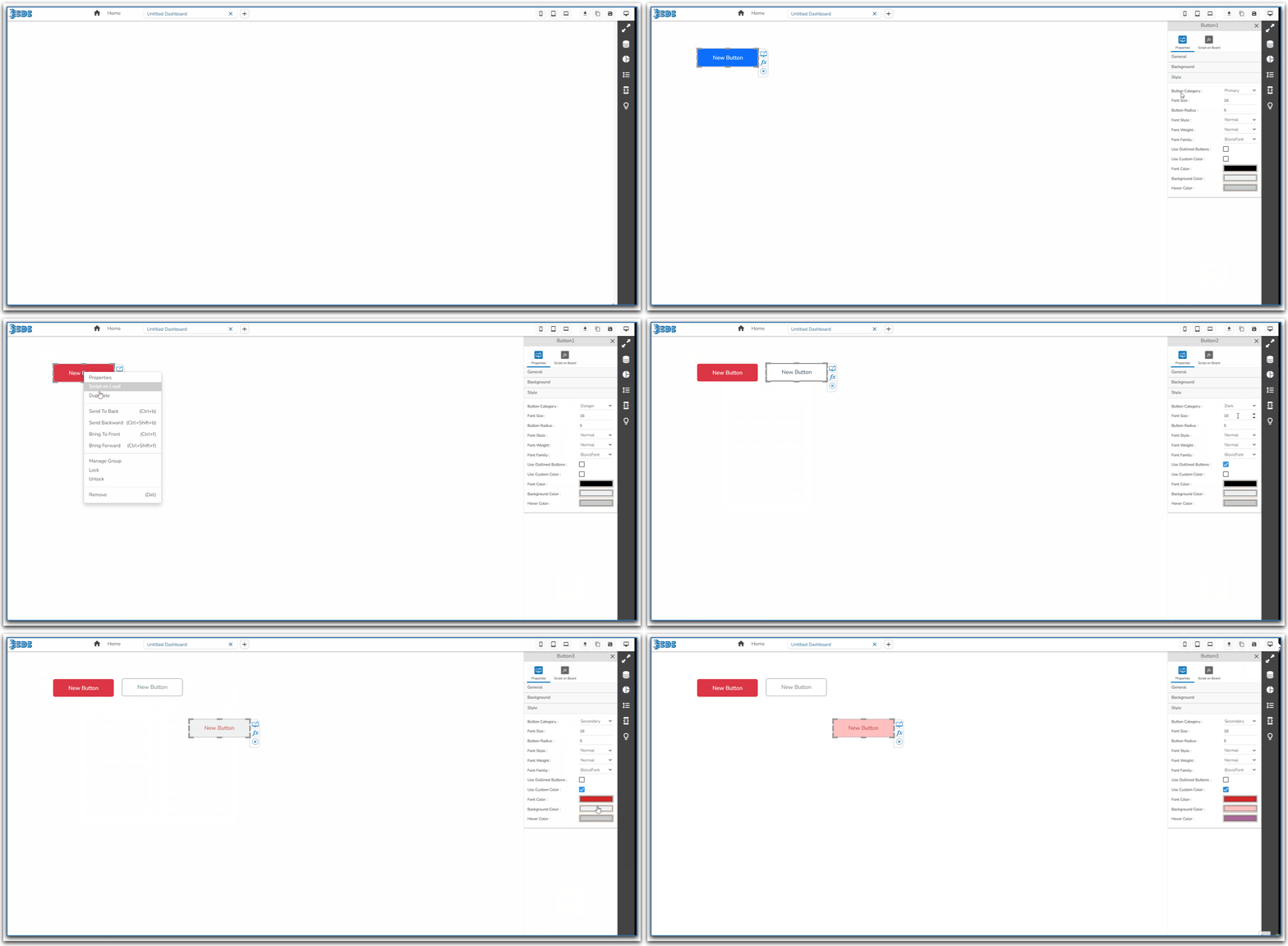
User can set the Button category as primary, secondary etc. & background color and font color as well as font styling properties in this section. Also use can customize the font colour, background color & Hover color.
* **Font size –** Set the font size.
* **Button Radius –** Set the border radius.
* **Font Style –** Select the font style.
* **Font Weight –** Select the font weight.
* **Font family –** Select the font family.

* **Set Button Category -** User can set the button category as Primary ,Secondary, Success, Warning, Danger, light, Info and Dark.

Based on the selected category the button component will have the default display as displayed below for the Secondary and Success Categories:
Secondary category Button

Success category Button

* **Use Outlined Button-** Outlined Button will display the button with the outline color.

E.g., Button Category is set as Secondary in the below given image:

* **Use Custom Color-** User can customize the font color, Background color, and Hover color.
\

* **Output -** Some of the possible previews of the button components are displayed in the below given image: