Chevron
Check out the below given walk-through on how to use the Chevron chart component in Designer module.

Chevron charts are used to represent the process flow or steps involved in a life cycle of any activity. They are represented using arrows.
Best situation to use chevron chart
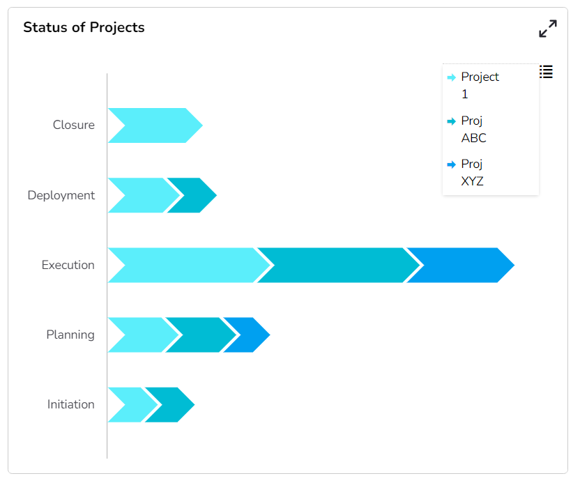
Combination of phases defines a project lifecycle. The chevron provides users in-detail information of the each phase involved in the project and its status.
Default Chart Image

Properties of Chevron Chart
Background
The user can change the background color of the chart, can get the border for the chart and can change the border color, can get the reflection of the chart by enable the shadow option can also change the color and increase & decrease the transparency of the shadow.
Export Options
The user can enable the “Enable Context Menu”, then it is possible to download the reports in different formats if we click on the chart from the preview section. The heading and sub heading of that downloaded chart and the name of the downloaded file can be change from this section.
General
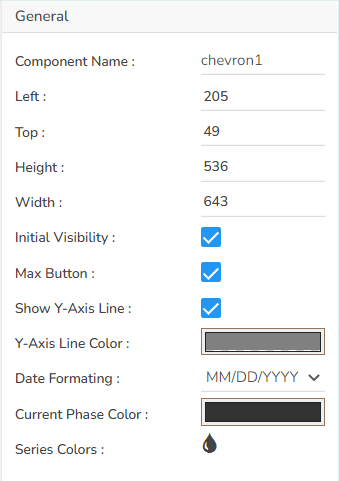
The user can change the height, width, top, left, chart type, column type & Line form. In this case we have only Chevron chart.

Legend
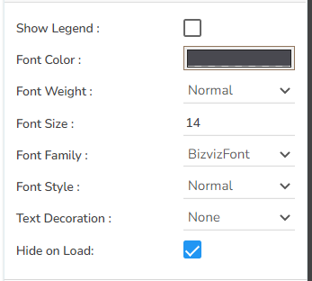
The user can enable the internal legend if we want to show and can change the font size, color, style.

Subtitle
The user can enable the subtitle if we have any second title and also, we can change the Name, Font color, size, style etc.
Title
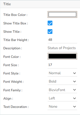
The user can change Title Name, Font color, size, style etc.

Tooltip
The user can show the description of series by enabling the tooltip.
The Chevron chart by changing the Properties
Please Note: The PhaseName column has been selected in the below-given chart as Category and the ProjectName column has been selected as Series.

The Chevron chart with Legends

Sample Data
Download the given sample data and map it as mentioned below to plot your Chevron chart:
Select the ProjectName column as Category, select PhaseName as Series. Select the rest of the columns based on their names such as choose the PhaseStartDate column under the Start Date field, the PhaseEnd Date column under the End Date field.