> For the complete documentation index, see [llms.txt](https://docs.bdb.ai/governed-dashboards-3/llms.txt). Markdown versions of documentation pages are available by appending `.md` to page URLs; this page is available as [Markdown](https://docs.bdb.ai/governed-dashboards-3/charts-gallery/filters/checkbox.md).

# Checkbox

{% hint style="success" %}
*Check out the given walk-through to understand the Check Box filter component.*
{% endhint %}

<figure><img src="https://859511478-files.gitbook.io/~/files/v0/b/gitbook-x-prod.appspot.com/o/spaces%2FGDmsjfjJBNqow7Fo97cO%2Fuploads%2FFMhB0mghl5WN8oGab2zW%2Fcheckbox%20.gif?alt=media&#x26;token=197493f8-6016-410a-9efc-5eeac977068c" alt=""><figcaption></figcaption></figure>

Check Box is used to filter data on any associated components. Enabling a check box will change the data displayed in the associated components.

## **Best Situation to use Check Box**

* To filter data displayed in the associated components
* To select multiple items at a time

## **Default Checkbox Image**

![](https://859511478-files.gitbook.io/~/files/v0/b/gitbook-x-prod.appspot.com/o/spaces%2FGDmsjfjJBNqow7Fo97cO%2Fuploads%2FtyMz2oApBxosMAQo0IfT%2FDefault%20Component%20Image.png?alt=media\&token=f88a4cc5-bc80-4e0d-b76c-f933e44defcc)

## Properties of the Check Box filter <a href="#properties-of-the-check-box-filter" id="properties-of-the-check-box-filter"></a>

### **General**

* The user can change the height, width, top and left position of the check box filter component.
* The user can set a name to the label and change its font color-style-weight-family from the General Properties.
* If the ***Show Checked*** option is enabled, then by default a checkmark will get enabled.
* Chrome color is used to set the component background, also the user can change its transparency.
* A value can be set to the ***Checked Value*** so that when the user clicks on the check box, this value will get passed.

{% hint style="info" %} <mark style="color:green;">Please Note</mark><mark style="color:green;">:</mark> *If initial visibility is not enabled, then the chart won’t be available for the first preview.*
{% endhint %}

​​![](https://859511478-files.gitbook.io/~/files/v0/b/gitbook-x-prod.appspot.com/o/spaces%2FGDmsjfjJBNqow7Fo97cO%2Fuploads%2FEqRqbXdvMwzAhn2txLuB%2Fimage.png?alt=media\&token=ee7a9d6f-4386-4565-9df5-17d8717a8eeb)​

### **Background**

* The user can get the reflection of the chart by enabling the shadow option.
* The user can also change the color and increase/decrease the transparency of the shadow.

<figure><img src="https://859511478-files.gitbook.io/~/files/v0/b/gitbook-x-prod.appspot.com/o/spaces%2FGDmsjfjJBNqow7Fo97cO%2Fuploads%2FGMOA8k0dYbVxnVqOVuhQ%2Fimage.png?alt=media&#x26;token=e37c17db-6823-43b4-a218-9abe11990890" alt=""><figcaption></figcaption></figure>

## **Modified Check box filter after changing its properties**

​![](https://859511478-files.gitbook.io/~/files/v0/b/gitbook-x-prod.appspot.com/o/spaces%2FGDmsjfjJBNqow7Fo97cO%2Fuploads%2FsuZyYOC3nLnYKPRblkfM%2Fimage.png?alt=media\&token=466e0022-08fb-48f0-a27a-a58da30837c7)​

## Check Box Use Case <a href="#check-box-use-case" id="check-box-use-case"></a>

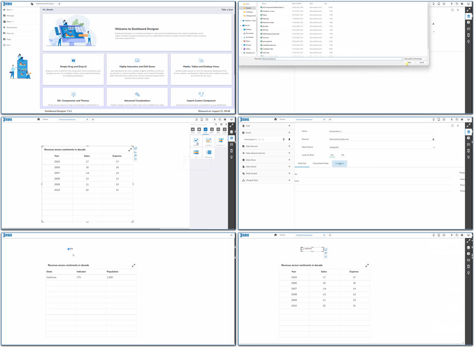
The following use case explains how to connect and use a Checkbox with a Data Grid component.

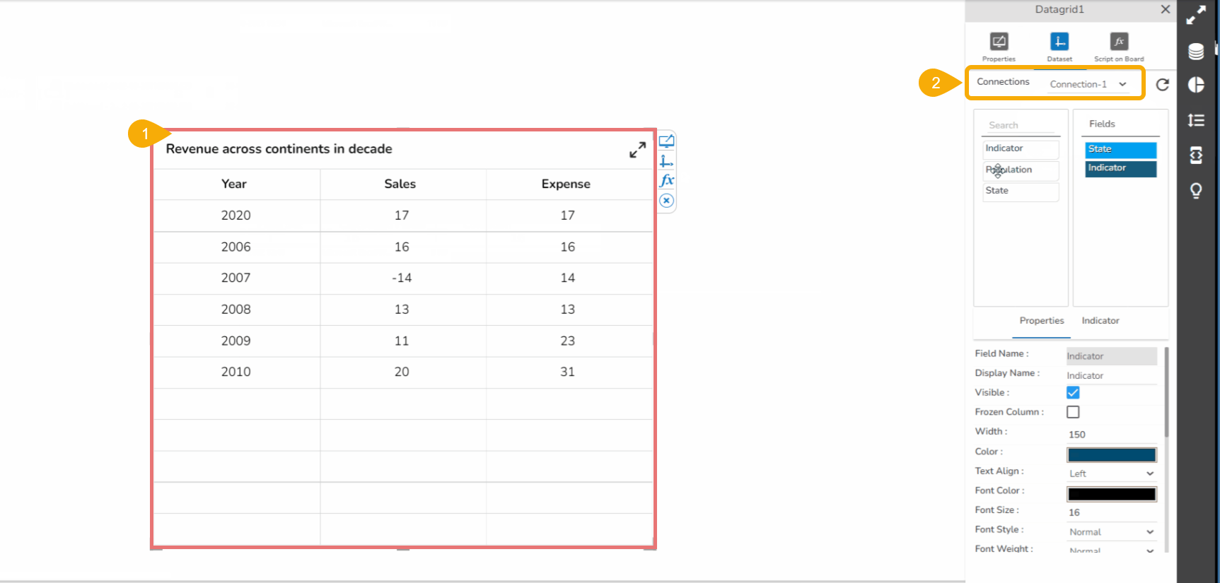
* Drag a Data Grid component to the Designer canvas.
* Associate a Data Connection with it.

<figure><img src="https://859511478-files.gitbook.io/~/files/v0/b/gitbook-x-prod.appspot.com/o/spaces%2FGDmsjfjJBNqow7Fo97cO%2Fuploads%2FNlchhfrbPRxFPGlZUoYd%2Fimage.png?alt=media&#x26;token=b6d1c334-20e5-4876-a985-87ac723bc461" alt=""><figcaption></figcaption></figure>

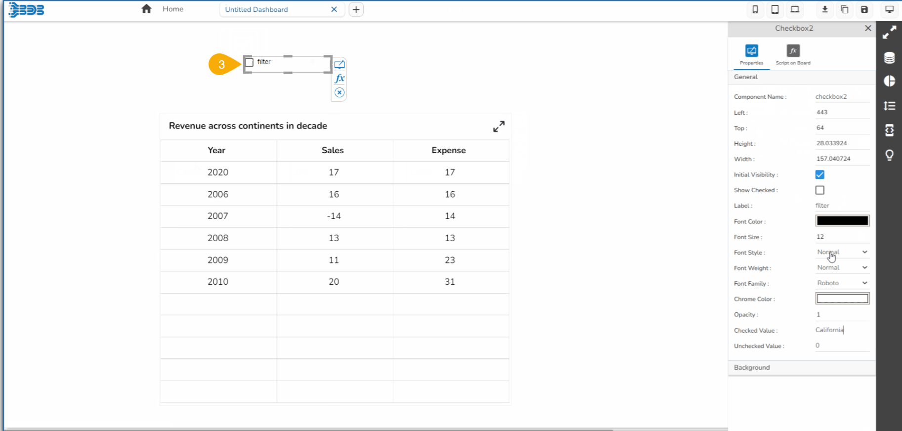
* Drag a Check Box component from the Filter group to the canvas.

<figure><img src="https://859511478-files.gitbook.io/~/files/v0/b/gitbook-x-prod.appspot.com/o/spaces%2FGDmsjfjJBNqow7Fo97cO%2Fuploads%2FErCIrasuffNnKYCRDh8y%2Fimage.png?alt=media&#x26;token=29849b1d-dfe5-4f03-a6c5-7b3dee84318f" alt=""><figcaption></figcaption></figure>

* Open the Check box Properties, provide the necessary properties, and apply them.

  * Provide the text for the Label.
  * Provide the Checked Value.
  * Keep the Unchecked Value blank.

  ​

  <figure><img src="https://859511478-files.gitbook.io/~/files/v0/b/gitbook-x-prod.appspot.com/o/spaces%2FGDmsjfjJBNqow7Fo97cO%2Fuploads%2FmpghkNgM5333rCPZBsTp%2Fimage.png?alt=media&#x26;token=926b76a6-8b2c-480f-ac07-f952e46f5e55" alt=""><figcaption></figcaption></figure>
* Use the component object page to write the required script at the component level.

![](https://859511478-files.gitbook.io/~/files/v0/b/gitbook-x-prod.appspot.com/o/spaces%2FGDmsjfjJBNqow7Fo97cO%2Fuploads%2Ftju9IMApqqWByqoUuTes%2Fimage.png?alt=media\&token=dbb0c1e0-85dd-40c8-8e9e-dc22c7914d8f)

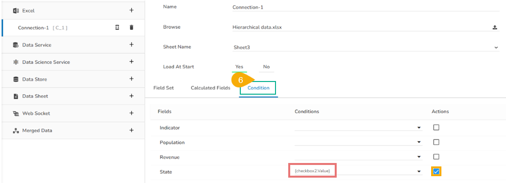
* Configure the Condition tab by providing a field value for the conditions (the field State is chosen in the given image).

<figure><img src="https://859511478-files.gitbook.io/~/files/v0/b/gitbook-x-prod.appspot.com/o/spaces%2FGDmsjfjJBNqow7Fo97cO%2Fuploads%2FbjBYKHifcaZJWZbsklL8%2Fimage.png?alt=media&#x26;token=5a40ab96-ecdd-4027-936e-d24d76f913cd" alt=""><figcaption></figcaption></figure>

* Click the ***Preview*** icon to preview the Dashboard.

![](https://859511478-files.gitbook.io/~/files/v0/b/gitbook-x-prod.appspot.com/o/spaces%2FGDmsjfjJBNqow7Fo97cO%2Fuploads%2FH56DbL4eF93XnOgbpPKo%2Fimage.png?alt=media\&token=86e9acfd-2ff4-4807-9718-b92fe1b368a8)​

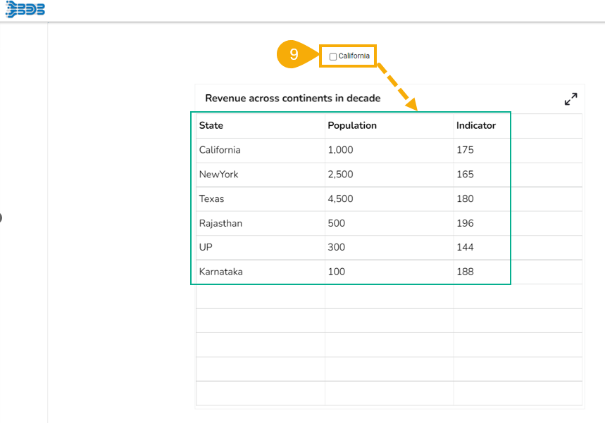
* Use a check mark in the given box to display the ***Checked Value*** in the chart.

<figure><img src="https://859511478-files.gitbook.io/~/files/v0/b/gitbook-x-prod.appspot.com/o/spaces%2FGDmsjfjJBNqow7Fo97cO%2Fuploads%2FNfcUG7SUit8XPVhd0hKu%2Fimage.png?alt=media&#x26;token=a4d2fe73-024d-4cf4-9d9d-c079ee9e1500" alt=""><figcaption></figcaption></figure>

* Uncheck the Check Box to display the ***Unchecked Value*** in the chart (In this case, no value has been assigned as Unchecked Value so it will display all the records).
<figure><img src="https://content.gitbook.com/content/q31vylHQzfu10ahsh9Qq/blobs/HV60bNFud3PS7gOGJpN3/image.png" alt=""><figcaption></figcaption></figure>

​