V-Slider
V-Slider
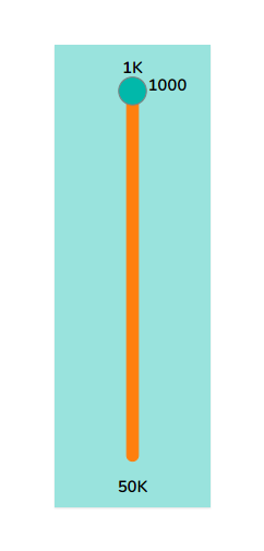
The V-Slider component is used to show the progress in the vertical direction.
Default Chart Image:

Properties of the V-slider:
Background: The user can enable the shadow, change the shadow color, and transparency of that shadow. Also, by changing the gradient color user can change the background color of the V-slider.
General: The user can change the height, width, top, and left values. If initial visibility is unchecked, then the chart won’t be visible at the first preview. The user can change the unit from Auto to Percent, also set the maximum and minimum limit. By default, the interval will be 1, if we change it to 2 then the increment happens in the multiples of 2. Chrome color is changed to change the color of the slider body. Also, we can alter the circle color, radius, and thickness.
Label: The user can change the font size, style, family, etc. of the Label.
General Properties:

Background Properties:

Label Properties:

The modified chart after changing the properties:
