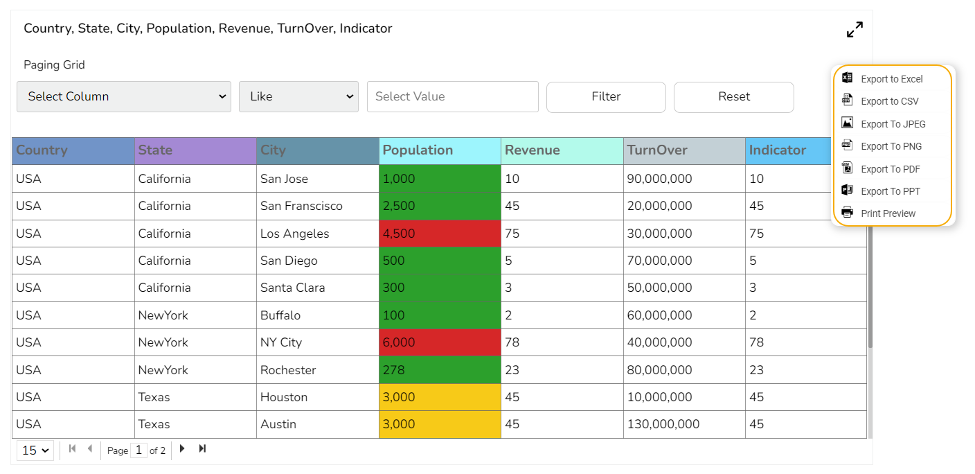
# Paging Grid
The Paging Data Grid is used to represent data in tabular form. Paging Data Grids can be used to filter data using columns, comparison operators, and search options provided.
## **Best Situation to use Paging Data Grid**
* When end-user need to view data in numerical format.
* When alerts need to be shown.
* When end-users need to filter, compare, and search for data within the grid.
### **Variations**
**Add-up Filters:** Filter data by selecting any column(s) present in the data grid
**Compare Operation**: Data can be compared by using comparison operators
**Search**: Search for a particular value
## **Default Chart Image**
## **Properties of the Paging Grid Component**
### **General**
* **Component Name**: The unique identifier for the Paging Grid Component.
* **Left**: Determines the horizontal position of the component on the page.
* **Top**: Sets the vertical position of the component within the layout.
* **Height**: Specifies the vertical size of the component.
* **Width**: Defines the horizontal size of the component.
* **Initial Visibility**: Controls whether the component is visible when the page first loads.
* **Max Button**: Allows users to maximize the component to full screen.
* **Fit Columns**: Adjusts the column widths automatically to fit the content or available space. 
### **Background**
* **Gradient Rotation**: Defines the angle at which the gradient is applied across the component.
* **Opacity**: Controls the transparency level of the background, where 0 is completely transparent and 1 is fully opaque.
* **Gradient**: Specifies the transition between colors used in the background.
* **Border**: Determines the presence and thickness of the border surrounding the component.
* **Border Color**: Sets the color of the component’s border.
* **Border Radius**: Rounds the corners of the component’s border.
* **Shadow**: Adds a shadow effect beneath the component.
* **Shadow Color**: Defines the color of the shadow.
* **Shadow Transparency**: Adjusts the visibility of the shadow, affecting how pronounced it appears.
{% hint style="info" %}
*Please Note: The users will be redirected to the **Background gradient colors** window by clicking the **Gradient** icon**.***
{% endhint %}
### Title
* **Title Box Color:** Set the color of the title box to complement your chart's overall design.
* **Show Title Box:** Toggle this option to display or hide the title box around the title text.
* **Show Title:** Enable or disable the title visibility on your chart.
* **Title Bar Height:** Adjust the title bar height to fit your design specifications.
* **Description:** Provide an additional description for the chart title to offer more context.
* **Font Color:** Choose the font color for the title to ensure readability and match your theme.
* **Font Size:** Set the title's font size for optimal visibility and aesthetics.
* **Font Style:** Select the font style (e.g., italic, bold) to enhance the title's appearance.
* **Font Weight:** Modify the font weight to make the title text lighter or bolder.
* **Font Family:** Pick a font family that aligns with your design theme for the title.
* **Align:** Align the title text to the left, center, or right according to your layout needs.
* **Text Decoration:** Apply text decorations to the title for emphasis (E.g., Underline).
* **Show Dataset Description**: Enable or disable the dataset description in the title. 
### **Subtitle**
* **Show Sub Title**: Enable or disable the display of the sub-title text.
* **Description**: Add a description text below the sub-title.
* **Font Color**: Select the color of the sub-title text.
* **Font Size**: Specify the size of the sub-title text.
* **Font Style**: Choose the font style for the Sub-title (e.g., italic or normal).
* **Font Weight**: Set the weight (boldness) of the font. The supported options are Normal, Bold, 300, 600, and 900.
* **Font Family**: Choose the font family for the sub-title text from the given choices.
* **Align**: Align the sub-title text (e.g., left, center, right).
* **Text Decoration**: Apply text decorations (e.g., underline) to the sub-title text. 
### **Header Style**
The Header Style section allows for customization of the header in your design. You can modify the following fields:
* **Header Text Color:** Set the color of the header text to align with your theme.
* **Font Size:** Define the text size in the header for visibility and emphasis.
* **Font Style:** Choose a style such as italic or normal to enhance the header's appearance.
* **Font Weight:** Set the weight (boldness) of the font. The supported options are Normal, Bold, 300, 600, and 900.
* **Font Family:** Select a font family for the header that complements your overall design.
* **Use Field Color:** Enable this option to apply a specific field color to the header background.
* **Background Color:** Change the header's background color to match or contrast with the text.
* **Text Decoration:** Apply decorative elements like Underline to the header text for additional styling.
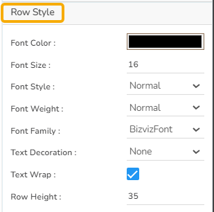
### **Row Style**
* **Font Color**: This property allows users to change the color of the text within a row, enabling better visibility and alignment with design aesthetics.
* **Font Size**: Adjusts the size of the text, enhancing readability and fitting within the design requirements.
* **Font Style**: Offers options such as italic or normal, providing stylistic flexibility for the text within the data grid.
* **Font Weight**: Controls the thickness of the text, from normal to bold, helping users emphasize specific data points.
* **Font Family**: Allows selection of different font families, ensuring the grid text aligns with overall design standards.
* **Text Decoration**: Includes options such as underline, overline, or line-through, offering additional stylistic choices for the text.
* **Text Wrap**: Enables text to wrap within the cell, ensuring complete visibility without affecting the row width.
* **Row Height**: Users can increase or decrease the height of rows to accommodate more content or improve the grid's appearance.
### **Styles**
The users can set various display styles for the data grid using these fields.
* **Roll Over Color**: The Roll Over Color property allows customization of the color change when a user hovers over an interface element. This provides visual feedback and helps highlight interactive components.
* **Selection Color**: The Selection Color property determines the color displayed when an element or text is selected. It helps distinguish the selected items from the rest, facilitating easier navigation and interaction.
* **Horizontal Grid Lines**: The Horizontal Grid Lines property allows users to enable or disable horizontal lines across the interface. These lines can aid in aligning and organizing content effectively, and their color can be customized to blend with the overall design.
* **Horizontal Line Color**: The Horizontal Line Color refers to the color of the horizontal grid lines that can be displayed across the interface. This color can be customized to fit the design palette of the application seamlessly.
* **Vertical Line Color**: The Vertical Line Color is the color assigned to the vertical grid lines. Users can adjust this color to help differentiate vertical separations on the interface, enhancing visual organization.
* **Grid Colors**: Grid Colors encompass horizontal and vertical line colors, offering comprehensive customization options for both components. Adjusting these colors allows users to create a coordinated look that complements the interface design.
* **Pagination Bar Color**: The Pagination Bar Color property allows customization of the color of the pagination bar. This feature helps maintain consistency with the application's design by aligning the pagination bar's color with the overall theme.
* **Pagination Font Color**: This setting enables users to change the color of the text displayed on the pagination controls. Adjusting the font color can enhance legibility and ensure it complements the pagination bar color.
* **Row Count**: The Row Count field allows users to specify the number of rows to be displayed per page in the data grid. This feature aids in enhancing data navigation and offers users control over how much data they wish to view at one time.
### 
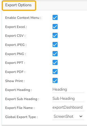
### **Export Options**
* **Enable Context Menu**: Activate a right-click context menu for quick access to export options in the preview mode of the chart.
* **Export Excel**: Save the chart data in an Excel file format (.xlsx).
* **Export CSV**: Export the chart data into a CSV file format (.csv).
* **Export JPEG**: Export the chart as a JPEG image (.jpg).
* **Export PNG**: Export the chart as a PNG image (.png).
* **Export PPT**: Export the chart to a PowerPoint presentation (.pptx).
* **Export PDF**: Export the chart as a PDF document (.pdf).
* **Show Print**: Include an option to print the chart directly.
* **Export Heading**: Add a custom heading to the exported file.
* **Export Sub Heading**: Add a custom subheading to the exported file.
* **Export File Name**: Specify the file name for the exported file/dashboard.
* **Global Export Type**: Define the default export format using the drop-down (e.g., Screenshot, Tabular).
The user can enable the ***Enable Context Menu*** from the preview section to download the reports in different formats.
How the Fit Columns field works in the Paging Grid?
The Fit Columns field has been provided to the Paging Gird component.
* The user **can't avail the horizontal scroll** for the Paging Grid component **if the Fit Columns field is enabled**.
* The user **can avail horizontal scroll** for the Paging grid component, if the **Fit Columns field is disabled** from the General Properties of the component.
{% hint style="success" %}
*Check out the given walk-through on how the Fit Columns field works for the Paging Grid component.*
{% endhint %}
Explaining the Fit to column option for the Paging Grid
## **Property Tab for Dataset Pallet**

## **Page Grids variants after Changes in Property:**
* **Page Grid without Conditions**

* **Page Grid with Conditions**

{% hint style="info" %}
*Please Note:*
* *The user needs to select the **Column Type** as **Numeric** for the selected Data Grid fields using the **Properties** tab provided for the Dataset, so they become responsive to the changes that the user sets using the **Indicator** tab.*

* *Refer to the* [***Alerts in Grids***](https://docs.bdb.ai/governed-dashboards-6/configurations/alerts-in-grids) *page under the* [***Configurations*** ](https://docs.bdb.ai/governed-dashboards-6/configurations)*section to understand how to insert **Alerts** in a Grid component.*
{% endhint %}
---
# Agent Instructions: Querying This Documentation
If you need additional information that is not directly available in this page, you can query the documentation dynamically by asking a question.
Perform an HTTP GET request on the current page URL with the `ask` query parameter:
```
GET https://docs.bdb.ai/governed-dashboards-6/charts-gallery/grids/paging-grid.md?ask=
```
The question should be specific, self-contained, and written in natural language.
The response will contain a direct answer to the question and relevant excerpts and sources from the documentation.
Use this mechanism when the answer is not explicitly present in the current page, you need clarification or additional context, or you want to retrieve related documentation sections.