Column Chart
A column chart is used when you want to compare the values of individual data points with another. They help in bringing out the highs and lows of the data set. The Column chart is a data visualization where each category is represented by a rectangle, with the height of the rectangle being proportional to the values being plotted. Column charts are also known as vertical bar charts.
Best Situations to Use a Column Chart
Column charts are suitable for displaying data sets with negative values
Example: To find the best and worst performers in an organization
Variations of this chart Use stacked Column charts: Where multiple categories can be clubbed together on top of each other, which makes addressing multiple questions easier.
Use columns side by side: Where comparison between multiple categories becomes easier instead of toggling between charts.
Add color for quick insight: Displaying the columns with colors will make users pay quick attention to important tasks.
Default Chart Image

The Properties of Column Chart
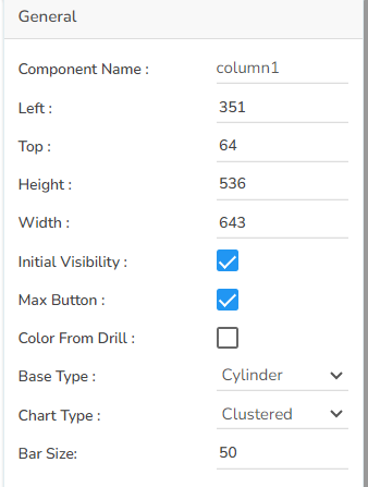
General
Component Name: Specify a unique identifier for the Column chart component. This field contains an auto-generated name indicating the sequence of the component in the dashboard.
Left: Determine the horizontal positioning of the chart.
Top: Adjust the vertical positioning of the chart.
Height: Define the height of the chart in pixels.
Width: Set the width of the chart in pixels.
Initial Visibility: Check this option to enable the chart's visibility upon the initial load.
Max Button: Enable or disable the maximization button for expanding the chart view.
Color From Drill: Allow the chart to inherit colors from a drill-down operation.
Base Type: Select the base shape of the columns, such as a Rectangle, Cylinder, Plain, Gradient 1, Gradient 2, or Gradient 3.
Chart Type: Choose the chart’s layout, such as Stacked, Clustered, Overlaid, or 100%.
Bar Size: Adjust the width of the bars within the chart.
Tooltip
Tooltips enhance user interaction by displaying additional information about chart elements.
Show Tool Tip: Enable this option to display tooltips for the chart series, providing descriptions or data insights.
Click the Show Tool Tip icon to access the Tool Tip Configuration window.
Select the Default option.
Put a checkmark in the box to enable the component formatter.
Click the Save option to display Tool Tip in the default display.

Background Color: Choose a background color for the tooltip to enhance visibility and match your visual theme.
Opacity: Adjust the tooltip's transparency to ensure it doesn't obstruct important chart elements while remaining readable.
Border Color: Select a border color that complements the tooltip, ensuring clarity and contrast against the chart background.
Tooltip Font Size: Customize the font size to maintain readability, adapting it to the overall chart presentation.
Box Width: Define the width of the tooltip box to ensure it fits the content appropriately and maintains a neat appearance.
Precision: Set the numerical precision for data values displayed in the tooltip, aiding in clearer data interpretation.
Highlighter: Toggle the highlighter to emphasize specific data points on the chart, drawing user attention to crucial information.
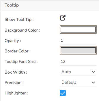
Please Note: To use the Custom option for the Tool Tip configuration, please refer to the Tooltip (Default & Custom) page.
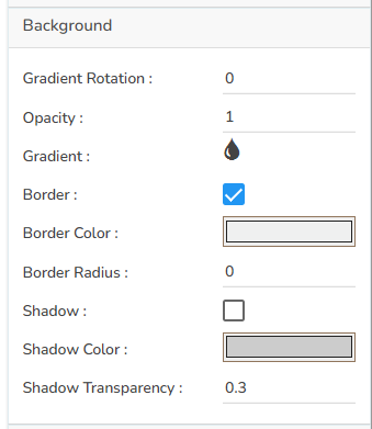
Background
Gradient Rotation: Modify the angle of the gradient to achieve the desired effect.
Opacity: Set the transparency level to balance visibility and aesthetics.
Gradient: Choose and customize the gradient colors to match your theme.
Click the Gradient icon to access the Background gradient colors dialog box.
Click the Add Color option to add multiple colors.
Click the Save option to apply the selected background colors.

Border: Add a border around the chart for a defined perimeter.
Border Color: Alter the border color to complement or contrast with the chart.
Border Radius: Round the corners of the chart border for a smoother look.
Shadow: Enable shadows to create depth and a 3D-like effect.
Shadow Color: Customize the shadow color to blend naturally with the chart.
Shadow Transparency: Adjust the transparency level to control the intensity of the shadow effect.
Title
Title Box Color: Choose the background color for the title box.
Show Title Box: Enable or disable the display of the title box on the chart.
Show Title: Enable or disable the display of the title text.
Title Bar Height: Set the height of the title bar.
Description: Add a description text below the title.
Font Color: Select the color of the title text.
Font Size: Specify the size of the title text.
Font Style: Choose a Font style using the drop-down menu (e.g., italic or normal).
Font Weight: Set the weight (boldness) of the font. The supported options are Normal, Bold, 300, 600, and 900.
Font Family: Choose the font family for the title text from the given choices.
Align: Align the title text (e.g., left, center, right).
Text Decoration: Apply text decorations (e.g., underline) to the title text.
Show Dataset Description: Enable or disable the dataset description in the title.

Please Note: By enabling the Show Dataset Description option the Title will get added from the mapped dataset.
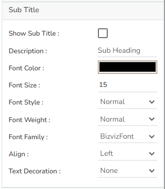
Subtitle
Show Sub Title: Enable or disable the display of the sub-title text.
Description: Add a description text below the sub-title.
Font Color: Select the color of the sub-title text.
Font Size: Specify the size of the sub-title text.
Font Style: Choose the font style for the Sub-title (e.g., italic or normal).
Font Weight: Set the weight (boldness) of the font. The supported options are Normal, Bold, 300, 600, and 900.
Font Family: Choose the font family for the sub-title text from the given choices.
Align: Align the sub-title text (e.g., left, center, right).
Text Decoration: Apply text decorations (e.g., underline) to the sub-title text.
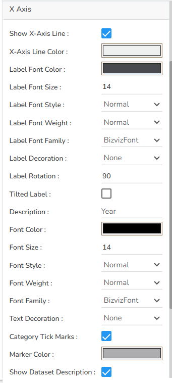
X-Axis
Show X-Axis Line: Toggle the visibility of the X-axis line.
X-Axis Line Color: Select the color for the X-axis line.
Label Font Color: Choose the font color for X-axis labels.
Label Font Size: Specify the size of the font for X-axis labels.
Label Font Style: Set the style (e.g., italic) for X-axis labels.
Label Font Weight: Determine the weight (e.g., bold) for X-axis label fonts.
Label Font Family: Choose the font family for X-axis labels.
Label Decoration: Add decorations (e.g., underline) to X-axis labels.
Label Rotation: Set the rotation angle for X-axis labels.
Tilted Label: Enable to tilt X-axis labels for better readability.
Description: Add a description for the X-axis.
Font Color: Specify the color of the X-axis text.
Font Size: Set the font size for the X-axis text.
Font Style: Choose the font style (e.g., italic) for X-axis text.
Font Weight: Determine the weight (boldness) of the X-axis text.
Font Family: Select the font family for the X-axis text.
Text Decoration: Add text decorations (e.g., underline) to the X-axis labels.
Category Tick Marks: Activate tick marks for categories on the X-axis.
Marker Color: Choose the color of the markers on the X-axis.
Show Dataset Description: Toggle the visibility of dataset descriptions on the X-axis.
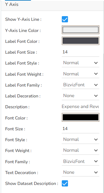
Y-Axis
Show Y-Axis Line: Toggle the visibility of the Y-axis line.
Y-Axis Line Color: Select the color for the Y-axis line.
Label Font Color: Choose the font color for Y-axis labels.
Label Font Size: Specify the size of the font for Y-axis labels.
Label Font Style: Set the style (e.g., italic) for Y-axis labels.
Label Font Weight: Determine the weight (e.g., bold) for Y-axis label fonts.
Label Font Family: Choose the font family for Y-axis labels.
Label Decoration: Add decorations (e.g., underline) to Y-axis labels.
Description: Add a description for the Y-axis.
Font Color: Specify the color of the Y-axis text.
Font Size: Set the font size for the Y-axis text.
Font Style: Choose the font style (e.g., italic) for Y-axis text.
Font Weight: Determine the weight (boldness) of the Y-axis text.
Font Family: Select the font family for the Y-axis text.
Text Decoration: Add text decorations (e.g., underline) to the Y-axis labels.
Show Dataset Description: Toggle the visibility of dataset descriptions on the Y-axis.
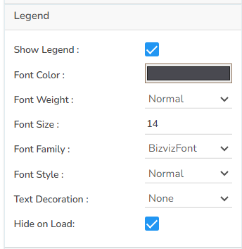
Legend
Show Legend: Toggle the visibility of the chart legend.
Font Color: Choose the font color for the legend text.
Font Weight: Determine the weight (boldness) of the legend text.
Font Size: Specify the size of the font for the legend text.
Font Family: Select the font family for the legend text.
Font Style: Choose the font style (e.g., italic) for the legend text.
Text Decoration: Add text decorations (e.g., underline) to the legend text.
Hide on Load: Determine if the legend should be hidden when the chart initially loads.
Formatter
Unit: Define the unit of measurement for the values displayed in the chart.
Precision: Set the number of decimal places to display for numerical values.
Currency: Format the numbers as a currency with the appropriate symbol.
Position: Determine the position of the formatted value (e.g., before or after the number).
Number Formatter: Apply a specific notation or style to the numbers (e.g., Indian, International).

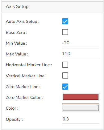
Axis Setup
Auto Axis Setup: Automatically adjust the axis settings based on the dataset.
Base Zero: Ensure the axis starts at zero for better data comparison.
Min Value: Define the minimum value displayed on the axis.
Max Value: Set the maximum value for the axis range.
Horizontal Marker Line: Add a horizontal line at a specified value for reference.
Vertical Marker Line: Place a vertical line at a specific point for highlighting.
Zero Marker Line: Include a line at zero to emphasize the baseline.
Zero Marker Color: Customize the color of the zero marker line.
Color: Set a color for the marker line.
Opacity: Adjust the color transparency of the axis marker line.
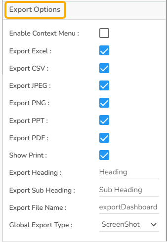
Export Options
Enable Context Menu: Activate a right-click context menu for quick access to export options in the preview mode of the chart.
Export Excel: Save the chart data in an Excel file format (.xlsx).
Export CSV: Export the chart data into a CSV file format (.csv).
Export JPEG: Export the chart as a JPEG image (.jpg).
Export PNG: Export the chart as a PNG image (.png).
Export PPT: Export the chart to a PowerPoint presentation (.pptx).
Export PDF: Export the chart as a PDF document (.pdf).
Show Print: Include an option to print the chart directly.
Export Heading: Add a custom heading to the exported file.
Export Sub Heading: Add a custom subheading to the exported file.
Export File Name: Specify the file name for the exported file/dashboard.
Global Export Type: Define the default export format using the drop-down (e.g., Screenshot, Tabular).
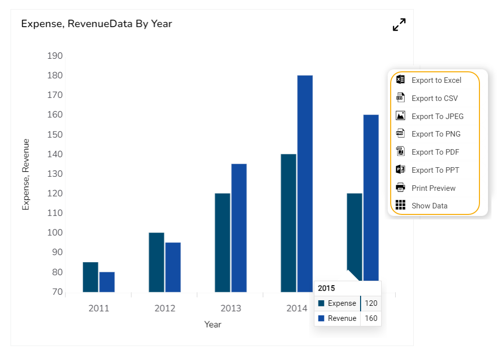
The user can get the Export Context Menu from the preview mode to download the reports in different export formats.
Dataset Series Properties
The user can change the color of each series by selecting any of the series from the Dataset properties. The user can enable the Data Label to show the value of each selected data field.

Various Variants of the Column Chart
The following variants of the Column chart can be seen by changing the chart properties:
Clustered Charts
Clustered chart with Plain Base

Clustered chart with Rectangle Base

Clustered chart with Cylinder Base

Clustered chart with Gradient1 Base

Clustered chart with Gradient2 Base

Clustered chart with Gradient3 Base

Stacked Charts
Stacked Chart with Rectangle Base

Stacked Chart with Cylinder Base

Stacked Chart with Plain Base

Stacked Chart with Gradient1 Base

Stacked Chart with Gradient2 Base

Stacked Chart with Gradient3 Base

Overlaid Charts
Overlaid Chart with Rectangle Base

Overlaid Chart with Cylinder Base

Overlaid Chart with Plain Base

Overlaid Chart with Gradient1 Base

Overlaid Chart with Gradient2 Base

Overlaid Chart with Gradient3 Base

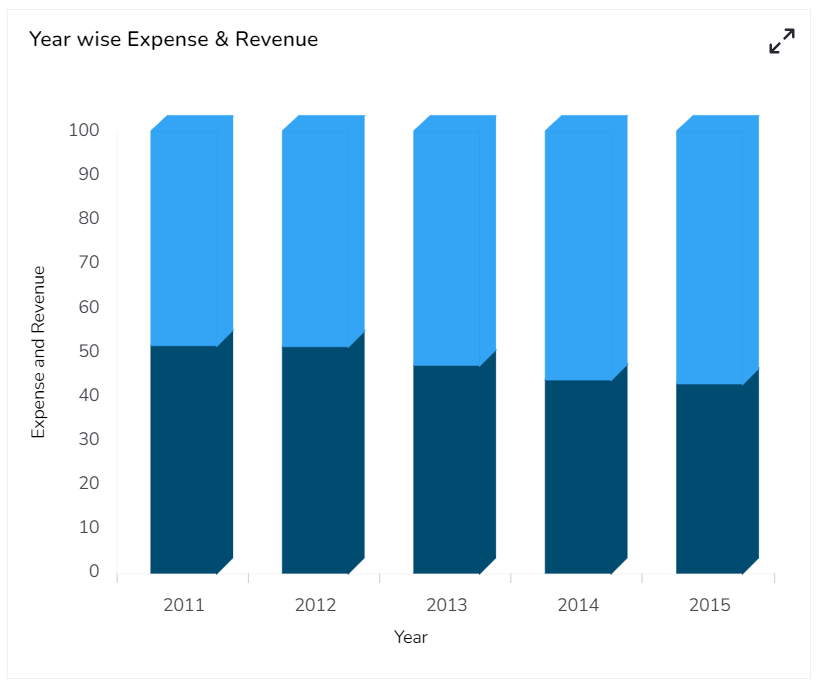
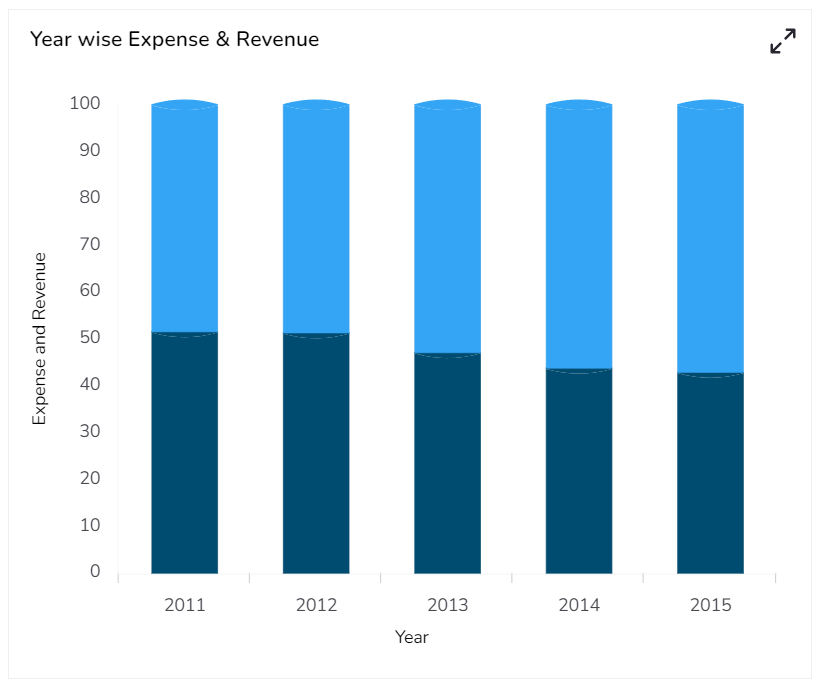
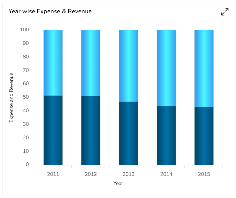
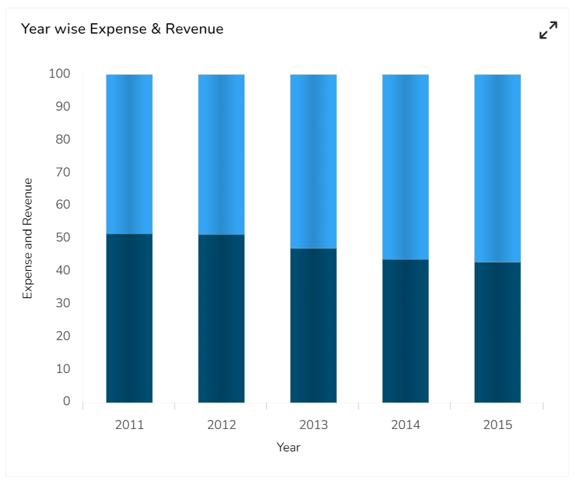
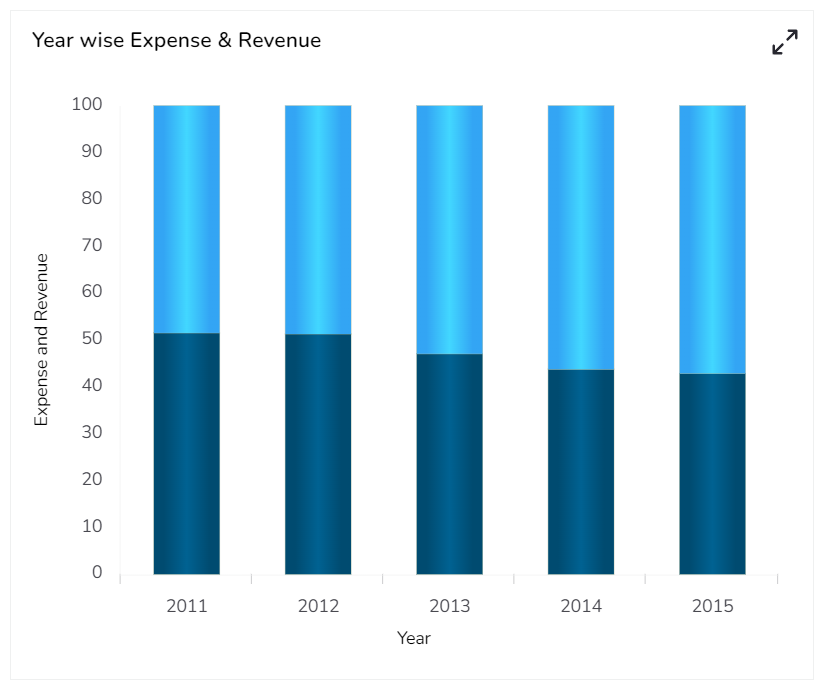
100% Charts
100% Chart with Rectangle Base
100% Chart with Cylinder Base
100% Chart with Plain Base

100% Chart with Gradient1 Base
100% Chart with Gradient2 Base
100% Chart with Gradient3 Base
Sample Data
Download the given sample data and map it as mentioned below to plot your Column chart:
Use the Year column as Category field, and the other columns as Series to plot data.
Please Note: The Category field can be any data type line, string, or numeric. But, Series fields can be only numeric data type.
Last updated