Project Timeline
Check out the below given walk-through on how to use the Project Timeline chart component in Designer module.

The Project Timeline is an interactive visualization chart to visualize data in time. The data items can take place on a single date or have a start and end date (a range). Users can easily move and zoom in on the timeline by using the drag-drop and scroll functionalities. The time scale on the axis is adjusted automatically, and it supports scales ranging from milliseconds to hours to days to years. The Project Timeline uses regular HTML DOM to render the timeline and items placed on the timeline. It allows for flexible customization using CSS styling.
Best Situations to Use a Project Timeline chart
To track project deadlines and status with the timeline template. To update status throughout the project
Default Chart Image

Properties of the Project Timeline chart
General
Component Name: Set a unique name for the component identification. This field contains an auto-generated name indicating the sequence of the component in the dashboard.
Left: Defines the horizontal position of the chart from the left margin.
Top: Specifies the vertical position of the chart from the top margin.
Height: Sets the height of the timeline chart.
Width: Determines the width of the timeline chart.
Initial Visibility: Configures the chart's visibility status on the initial load (visible or hidden).
Max Button: Boolean setting to enable or disable the maximize button for the chart view.
Date Formatting: Allows customization of the date display format on the timeline.

Tooltip
Show Tool Tip: The user can show the series description and get the tooltip by clicking the Show Tool Tip option.
The Tool Tip Configuration window opens.
Select any Tool Tip option. The supported Tool Tip options are None and Default.
Click the Save option.

Background Color: Set the background color for the tooltip box to enhance readability.
Opacity: Adjust the transparency level of the tooltip background.
Border Color: Define the color of the border surrounding the tooltip box.
Tooltip Font Size: Specify the font size for the text displayed in the tooltip.
Box Width: Determine the width of the tooltip box for optimal presentation.
Precision: Set the number of decimal places to show in the tooltip for numerical values.

Please Note: To use the Custom option for the Tool Tip configuration, please refer to the Tooltip (Default & Custom) page.
Background
The user can change the background color of the chart, get the border for the chart, and change the border color. Get the reflection of the chart by enabling the shadow option can also change the color, and increase or decrease the transparency of the shadow.
Gradient Rotation: Modify the angle of the gradient to achieve the desired effect.
Opacity: Set the transparency level to balance visibility and aesthetics.
Gradient: Choose and customize the gradient colors to match your theme.
Click the Gradient icon to access the Background gradient colors dialog box.
Click the Add Color option to add multiple colors.
Click the Save option to apply the selected background colors.

Border: Add a border around the chart for a defined perimeter.
Border Color: Alter the border color to complement or contrast with the chart.
Border Radius: Round the corners of the chart border for a smoother look.
Shadow: Enable shadows to create depth and a 3D-like effect.
Shadow Color: Customize the shadow color to blend naturally with the chart.
Shadow Transparency: Adjust the transparency level to control the intensity of the shadow effect.

Timeline Styles
Timeline Position: Adjust the position of the timeline on the chart for better alignment.
Today Marker Color: Set the color of the marker that indicates the current date.
Today Marker Size: Determine the size of the today marker for better visibility.
Show Major Labels: Display major time labels for clear time segmentation.
Show Minor Labels: Include minor time labels for detailed time navigation.
Marker Border Color: Customize the border color of time markers to highlight them.
Font Color: Change the font color used in timeline labels for readability.
Font Size: Adjust the font size to optimize label visibility and prevent clutter.
Font Weight: Modify the font weight (e.g., bold) to emphasize certain labels.
Font Family: Select the font family to ensure style consistency across the chart.
Font Style: Choose from various font styles (e.g., italics) to align with design preferences.

Milestone Styles
Milestone: Customize the appearance of milestones on the chart to highlight key events.
Click the Milestone icon.
The Milestone Properties window opens.
Add a new range by clicking the Add Range option.
Choose the color for each range.
Click the Save option.

Border Width: Set the border width of milestones for better definition.
Font Color: Adjust the font color for milestone labels to ensure readability.
Font Size: Change the font size for milestone labels to maintain clarity.
Font Weight: Modify the font weight (e.g., bold) to make milestone labels stand out.
Font Family: Choose a font family for milestone labels that complements the overall design.
Font Style: Select font styles (e.g., italics) for milestone labels to match the aesthetic preferences.

Task Styles
Task: Customize the appearance of task boxes on the chart for improved visual distinction.
Show Overflow Text: Enable or disable text overflow settings to ensure task labels are evident without truncation.
Font Color: Change the font color used in task labels to enhance readability on the chart.
Font Size: Adjust the font size of task labels for clarity and to ensure they are legible at various zoom levels.
Font Weight: Modify the font weight (e.g., bold) to emphasize certain task labels.
Font Family: Select a font family for task labels that complements the overall chart design and maintains consistency.
Font Style: Choose from font styles (e.g., italics) to align task labels with the desired design aesthetic.

Title
Title Box Color: Choose the background color for the title box.
Show Title Box: Enable or disable the display of the title box on the chart.
Show Title: Enable or disable the display of the title text.
Title Bar Height: Set the height of the title bar.
Description: Add a description text below the title.
Font Color: Select the color of the title text.
Font Size: Specify the size of the title text.
Font Style: Choose the font style (e.g., italic or normal).
Font Weight: Set the weight (boldness) of the font. The supported options are Normal, Bold, 300, 600, and 900.
Font Family: Choose the font family for the title text from the given choices.
Align: Align the title text (e.g., left, center, right).
Text Decoration: Apply text decorations (e.g., underline) to the title text.
Show Dataset Description: Enable or disable the dataset description in the title.

Please Note: By enabling the Show Dataset Description option the Title will be added from the mapped dataset.
Subtitle
The user can customize the Subtitle properties which include:
Show Subtitle: Toggle this option to display or hide the subtitle.
Description: Add a custom description for the subtitle.
Font Color: Change the color of the subtitle text.
Font Size: Adjust the size of the subtitle text.
Font Style: Apply styles such as italics to the subtitle.
Font Weight: Modify the thickness of the subtitle text, e.g., bold.
Font Family: Select the font type for the subtitle.
Align: Align the subtitle text (left, center, or right).
Text Decoration: Add elements like underline or overline to the subtitle text.

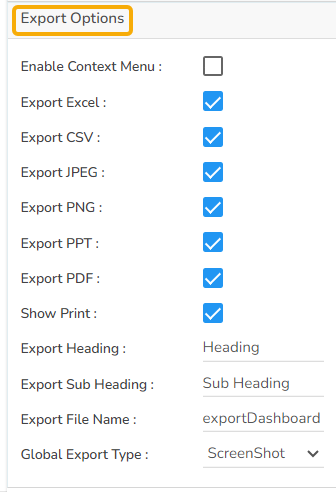
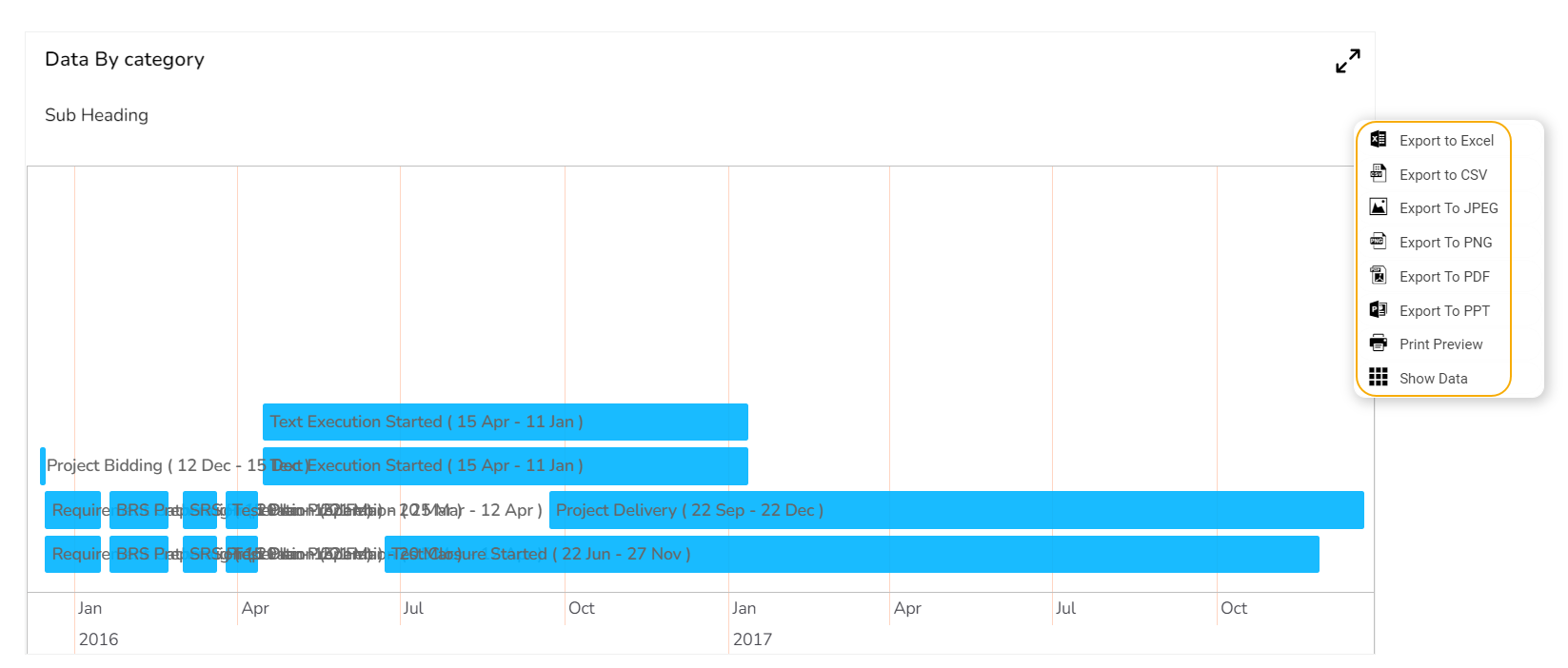
Export Options
The Export Options section allows users to easily export their chart data in various formats for reporting and presentation purposes. This feature supports seamless integration with common applications and file types.
Enable Context Menu: Activates a context menu on the chart, providing quick access to export functions directly from the chart interface.
Export Excel: Allows the data to be exported as an Excel file, suitable for further analysis or sharing in a tabular format.
Export CSV: Exports data in CSV format, ideal for importing into databases or other data processing tools.
Export JPEG: Provides the option to export the chart as a JPEG image, useful for creating static visual representations.
Export PNG: Similar to JPEG, but offers a lossless export option in PNG format for clearer image quality in visual presentations.
Export PPT: Facilitates exporting the chart directly into a PowerPoint file, streamlining the process of incorporating charts into slideshows.
Export PDF: Enables exporting the chart and its data in PDF format, suitable for creating shareable and print-ready documents.
Show Print: Displays a print button on the chart, allowing users to print the chart directly from the application.
Export Heading: Customizes the heading title for exported files, ensuring clarity and context when distributing chart data.
Export Sub Heading: Adds a secondary title or description to exported files, providing additional context or information.
Export File Name: Allows customization of the file name for the exported data, ensuring easy identification and organization.
Global Export Type: Sets a default export format for all charts, streamlining the export process across multiple datasets.
The user can get the Export Context Menu from the preview mode to download the reports in different export formats.
Project Timeline chart by changing the Properties

Sample Data
Download the given sample data and map it as mentioned below to plot your Project Timeline chart.
Use the Category column as the Category field, Start Date as the Start Date field, and End Date as the End Date to plot data.
Last updated