Combobox
Check out the walk-through given below on how to use a Combobox filter component in the Designer.

Combo Box is used to filter data on any associated components. Selecting an item from the drop-down menu will change the data displayed in the associated components.
Best Situation to Use Combo Box
To filter data on associated components.
To select only a particular item.
Default Component Image

Properties of the Combo Box Filter
General
The General Properties allow customization of the Combo Box Filter component through various fields:
Component Name: Defines the identifier name for the Combo Box Filter component.
Show Search: Enables or disables the search function, assisting users in finding specific values.
Left, Top: Sets the component position in the user interface by specifying the leftmost and topmost margins.
Height, Width: Adjusts the size dimensions of the Combo Box Filter component.
Initial Visibility: Determines whether the filter is visible upon the first preview. If not enabled, the chart won't appear initially.
Font Color, Font Size: Modifies the text color and size within the filter for better visual distinction.
Font Style, Font Weight, Font Family: Customizes the typography, including style (e.g., italic), weight (e.g., bold), and font family for a consistent visual theme.
Font Weight: Set the weight (boldness) of the font. The supported options are Normal, Bold, 300, 600, and 900.
Font Family: Choose the font family for the title text from the given choices.
Selection: Allows choosing between 'Default', 'Single', or 'Multiple' selection modes for item selection flexibility.
Selected Index: Sets a default value that appears initially in the filter; requires enabling 'Notify GV Update' for dynamic changes.
Auto Update GV: Automatically refreshes the filter when changes occur to the governing variables (GV) without manual intervention.
Notify GV Update: Notifies and updates linked variables when a selection is made, keeping data in sync.
Public Filter: Determines if the filter settings should be accessible to other components or users.

Background
The Background Properties panel offers options to enhance the visual layout of the component through the following fields:
Shadow: Enables a shadow effect for the component, creating a sense of depth and focus.
Shadow Color: Sets the color of the shadow, allowing for customization to match the overall design theme.
Shadow Transparency: Adjusts the transparency of the shadow, providing control over how prominent or subtle the shadow appears.
Background Color: Defines the main color filling to the component background for aesthetic and branding consistency.

Title
Title Box Color: Sets the background color of the title box for a cohesive look.
Show Title Box: Toggles the visibility of the title box.
Show Title: Allows the title text to be displayed.
Show Only Title: Displays only the title, hiding other elements for a minimalist approach.
Title Bar Height: Adjusts the height of the title bar, impacting the overall layout.
Description: Adds supplementary information beneath the title.
Font Color: Specifies the color of the title text for readability and design alignment.
Font Size: Defines the size of the title text.
Font Style: Choose between normal, italic, or oblique styling for the title text.
Font Weight: Sets the thickness of the title text, offering a range from light to bold.
Font Family: Selects the font family to apply to the title text.
Align: Aligns the title text (left, center, right) within its container.
Text Decoration: Adds text decoration such as underline, overline, or line-through.
Position: Determines the position of the title element within the component.

Dropdown Style
Rollover Color: This property changes the background color when a user hovers over an option in the dropdown, enhancing interactivity and user experience.
Selection Color: Defines the background color of a selected option in the dropdown, providing a visual indication of the user's choice.
Background Color: Sets the overall background color of the dropdown menu, contributing to the visual consistency of the design.

Combo Box Filter Variants after Changing its Properties
Default Selection

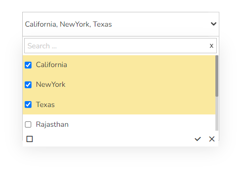
Single Select

Multiselect with enhanced Checkbox
Last updated