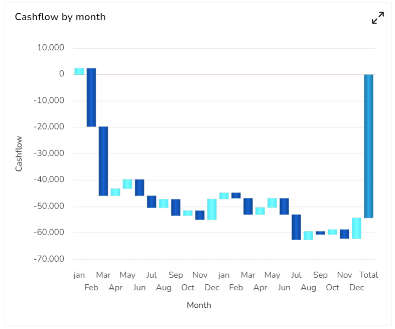
Waterfall Chart
A Waterfall Chart is a form of data visualization that helps in understanding the cumulative effect of sequentially introduced positive or negative values. The waterfall chart is also known as a flying bricks chart or Mario chart due to the apparent suspension of columns (bricks) in mid-air. The Waterfall Chart is used to show how an initial value is increased and decreased by a series of intermediate values, leading to a final value.
Best Situations to Use Waterflow chart
To show incremental changes in the values over time.
Default Chart Image

Properties of the Waterfall Chart
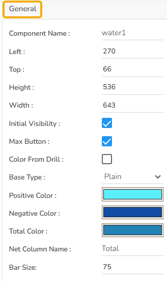
General
The General Properties panel allows you to modify the core attributes of the Bar chart. Here are the fields available:
Component Name: Set a unique name for the component identification. This field contains an auto-generated name indicating the sequence of the component in the dashboard.
Left: Specify the left position coordinate of the chart component on the canvas.
Top: Indicate the top position coordinate for the chart placement.
Height: Set the height of the chart to determine its vertical size.
Width: Adjust the width of the chart to control its horizontal dimension.
Initial Visibility: Enable to ensure the chart appears during the initial preview.
Max Button: Enable or disable the max button to allow users to maximize the chart for a more detailed view.
Color From Drill: Enable this option to choose whether the colors displayed should derive from drill-down operations.
Base Type: Select the base type for bar categorization in the chart.
Positive Color: Select the color representing positive values in the chart, making it visually distinct and easy to identify growth or profit.
Negative Color: Choose the color for negative values, highlighting losses or decreases consistently.
Total Color: Define the color for the total value, ensuring it stands out distinctly from individual positive or negative values.
Net Column Name: Specify the column name representing the calculated net values, allowing for clear identification and understanding of the presented data.
Bar Size: Configure the size of each bar to adjust spacing and appearance.
Tooltip
Show Tool Tip: The user can show the series description and get the tooltip by clicking the Show Tool Tip option.
The Tool Tip Configuration window opens.
Select any Tool Tip option. The supported Tool Tip options are None and Default.
Click the Save option.

Background Color: Set the background color for the tooltip box to enhance readability.
Opacity: Adjust the transparency level of the tooltip background.
Border Color: Define the color of the border surrounding the tooltip box.
Tooltip Font Size: Specify the font size for the text displayed in the tooltip.
Box Width: Determine the width of the tooltip box for optimal presentation.
Precision: Set the number of decimal places to show in the tooltip for numerical values.
Highlighter: Toggle the highlighter to emphasize specific data points on the chart, drawing user attention to crucial information.

Please Note: To use the Custom option for the Tool Tip configuration, please refer to the Tooltip (Default & Custom) page.
Background
Gradient Rotation: Adjust the angle of the gradient applied to the background, allowing for a dynamic visual transition between colors.
Opacity: Set the transparency level of the background, ranging from fully opaque to completely transparent.
Gradient: Enable or disable gradient colors in the background for depth and visual appeal.
Click the Gradient icon to access the Background gradient colors dialog box.
Click the Add Color option to add multiple colors.
Click the Save option to apply the selected background colors.

Border: Define the width of the border surrounding the pyramid chart.
Border Color: Select the color for the chart's border, enhancing its visibility and aesthetics.
Border Radius: Round the corners of the chart's border for a softer, more modern appearance.
Shadow: Enable a shadow effect for the background to add dimension and focus to the chart.
Shadow Color: Choose the color of the shadow cast.
Shadow Transparency: Adjust the transparency level of the shadow to control its prominence and intensity.

Title
Title Box Color: Choose the background color for the title box.
Show Title Box: Enable or disable the display of the title box on the chart.
Show Title: Enable or disable the display of the title text.
Title Bar Height: Set the height of the title bar.
Description: Add the title text.
Font Color: Select the color of the title text.
Font Size: Specify the size of the title text.
Font Style: Choose the font style (e.g., italic or normal).
Font Weight: Set the weight (boldness) of the font. The supported options are Normal, Bold, 300, 600, and 900.
Font Family: Choose the font family for the title text from the given choices.
Align: Align the title text (e.g., left, center, right).
Text Decoration: Apply text decorations (e.g., underline) to the title text.
Show Dataset Description: Enable or disable the dataset description in the title.
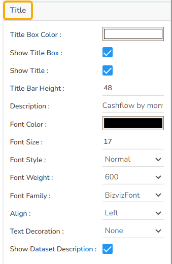
Please Note: The Title will be added from the mapped dataset by enabling the Show Dataset Description option.
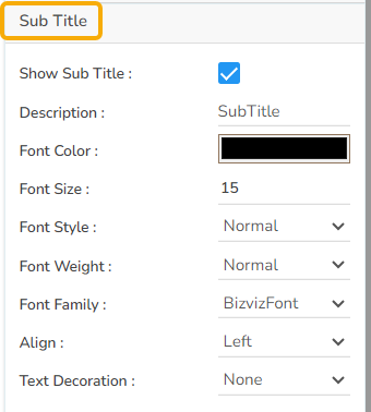
Subtitle
The user can customize the Subtitle properties which include:
Show Subtitle: Toggle this option to display or hide the subtitle.
Description: Add a custom description for the subtitle.
Font Color: Change the color of the subtitle text.
Font Size: Adjust the size of the subtitle text.
Font Style: Apply styles such as italics to the subtitle.
Font Weight: Modify the thickness of the subtitle text, e.g., bold.
Font Family: Select the font type for the subtitle.
Align: Align the subtitle text (left, center, or right).
Text Decoration: Add elements like underline or overline to the subtitle text.
X-Axis
Show X-Axis Line: Toggle the visibility of the x-axis line.
X-Axis Line Color: Select the color for the x-axis line.
Label Font Color: Set the color of the x-axis labels.
Label Font Size: Adjust the font size used for x-axis labels.
Label Font Style: Choose the style (e.g., italic, oblique) for label text.
Label Font Weight: Define the thickness of the label text.
Label Font Family: Select the font type for the labels.
Label Decoration: Add text decorations such as underlining to labels.
Label Rotation: Specify the angle for rotating x-axis labels.
Tilted Label: Enable this to tilt labels for better visibility.
Description: Provide a brief description or title for the x-axis.
Font Color: Pick a color for the x-axis text elements.
Font Size: Change the overall size of text on the x-axis.
Font Style: Set the text style for x-axis elements (e.g., normal, italic).
Font Weight: Modify the boldness of the text on the x-axis.
Font Family: Define the typeface for text along the x-axis.
Text Decoration: Apply decorative styles like underlining to x-axis text.
Category Tick Marks: Control the appearance and frequency of tick marks on the x-axis.
Marker Color: Choose a color for the markers along the x-axis.
Show Dataset Description: Enable or disable the dataset description for the X-Axis.

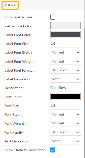
Y-Axis
Show Y-Axis Line: Toggle the visibility of the Y-axis line.
Y-Axis Line Color: Select the color for the Y-axis line.
Label Font Color: Choose the font color for Y-axis labels.
Label Font Size: Specify the size of the font for Y-axis labels.
Label Font Style: Set the style (e.g., italic) for Y-axis labels.
Label Font Weight: Determine the weight (e.g., bold) for Y-axis label fonts.
Label Font Family: Choose the font family for Y-axis labels.
Label Decoration: Add decorations (e.g., underline) to Y-axis labels.
Description: Add a description for the Y-axis.
Font Color: Specify the color of the Y-axis text.
Font Size: Set the font size for the Y-axis text.
Font Style: Choose the font style (e.g., italic) for Y-axis text.
Font Weight: Determine the weight (boldness) of the Y-axis text.
Font Family: Select the font family for the Y-axis text.
Text Decoration: Add text decorations (e.g., underline) to the Y-axis labels.
Show Dataset Description: Enable or disable the dataset description for the Y-Axis.
Legend
The users can enable the internal legend if they want to show it and customize the font size, color, style, etc. for the enabled legend.
Show Legend: Toggle the visibility of the chart legend.
Font Color: Choose the font color for the legend text.
Font Weight: Determine the weight (boldness) of the legend text.
Font Size: Specify the size of the font for the legend text.
Font Family: Select the font family for the legend text.
Font Style: Choose the font style (e.g., italic) for the legend text.
Text Decoration: Add text decorations (e.g., underline) to the legend text.
Hide on Load: Determine if the legend should be hidden when the chart initially loads.

Formatter
Unit: Define the unit of measurement for the values displayed in the chart.
Precision: Set the number of decimal places to display for numerical values.
Currency: Format the numbers as a currency with the appropriate symbol.
Position: Determine the position of the formatted value (e.g., Prefix or Suffix).
Number Formatter: Apply a specific notation or style to the numbers (e.g., Indian, International).

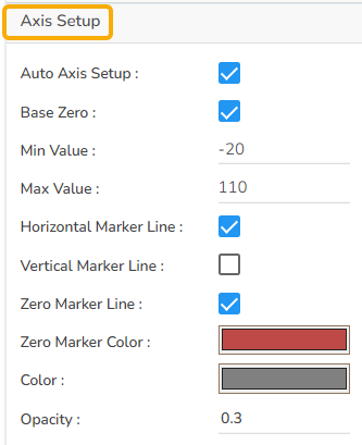
Axis Setup
Auto Axis Setup: Automatically adjust the axis settings based on the dataset.
Base Zero: Ensure the axis starts at zero for better data comparison.
Min Value: Define the minimum value displayed on the axis.
Max Value: Set the maximum value for the axis range.
Horizontal Marker Line: Add a horizontal line at a specified value for reference.
Vertical Marker Line: Place a vertical line at a specific point for highlighting.
Zero Marker Line: Include a line at zero to emphasize the baseline.
Zero Marker Color: Customize the color of the zero marker line.
Color: Choose the color for the axis and labels.
Opacity: Adjust the transparency of the axis and markers.
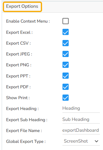
Export Options
Enable Context Menu: Activate a right-click context menu for quick access to export options in the preview mode of the chart.
Export Excel: Save the chart data in an Excel file format (.xlsx).
Export CSV: Export the chart data into a CSV file format (.csv).
Export JPEG: Export the chart as a JPEG image (.jpg).
Export PNG: Export the chart as a PNG image (.png).
Export PPT: Export the chart to a PowerPoint presentation (.pptx).
Export PDF: Export the chart as a PDF document (.pdf).
Show Print: Include an option to print the chart directly.
Export Heading: Add a custom heading to the exported file.
Export Sub Heading: Add a custom subheading to the exported file.
Export File Name: Specify the file name for the exported file/dashboard.
Global Export Type: Define the default export format using the drop-down (e.g., Screenshot, Tabular).
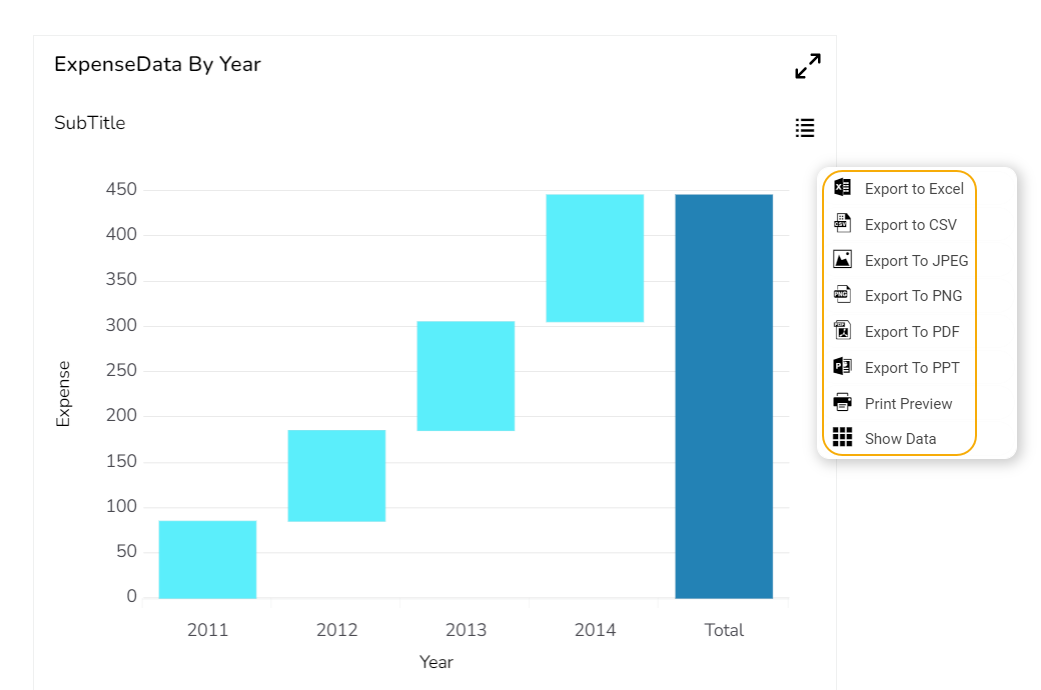
The user can get the Export Context Menu from the preview mode to download the reports in different export formats.
Dataset Property
The users can map a dataset with the dragged Waterfall chart component, and map the data fields as displayed in the given image:

Waterfall charts after changing its properties
Base Type with Plain

Base Type with Gradient 1

Base Type with Gradient 2

Base Type with Gradient 3
Sample Data
Download the given sample data and map it as mentioned below to plot your Waterfall chart.
Select the Year column as the Category field and the Expense or Revenue column as the Series field to plot the data.
Please Note: The Waterfall chart supports only one series field.
Last updated