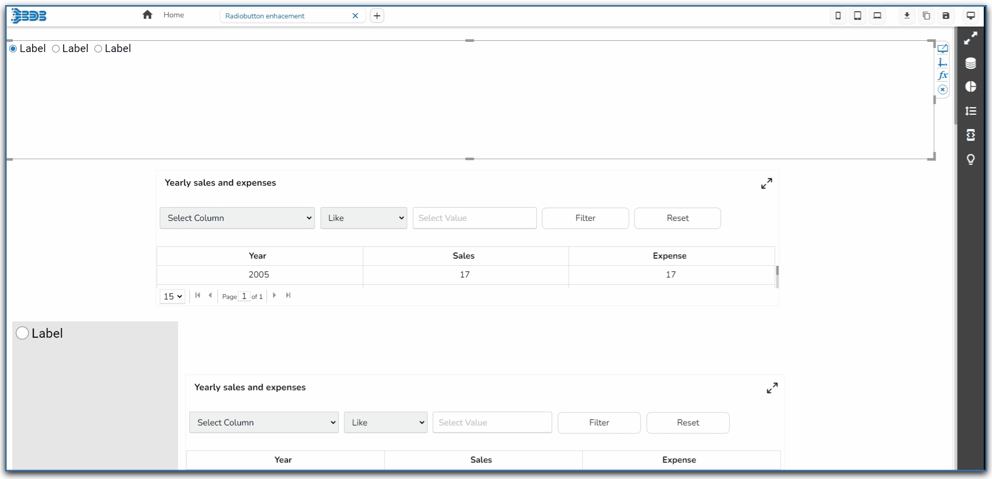
Radio Button

The Radio Button component helps to filter data on other components.

Default Component Image

Properties of the Radio Button

General

General

  • Component Name: Allows users to set a unique identifier for the radio button component.

  • Left/Top: Specifies the position of the radio button within the interface, in terms of left and top margins.

  • Height/Width: Defines the dimensions of the radio button.

  • Initial Visibility: Toggles the initial display state of the component; if not enabled, it won't appear on the first preview.

  • View Type: Determines the display style of the radio button, such as the Enhance Button.

  • Font Color/Size/Style/Weight/Family: Customizes the typography, including color, size, style, weight, and typeface.

  • Spacing: Adjusts the space between radio buttons to enhance layout clarity.

  • Border Radius: Rounds the corners of the buttons for a softer look.

  • Selection Color: Highlights the selected button, providing visual feedback.

  • Chrome Color: Sets the background color for buttons, with adjustable transparency.

  • Button Color: Defines the fill color of the radio button.

  • Circle Color: Sets the color of the circle within the radio button.

  • Circle Size: Adjusts the size of the circle marker inside the button.

  • Button Top Spacing: Sets the space above the button to manage layout balance.

  • Opacity: Controls the transparency level of the radio button for layering effects.

  • Orientation: Switches the arrangement between horizontal and vertical alignments.

  • Selected Index: Indicates which button is initially selected.

  • Auto Update GV: Automatically updates the global variable with the selected value.

  • Notify GV Update: Alerts the system to update the global variable when selection changes.

Modifying the Radio Button component with newly added Properties

Background

  • Shadow: Enable or disable the shadow effect on the component. This adds depth and contrast to the component's appearance.

  • Shadow Color: Choose the color for the shadow effect. This can be matched with your design aesthetics or contrast requirements.

  • Shadow Transparency: Control the transparency level of the shadow. Adjust this to blend the shadow with the background seamlessly or make it more pronounced.

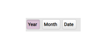
Modified Radio Button after changing its properties

Last updated