Pie Chart
Check out the walk-through on how to use the Pie chart component in the Designer module.

The most widely used chart to show proportions, percentages, and categories of information. Users can use the Pie charts mainly to compare various categories. It is better to limit the categories up to 6 or fewer while visualizing them through a pie chart. Generally, Pie charts are used when values or the sum of values meet 100%.
Best Situations to Use a Pie Chart
Top performers and least performers based on the comparison of categories To illustrate breakdowns within a single dimension To show differences within groups based on one variable.
Variations of this chart
Pie-Doughnut
Doughnut charts behave like a Pie-chart the user can switch the pie-chart to a doughnut.
Default Pie Chart Image

Properties of the Pie chart
General
Component Name: Set a unique name for the component identification. This field contains an auto-generated name indicating the sequence of the component in the dashboard.
Left/Top: Control the positioning of the chart within its container.
Height/Width: Specify the dimensions of the pie chart to fit your layout needs.
Initial Visibility: Toggle to determine if the chart is visible on the first preview.
Max Button: Enable to allow maximization of the chart independently.
Series Colors: Customize the colors for each slice in the pie chart.
Opacity: Adjust the transparency of the pie chart elements.
Chart Type: Choose between Pie, Doughnut, or Semi Doughnut chart styles.
Show Percentage: Option to display the percentage values on slices.
Animation: Add transitions or animation effects to the pie chart.
Show Limited Slices: Limit the number of slices displayed on the chart.
Maximum Slices: Define the number of slices to be shown when limited.
Doughnut Width: Change the width of the Doughnut-style chart.
Chart Alignment: Align the chart within its space (e.g., center, left, right).
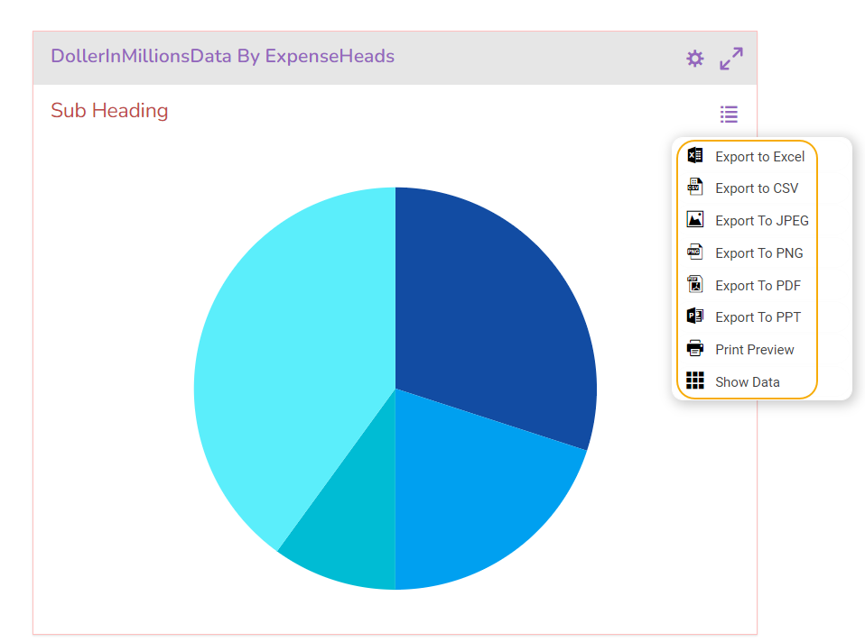
Actions: Access additional actions like 'show data', 'sort data', 'export', and 'chart' in the preview mode.

Tooltip
The user can show the series description and get the tooltip by clicking the Show Tool Tip option.
The Tool Tip Configuration window opens.
Select any Tool Tip option. The supported Tool Tip is None, Default, Custom.
Click the Save option.

Background Color: Set the background color for the tooltip box to enhance readability.
Opacity: Adjust the transparency level of the tooltip background.
Border Color: Define the color of the border surrounding the tooltip box.
Tooltip Font Size: Specify the font size for the text displayed in the tooltip.
Box Width: Determine the width of the tooltip box for optimal presentation.
Precision: Set the number of decimal places to show in the tooltip for numerical values.

Please Note: To use the Custom option for the Tool Tip configuration, please refer to the Tooltip (Default & Custom) page.
Background
The user can change the background color of the chart, get the border for the chart, and change the border color. Get the reflection of the chart by enabling the shadow option can also change the color, and increase or decrease the transparency of the shadow.
Gradient Rotation: Modify the angle of the gradient to achieve the desired effect.
Opacity: Set the transparency level to balance visibility and aesthetics.
Gradient: Choose and customize the gradient colors to match your theme.
Click the Gradient icon to access the Background gradient colors dialog box.
Click the Add Color option to add multiple colors.
Click the Save option to apply the selected background colors.

Border: Add a border around the chart for a defined perimeter.
Border Color: Alter the border color to complement or contrast with the chart.
Border Radius: Round the corners of the chart border for a smoother look.
Shadow: Enable shadows to create depth and a 3D-like effect.
Shadow Color: Customize the shadow color to blend naturally with the chart.
Shadow Transparency: Adjust the transparency level to control the intensity of the shadow effect.

Title
Title Box Color: Choose the background color for the title box.
Show Title Box: Enable or disable the display of the title box on the chart.
Show Title: Enable or disable the display of the title text.
Title Bar Height: Set the height of the title bar.
Description: Add a description text below the title.
Font Color: Select the color of the title text.
Font Size: Specify the size of the title text.
Font Style: Choose the font style (e.g., italic or normal).
Font Weight: Set the weight (boldness) of the font. The supported options are Normal, Bold, 300, 600, and 900.
Font Family: Choose the font family for the title text from the given choices.
Align: Align the title text (e.g., left, center, right).
Text Decoration: Apply text decorations (e.g., underline) to the title text.
Show Dataset Description: Enable or disable the dataset description in the title.

Please Note: By enabling the Show Dataset Description option the Title will be added from the mapped dataset.
Subtitle
Show Sub Title: Enable or disable the display of the subtitle text.
Description: Add descriptive text below the subtitle.
Font Color: Choose the color for the subtitle text.
Font Size: Set the size of the subtitle text.
Font Style: Select the style of the subtitle text (e.g., italic or normal).
Font Weight: Define the weight (boldness) of the subtitle font, with options such as Normal, Bold, 300, 600, and 900.
Font Family: Choose the font family for the subtitle text from the available options.
Align: Align the subtitle text (e.g., left, center, right).
Text Decoration: Apply decorations, such as underlining, to the subtitle text.

Legend
Show Legend: Toggle to display or hide the legend on the chart.
Font Color: Select the color for the legend text.
Font Weight: Set the boldness of the legend text, with options like Normal, Bold, 300, 600, and 900.
Font Size: Specify the size of the legend text.
Font Family: Choose the font family for the legend text from the available options.
Font Style: Choose the style for the legend text, such as italic or normal.
Text Decoration: Apply decorations like underlining to the legend text.
Hide on Load: Determine if the legend should be hidden initially when the chart loads.

Formatter
Unit: Specify the unit of measuring currency represented on the chart.
Precision: Define the number of decimal places to be displayed for numerical values to ensure accuracy and consistency.
Currency: Set the currency type for monetary values, allowing for consistent representation of financial data.
Position: Determine the placement of the formatted value about the axis or chart element, such as Prefix or Suffix.
Number Formatter: Customize how numbers are displayed (International or Indian).

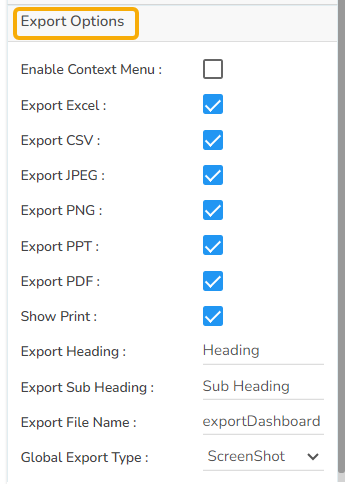
Export Options
The Export Options section allows users to easily export their chart data in various formats for reporting and presentation purposes. This feature supports seamless integration with common applications and file types.
Enable Context Menu: Activates a context menu on the chart, providing quick access to export functions directly from the chart interface.
Export Excel: Allows the data to be exported as an Excel file, suitable for further analysis or sharing in a tabular format.
Export CSV: Exports data in CSV format, ideal for importing into databases or other data processing tools.
Export JPEG: Provides the option to export the chart as a JPEG image, useful for creating static visual representations.
Export PNG: Similar to JPEG, but offers a lossless export option in PNG format for clearer image quality in visual presentations.
Export PPT: Facilitates exporting the chart directly into a PowerPoint file, streamlining the process of incorporating charts into slideshows.
Export PDF: Enables exporting the chart and its data in PDF format, suitable for creating shareable and print-ready documents.
Show Print: Displays a print button on the chart, allowing users to print the chart directly from the application.
Export Heading: Customizes the heading title for exported files, ensuring clarity and context when distributing chart data.
Export Sub Heading: Adds a secondary title or description to exported files, providing additional context or information.
Export File Name: Allows customization of the file name for the exported data, ensuring easy identification and organization.
Global Export Type: Sets a default export format for all charts, streamlining the export process across multiple datasets.
The user can get the Export Context Menu from the preview mode to download the reports in different export formats.
Data Set Pallet Properties

Variants of the Pie Chart
Pie-Doughnut
Doughnut charts behave like a Pie-chart the user can switch the pie-chart to a doughnut.

Semi- Doughnut Pie Chart

Sample Data
Download the given sample data and map it as mentioned below to plot your Pie chart.
Use the ExpenseHeads column as a Category field and the DollorInMillion column as a Series to plot data.
Please Note: The Category field can be any data type line, string, or numeric. However, Series fields can be only numeric data types.
Last updated