Governed Dashboards
  • About Dashboard Designer
    • What is Dashboard Designer?
    • Why is it used?
  • Getting Started
    • Accessing the Designer Module
    • Overview of Designer Module
      • Homepage
        • Guided Tour
        • Left Menu Panel
          • New
          • Manage
          • Open Dashboard
          • Preferences
          • Save As
          • Help
          • Exit
      • Dashboard Canvas Page
        • Right side Panel
          • Connection Page
          • Chart Container
          • Manage Window
          • Script Window
          • Guided Tour
        • Canvas Properties
          • Global Properties
          • Dashboard Themes
        • Context Menu Properties
  • Create New Workspace
    • Workspace Creation: Complete Flow
    • Creating a Workspace
    • Renaming a Workspace
    • Deleting a Workspace
    • Sharing a Workspace
  • Create New Dashboard
    • Dashboard Creation: Basic Workflow
    • Adding a New Dashboard
    • Create Connection
    • Drag and Drop Charts
    • Associate the Dataset
    • Preview the Dashboard
    • Save the Dashboard
    • User Alert Notification
  • Managing Options for a Dashboard
    • Open Dashboard in Designer
    • Publish a Dashboard
    • Share a Dashboard
    • Dashboard Version Control
    • Action Menu
      • Preview Dashboard
      • Export to Local Disk
      • Rename
      • Delete
      • Moving a Dashboard
      • Information Icon
      • Dashboard as Template
  • Connecting to a Data Source
    • Accessing the Data Connectors
    • Establishing a Data Connection
      • CSV Connection
      • Excel Connection
      • Data Service Connection
      • Data Store Connection
      • Data Sheet Connection
        • Data Sheet Enhancements
      • WebSocket Connection
      • Merged Connection
  • Charts Gallery
    • Charts
      • Area chart
      • Bar Chart
      • Bubble Chart
      • Circumplex Chart
      • Column Chart
      • Funnel Chart
      • Histogram Chart
      • Inverted Funnel
      • KPI Tile
      • Line Chart
      • Map Chart
      • Mito Plot
      • Mixed Chart
      • Pie Chart
      • Project Timeline
      • Pyramid Chart
      • Scatter Plot
      • Spark Line
      • Spider Chart
      • Waterfall Chart
    • Grids
      • Data Grid
      • Paging Grid
      • Data Sheet
      • Scorecard
      • Pivot Grid
    • Filters
      • Checkbox
      • Combobox
      • Hierarchical Combobox
      • List
      • Radio Button
    • Advanced Charts
      • Benchmark Analysis
      • Box Plot
      • Candle Stick
      • Chevron
      • Data Search
      • Decision Tree
      • Group Bar
      • Group Column
      • Heat Map
      • Sankey
      • Text Analyzer
      • Time Series
      • Decomposition
      • Knowledge Graph
      • Treemap
      • Trellis
      • Word Cloud
      • New Word Cloud
    • Other Charts
      • Box
      • Bullet
      • Date Picker
      • Export
      • Filter Chips
      • Filter Saver
      • Gauge
      • Graphics
      • Guided Tour
      • H-Slider
      • Image
      • Info Button
      • Input Box
      • Label
      • Legend
      • Progress Pie
      • Semi Gauge
      • Stepper
      • SVG Image
      • Text Box
      • Trend
      • URL Button
      • V-Slider
      • Tab Component
      • Inputbox component
      • Button component
    • Custom Charts
    • Common Chart Properties
      • Background
      • Title & Sub-title
      • X & Y Axis Properties
      • Legend Properties
      • Formatter
      • Axis Setup
      • Export Options
      • Copy Paste Chart Properties
  • Dashboard Objects
    • Manage Dashboard Components
    • Dashboard Objects Properties
  • Configurations
    • Filtering the Data
    • Drill Through
      • Drill Highlighter
    • Dataset Properties
    • Indicators in Charts
    • Tooltip(Default & Custom)
    • Data Label
    • Geo Mapping
    • Language Mapping
    • Legend Mapping
    • Alerts in Grids
  • Script Help Section
    • Navigate to Script Help page
    • How to use Scripts?
Powered by GitBook
On this page
  • Default Component Image
  • Properties of the Data Search
  • General
  • Background
  • Style
  • Associating a Chart
  • Preview mode for the Data Search component
Export as PDF
  1. Charts Gallery
  2. Advanced Charts

Data Search

PreviousChevronNextDecision Tree

Last updated 6 months ago

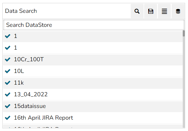
The Data Search can use this to search for particular data. The user can also search for Chart, Query & Data Store.

Default Component Image

Properties of the Data Search

General

The user can change the height, width, top, and left. If initial visibility is not enabled, the chart won’t be available for the first preview.

  • Component Name: The unique identifier for the Data Search chart.

  • Left: The position of the chart from the left edge of the containing element.

  • Top: The position of the chart from the top edge of the containing element.

  • Width: The horizontal dimension of the chart.

  • Height: The vertical dimension of the chart.

  • Initial Visibility: Whether the chart is visible when initially rendered.

  • Associate Chart: Redirects the user to the associate chart to establish a connection between the data search and the component.

Background

The user can get the reflection of the chart by enabling the shadow option from the Background properties.

  • Shadow: Enable the shadow effect on the chart by marking the given checkbox.

  • Shadow Color: The color of the shadow effect.

Style

The User can set or customize the style for the Data Search component.

  • Background Color: Set the background color of the chart or component.

  • Opacity: Control the transparency level of the background color.

  • Border Radius: Define the curvature of the borders.

  • Font Color: Choose a color for the text.

  • Font Size: Specify the size of the font.

  • Font Style: Apply styles like italics to the text.

  • Font Weight: Adjust the thickness (boldness) of the text.

  • Font Family: Select a font type for the text.

  • Text Decoration: Add decorations like underlining to the text.

  • Icon Font Size: Set the size of icons within the component.

  • Panel Height: Define the height of the panel.

Associating a Chart

It is possible to associate multiple charting components with the Data Search component. The user gets the Associate Chart option under the General properties.

  • The Associated chart dialog box appears as displayed below:

  • The user can use the given check box to select the dragged chart component.

Preview mode for the Data Search component

The below-given image displays the auto-generated suggestions to provide a text query in the Data Search bar:

Click Value: The value a user types in the Click Value field is passed to the backend.

Shadow Transparency: Set the transparency level of the shadow effect.
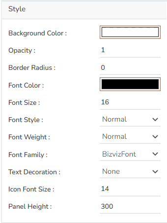
Click the Associate Chart iconfrom the General Properties of the Search component.

Click the Save to associate the selected charting component with the Data Search option.

The following image displays the Data Search component in the preview mode: