Spark Line
A Sparkline is a small chart that is drawn without axes. It does not contain some chart-specific elements (such as legend, title, etc.). The Sparkline chart can be easily embedded in the text as it performs more like an inline element (rendered inside a span) as opposed to the standard charts, which behave like block elements. The primary purpose attached to the Sparkline Chart is to show a trend of something unique.
The best situation to use the Sparkline chart
To show the data trend.
Default Chart Image

Properties of the Sparkline chart
General
Component Name: Set a unique name for the component identification. This field contains an auto-generated name indicating the sequence of the component in the dashboard.
Left: Sets the horizontal position of the chart within the workspace.
Top: Sets the vertical position of the chart within the workspace.
Height: Adjusts the vertical size of the chart.
Width: Adjusts the horizontal size of the chart.
Initial Visibility: When unchecked, the chart will not be displayed during the first preview.
Type: Allows the selection of the chart type, such as Line, Bar, or Tristate, offering flexibility in data representation.

Background
Gradient Rotation: Adjust the angle of the gradient applied to the background, allowing for a dynamic visual transition between colors.
Opacity: Set the transparency level of the background, ranging from fully opaque to completely transparent.
Gradient: Enable or disable gradient colors in the background for depth and visual appeal.
Click the Gradient icon to access the Background gradient colors dialog box.
Click the Add Color option to add multiple colors.
Click the Save option to apply the selected background colors.

Border: Define the width of the border surrounding the pyramid chart.
Border Color: Select the color for the chart's border, enhancing its visibility and aesthetics.
Border Radius: Round the corners of the chart's border for a softer, more modern appearance.
Shadow: Enable a shadow effect for the background to add dimension and focus to the chart.
Shadow Color: Choose the color of the shadow cast by the chart background.
Shadow Transparency: Adjust the transparency level of the shadow to control its prominence and intensity.

Tooltip
Show Tool Tip: The user can show the series description and get the tooltip by clicking the Show Tool Tip option.
The Tool Tip Configuration window opens.
Select any Tool Tip option. The supported Tool Tip options are None and Default.
Click the Save option.

Background Color: Set the background color for the tooltip box to enhance readability.
Opacity: Adjust the transparency level of the tooltip background.
Border Color: Define the color of the border surrounding the tooltip box.
Tooltip Font Size: Specify the font size for the text displayed in the tooltip.
Box Width: Determine the width of the tooltip box for optimal presentation.
Precision: Set the number of decimal places to show in the tooltip for numerical values.

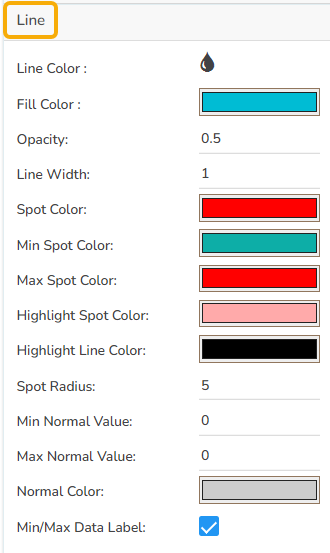
Line
When configuring the Line chart in the Sparkline component, various properties can be adjusted to enhance visual representation:
Line Color: Set the color for the line in the chart to make it stand out.
Fill Color: Choose a color to fill the area between the line and the x-axis.
Opacity: Adjust the transparency level of the fill color for clear visibility.
Line Width: Specify the thickness of the line to ensure it is easily visible.
Spot Color: Define a color for spots along the line to highlight data points.
Min Spot Color: Set a distinct color for the minimum value spot on the line.
Max Spot Color: Choose a color for highlighting the maximum value spot.
Highlight Spot Color: Specify a color to highlight certain spots for emphasis.
Highlight Line Color: Select a color to emphasize particular lines in the chart.
Spot Radius: Determine the size of the spots displayed on the line.
Min Normal Value: Set the lower bound of the normal value range to indicate on the chart.
Max Normal Value: Define the upper limit of the normal value range.
Normal Color: Choose a color to fill the area within the normal value range.
Min/Max Data Label: Enable this option to display the minimum and maximum values directly on the chart.
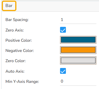
Bar
Bar Spacing: Adjust the space between individual bars for better clarity or a compact look.
Zero Axis: Enable or disable the zero-axis line for reference in the bar chart.
Positive Color: Select a color to represent the bars with positive values.
Negative Color: Choose a color for bars indicating negative values.
Zero Color: Define the color for bars that represent zero values.
Auto Axis: Automatically adjust the axis based on the data range to optimize chart appearance.
Min Y-Axis Range: Set the minimum range for the Y-axis to maintain a consistent scale across charts.
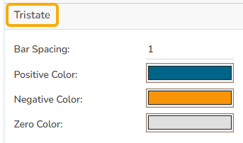
Tristate
After selecting the type to Tristate from the General section, the following properties can be adjusted to enhance its visual representation:
Bar Spacing: Modify the space between bars to achieve a more refined or compact layout, allowing for better visual differentiation.
Positive Color: Assign a specific color to bars that represent positive values, aiding quick identification of growth or gains.
Negative Color: Choose a distinct color for bars displaying negative values, highlighting losses or declines effectively.
Zero Color: Set a color for bars that denote zero values, ensuring these neutral or unchanged data points are visible.
Formatter
The Formatter allows users to customize how numerical data is displayed. This includes:
Currency: Select the currency type for financial values. Options include CENT, EURO, INR, POUND, USD, and YEN.
Position: Choose where the currency symbol appears. Use the Prefix position if the currency is in INR format, or the Suffix position for other formats like Pound or USD.
Number Formatter: Set the number format based on your region's convention. You can choose between the Indian and International number formats, affecting how large numbers are grouped and separated.

The following variants can be obtained by changing Spark Line properties:
Sparkline Line

Sparkline Bar

Sparkline Tristate

Sample Data
Download the given sample data and map it as mentioned below to plot your Spark Line chart.
Use the Tristate column as the Category field, and the Trend column as the Series field to plot data.
Last updated