> For the complete documentation index, see [llms.txt](https://docs.bdb.ai/governed-dashboards-6/llms.txt). Markdown versions of documentation pages are available by appending `.md` to page URLs; this page is available as [Markdown](https://docs.bdb.ai/governed-dashboards-6/charts-gallery/charts/funnel-chart.md).
# Funnel Chart
The Funnel chart can represent various stages in a process. As the shape suggests it widens at the top and narrows at the bottom this chart helps to pinpoint a phase where the maximum dropout occurred. This type of chart can describe a progressive reduction of data as it passes from one phase to the other where each phase represents a different percentage of data contributing to the whole.
Funnel charts help to track progress through a workflow with multiple steps. The user can highlight how well a process is being followed and easily identify any bottlenecks.
## **Best Situations to Use a Funnel Chart**
Funnel charts are suitable for displaying sales conversation data.
**Examples:**
* To evaluate the success of a promotional campaign
* To analyze the recruitment process
* Default Chart Image
## **Default Chart Image**
## **Properties of the Funnel chart**
### **General**
* **Component Name**: Assigns a unique identifier to the funnel chart component. This field contains an auto-generated name indicating the sequence of the component in the dashboard.
* **Left**: Determines the horizontal position of the chart within the container.
* **Top**: Sets the vertical positioning of the chart.
* **Height**: Specifies the height of the funnel chart.
* **Width**: Defines the width of the chart.
* **Initial Visibility**: Controls whether the chart is visible upon initial load.
* **Max Button**: Allows the inclusion of a button to maximize the chart view.
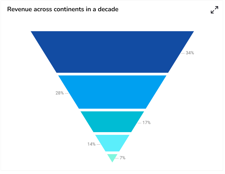
* **Show Percentage**: Enables the display of percentage values on the chart.
* **Series Colors**: Customizes the colors for different series in the funnel chart.
***

### **Tooltip**
Tooltips enhance user interaction by displaying additional information about chart elements.
* **Show Tool Tip**: Enable this option to display tooltips for the chart series, providing descriptions or data insights.
* Click the ***Show Tool Tip*** icon to access the ***Tool Tip Configuration*** window.
* Select the ***Default*** option.
* Click the ***Save*** option to display Tool Tip in the default display. 
* **Background Color**: Choose a background color for the tooltip to enhance visibility and match your visual theme.
* **Opacity**: Adjust the tooltip's transparency to ensure it doesn't obstruct important chart elements while remaining readable.
* **Border Color**: Select a border color that complements the tooltip, ensuring clarity and contrast against the chart background.
* **Tooltip Font Size**: Customize the font size to maintain readability, adapting it to the overall chart presentation.
* **Box Width**: Define the width of the tooltip box to ensure it fits the content appropriately and maintains a neat appearance.
* **Precision**: Set the numerical precision for data values displayed in the tooltip, aiding in clearer data interpretation.
* **Highlighter**: Toggle the highlighter to emphasize specific data points on the chart, drawing user attention to crucial information.

{% hint style="info" %}
*Please Note: To use the Custom option for the Tool Tip configuration, please refer to the* [***Tooltip (Default & Custom)***](/governed-dashboards-6/configurations/tooltip-default-and-custom.md) *page.*
{% endhint %}
### **Background**
* **Gradient Rotation**: Modify the angle of the gradient to achieve the desired effect.
* **Opacity**: Set the transparency level to balance visibility and aesthetics.
* **Gradient**: Choose and customize the gradient colors to match your theme.
* Click the ***Gradient*** icon to access the ***Background gradient colors*** dialog box.
* Click the ***Add Color*** option to add multiple colors.
* Click the **Save** option to apply the selected background colors. 
* **Border**: Add a border around the chart for a defined perimeter.
* **Border Color**: Alter the border color to complement or contrast with the chart.
* **Border Radius**: Round the corners of the chart border for a smoother look.
* **Shadow**: Enable shadows to create depth and a 3D-like effect.
* **Shadow Color**: Customize the shadow color to blend naturally with the chart.
* **Shadow Transparency**: Adjust the transparency level to control the intensity of the shadow effect.

### **Title**
* **Title Box Color**: Choose the background color for the title box.
* **Show Title Box**: Enable or disable the display of the title box on the chart.
* **Show Title**: Enable or disable the display of the title text.
* **Title Bar Height**: Set the height of the title bar.
* **Description**: Add a description text below the title.
* **Font Color**: Select the color of the title text.
* **Font Size**: Specify the size of the title text.
* **Font Style**: Choose a Font style using the drop-down menu (e.g., italic or normal).
* **Font Weight**: Set the weight (boldness) of the font. The supported options are Normal, Bold, 300, 600, and 900.
* **Font Family**: Choose the font family for the title text from the given choices.
* **Align**: Align the title text (e.g., left, center, right).
* **Text Decoration**: Apply text decorations (e.g., underline) to the title text.
* **Show Dataset Description**: Enable or disable the dataset description in the title.

{% hint style="info" %}
*Please Note: By enabling the **Show Dataset Description** option the Title will get added from the mapped dataset.*
{% endhint %}
### **Subtitle**
* **Show Sub Title**: Enable or disable the display of the sub-title text.
* **Description**: Add a description text below the sub-title.
* **Font Color**: Select the color of the sub-title text.
* **Font Size**: Specify the size of the sub-title text.
* **Font Style**: Choose the font style for the Sub-title (e.g., italic or normal).
* **Font Weight**: Set the weight (boldness) of the font. The supported options are Normal, Bold, 300, 600, and 900.
* **Font Family**: Choose the font family for the sub-title text from the given choices.
* **Align**: Align the sub-title text (e.g., left, center, right).
* **Text Decoration**: Apply text decorations (e.g., underline) to the sub-title text.

### **Legend**
* **Show Legend**: Toggle the visibility of the chart legend.
* **Font Color**: Choose the font color for the legend text.
* **Font Weight**: Determine the weight (boldness) of the legend text.
* **Font Size**: Specify the size of the font for the legend text.
* **Font Family**: Select the font family for the legend text.
* **Font Style**: Choose the font style (e.g., italic) for the legend text.
* **Text Decoration**: Add text decorations (e.g., underline) to the legend text.
* **Hide on Load**: Determine if the legend should be hidden when the chart initially loads.

### **Formatter**
* **Unit**: Define the unit of measurement for the values displayed in the chart.
* **Precision**: Set the number of decimal places to display for numerical values.
* **Currency**: Format the numbers as a currency with the appropriate symbol.
* **Position**: Determine the position of the formatted value (e.g., before or after the number).
* **Number Formatter**: Apply a specific notation or style to the numbers (e.g., Indian, International). 
### **Export Options**
* **Enable Context Menu**: Activate a right-click context menu for quick access to export options in the preview mode of the chart.
* **Export Excel**: Save the chart data in an Excel file format (.xlsx).
* **Export CSV**: Export the chart data into a CSV file format (.csv).
* **Export JPEG**: Export the chart as a JPEG image (.jpg).
* **Export PNG**: Export the chart as a PNG image (.png).
* **Export PPT**: Export the chart to a PowerPoint presentation (.pptx).
* **Export PDF**: Export the chart as a PDF document (.pdf).
* **Show Print**: Include an option to print the chart directly.
* **Export Heading**: Add a custom heading to the exported file.
* **Export Sub Heading**: Add a custom subheading to the exported file.
* **Export File Name**: Specify the file name for the exported file/dashboard.
* **Global Export Type**: Define the default export format using the drop-down (e.g., Screenshot, Tabular).

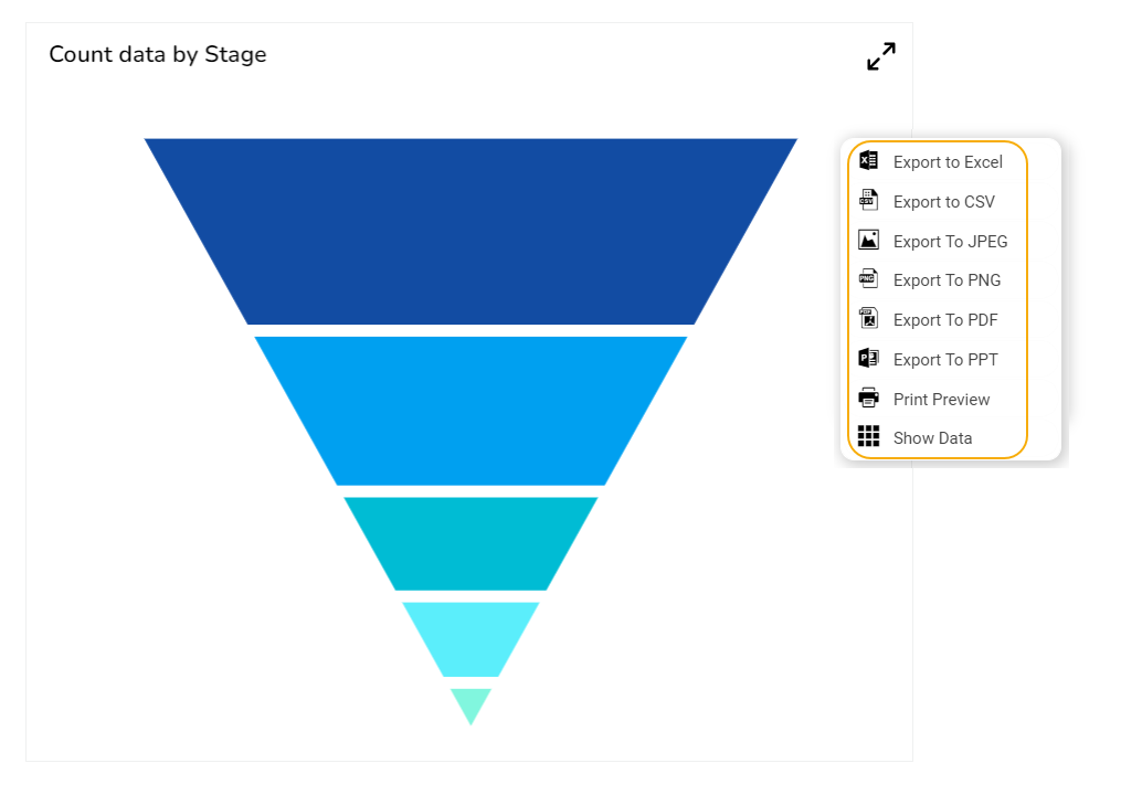
* The user can get the ***Export Context Menu*** from the preview mode to download the reports in different export formats.
Accessing the Export Context menu in the Preview mode
## **Different Variants of Funnel Chart**
### **Funnel with default options**
### **Funnel with Percentage Option**
## Sample Data
Download the given sample data and map it as mentioned below to plot your ***Funnel*** chart:
* Use the ***Stage*** column as a ***Category*** field, and the ***Count*** column as a ***Series** to plot data.*
{% file src="/files/y38iWpbHU1om2uTjEjLh" %}
{% hint style="info" %}
*Please Note: The Category field can be any data type line, string, or numeric. However, the Series fields can be only numeric data types.*
{% endhint %}