List
Check out the walk-through on how to use the List filter component in the Designer module.

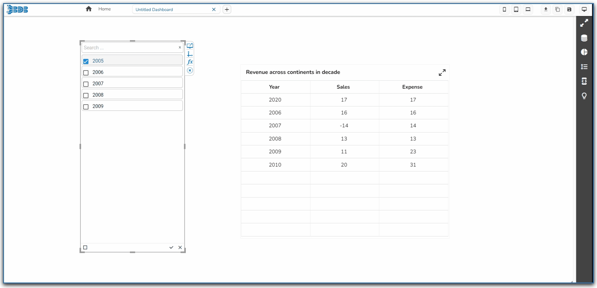
List is a component used to filter data. All available items are displayed as a list. Users can select multiple items simultaneously by holding the CTRL-key. Select items will determine the data that is displayed in any associated chart(s).
Default Component Image

Properties of the List Filter
Background
Background Color: Select the desired color for the component's background. This allows you to customize the visual look to match your design preferences.
Opacity: Adjust the transparency of the background color. A lower value makes the background more transparent, while a higher value makes it more opaque.
Shadow: Enable or disable the shadow effect on the component. This adds depth and contrast to the component's appearance.
Shadow Color: Choose the color for the shadow effect. This can be matched with your design aesthetics or contrast requirements.
Shadow Transparency: Control the transparency level of the shadow. Adjust this to blend the shadow with the background seamlessly or make it more pronounced.

General
Component Name: Assign a unique identifier to the component for easy reference within your design or code.
Show Search: Enable this to allow users to search within the list, enhancing usability for long lists.
Left, Top: Specify the position of the component on the screen by setting the Left and Top values.
Height, Width: Define the size dimensions of the component. Adjust these to fit your layout requirements.
Initial Visibility: Determine if the component should be visible initially. If disabled, the component will not appear until explicitly shown.
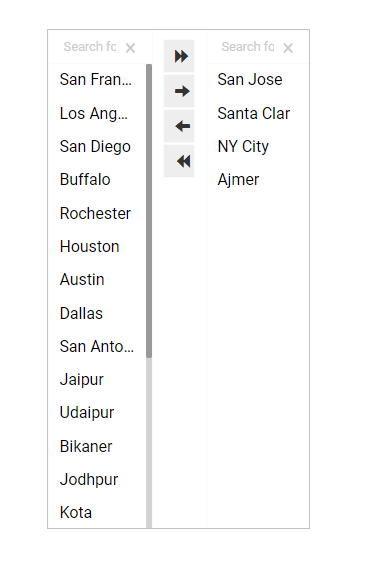
List Swap: Allow users to move items between lists, facilitating better management of selected values.
Multiple Selection: Enable this to allow users to select more than one item from the list at a time.
Row Height: Set the height of individual rows within the list, affecting overall list readability.
Action Bar Height: Define the height of the action bar, which may contain buttons for additional functionality.
Action Icons Color: Customize the color of icons within the action bar to match your design theme.
Selected Index: Specify an index to highlight a particular item by default when the list is initially presented.
Auto Update GV: Automatically update global variables when the list values change, ensuring data consistency.
Notify GV Update: Enable notifications for global variable updates, providing feedback when data changes occur.
Public Filter: Set this feature to allow public access or use of the filter, expanding its availability to multiple users.

Title
Title Box Color: Defines the background color of the title box.
Show Title Box: Toggles the visibility of the title box.
Show Title: Toggles the visibility of the title text.
Title Bar Height: Adjusts the height of the title bar.
Description: Allows for additional text under the title.
Font Color: Changes the color of the title text.
Font Size: Modifies the size of the title text.
Font Style: Sets the style of the title text (e.g., italic).
Font Weight: Controls the thickness of the title text (e.g., bold).
Font Family: Specifies the typeface for the title text.
Align: Adjusts the text alignment (e.g., left, center, right).
Text Decoration: Adds effects like underlining the text.

Style
The Style properties panel provides various fields to customize the appearance of the component:
Font Color: Sets the color of the text for clarity and aesthetic cohesion.
Font Size: Determines the size of the text, enabling readability adjustments.
Font Style: Offers style options such as italic or normal for text appearance.
Font Weight: Controls the thickness of the text, ranging from light to bold.
Font Family: Selects the typeface to align with branding or design preferences.
Chrome Color Opacity: Controls the transparency level of the chrome color, allowing more or less background visibility.
Chrome Color: Sets the color of the browser's interface elements surrounding the component.
Roll Over Color: Defines the color that appears when hovering over elements, enhancing interactive feedback.
Selection Color: Specifies the color used to highlight selected elements, making them visually distinct.
Selection Font Color: Determines the font color of selected text, ensuring readability against the selection color.
Border: Adjusts the thickness and style of the component's border, contributing to its visual outline.
Border Color: Sets the color of the component's border, influencing its contrast and aesthetic appeal.

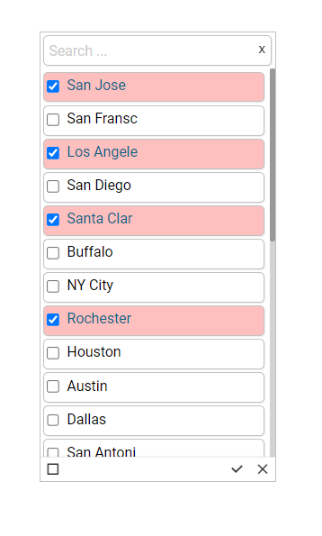
Modified List filter after changing its Properties
Last updated