Spider Chart
The Spider chart also known as the 'Radar chart' can plot values of each category along the axis that starts at the center of the chart and extends up to the end of the radius. It is a two-dimensional chart type designed to plot one or more series of values arranged in the form of spokes.
Check out the walk-through on how to use the Spider chart component in the Designer module.

Best Situations to Use a Spider chart
To analyze performance areas in an organization.
To compare allocated values and spending analysis in different departments.
Default Spider Chart Image

Properties of the Spider Chart
General
Component Name: Set a unique name for the component identification. This field contains an auto-generated name indicating the sequence of the component in the dashboard.
Left: The horizontal position of the chart on the interface.
Top: The vertical position of the chart on the interface.
Height: The chart's vertical dimension.
Width: The chart's horizontal dimension.
Initial Visibility: Determines if the chart is visible upon initial preview.
Max Button: Allows maximization of the chart if enabled.
Color From Drill: Adjusts the color scheme based on drilled data.
Points: Enable this option to plot the data points on the chart.
Chart Type: Choose between a Polygon and a Circle for the shape of the spider chart.
Web Type: Defines the web style between Fill and Stroke.
Axis Color: Sets the color of the chart's axes.
Actions: Custom actions that can be associated with the chart such as sorting, exporting, and displaying data in the tabular format will be listed in the preview mode of the chart.
Animation: Enables animated transitions for the chart.

Tooltip
Show Tool Tip: The user can show the series description and get the tooltip by clicking the Show Tool Tip option.
The Tool Tip Configuration window opens.
Select any Tool Tip option. The supported Tool Tip options are None and Default.
Click the Save option.

Background Color: Set the background color for the tooltip box to enhance readability.
Opacity: Adjust the transparency level of the tooltip background.
Border Color: Define the color of the border surrounding the tooltip box.
Tooltip Font Size: Specify the font size for the text displayed in the tooltip.
Box Width: Determine the width of the tooltip box for optimal presentation.
Precision: Set the number of decimal places to show in the tooltip for numerical values.
Highlighter: Toggle the highlighter to emphasize specific data points on the chart, drawing user attention to crucial information.

Please Note: To use the Custom option for the Tool Tip configuration, please refer to the Tooltip (Default & Custom) page.
Background
Gradient Rotation: Adjust the angle of the gradient applied to the background, allowing for a dynamic visual transition between colors.
Opacity: Set the transparency level of the background, ranging from fully opaque to completely transparent.
Gradient: Enable or disable gradient colors in the background for depth and visual appeal.
Click the Gradient icon to access the Background gradient colors dialog box.
Click the Add Color option to add multiple colors.
Click the Save option to apply the selected background colors.

Border: Define the width of the border surrounding the pyramid chart.
Border Color: Select the color for the chart's border, enhancing its visibility and aesthetics.
Border Radius: Round the corners of the chart's border for a softer, more modern appearance.
Shadow: Enable a shadow effect for the background to add dimension and focus to the chart.
Shadow Color: Choose the color of the shadow cast by the chart background.
Shadow Transparency: Adjust the transparency level of the shadow to control its prominence and intensity.

Title
Title Box Color: Choose the background color for the title box.
Show Title Box: Enable or disable the display of the title box on the chart.
Show Title: Enable or disable the display of the title text.
Title Bar Height: Set the height of the title bar.
Description: Add the title text.
Font Color: Select the color of the title text.
Font Size: Specify the size of the title text.
Font Style: Choose the font style (e.g., italic or normal).
Font Weight: Set the weight (boldness) of the font. The supported options are Normal, Bold, 300, 600, and 900.
Font Family: Choose the font family for the title text from the given choices.
Align: Align the title text (e.g., left, center, right).
Text Decoration: Apply text decorations (e.g., underline) to the title text.
Show Dataset Description: Enable or disable the dataset description in the title.

Please Note: The Title will be added from the mapped dataset by enabling the Show Dataset Description option.
Sub Title
The user can customize the Subtitle properties which include:
Show Subtitle: Toggle this option to display or hide the subtitle.
Description: Add a custom description for the subtitle.
Font Color: Change the color of the subtitle text.
Font Size: Adjust the size of the subtitle text.
Font Style: Apply styles such as italics to the subtitle.
Font Weight: Modify the thickness of the subtitle text, e.g., bold.
Font Family: Select the font type for the subtitle.
Align: Align the subtitle text (left, center, or right).
Text Decoration: Add elements like underline or overline to the subtitle text.

Legend
The users can enable the internal legend if they want to show it and customize the font size, color, style, etc. for the enabled legend.
Show Legend: Toggle the visibility of the chart legend.
Font Color: Choose the font color for the legend text.
Font Weight: Determine the weight (boldness) of the legend text.
Font Size: Specify the size of the font for the legend text.
Font Family: Select the font family for the legend text.
Font Style: Choose the font style (e.g., italic) for the legend text.
Text Decoration: Add text decorations (e.g., underline) to the legend text.
Hide on Load: Determine if the legend should be hidden when the chart initially loads.

Formatter
Unit: Define the unit of measurement for the values displayed in the chart.
Precision: Set the number of decimal places to display for numerical values.
Currency: Format the numbers as a currency with the appropriate symbol.
Position: Determine the position of the formatted value (e.g., Prefix or Suffix).
Number Formatter: Apply a specific notation or style to the numbers (e.g., Indian, International).

Axis Labels
Font Color: Choose the color for the axis labels to enhance visibility and match the design theme.
Font Size: Set the font size of the axis labels to ensure readability.
Font Style: Select styles like italic or normal to give a distinct appearance to the axis labels.
Font Weight: Adjust the thickness of the text by choosing options like light, regular, or bold for emphasis.
Font Family: Choose the typeface to maintain consistency with the overall design and branding.

Export Options
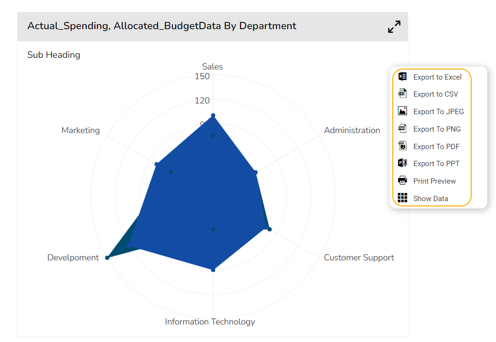
Enable Context Menu: Activate a right-click context menu for quick access to export options in the preview mode of the chart.
Export Excel: Save the chart data in an Excel file format (.xlsx).
Export CSV: Export the chart data into a CSV file format (.csv).
Export JPEG: Export the chart as a JPEG image (.jpg).
Export PNG: Export the chart as a PNG image (.png).
Export PPT: Export the chart to a PowerPoint presentation (.pptx).
Export PDF: Export the chart as a PDF document (.pdf).
Show Print: Include an option to print the chart directly.
Export Heading: Add a custom heading to the exported file.
Export Sub Heading: Add a custom subheading to the exported file.
Export File Name: Specify the file name for the exported file/dashboard.
Global Export Type: Define the default export format using the drop-down (e.g., Screenshot, Tabular).

The user can get the Export Context Menu from the preview mode to download the reports in different export formats.
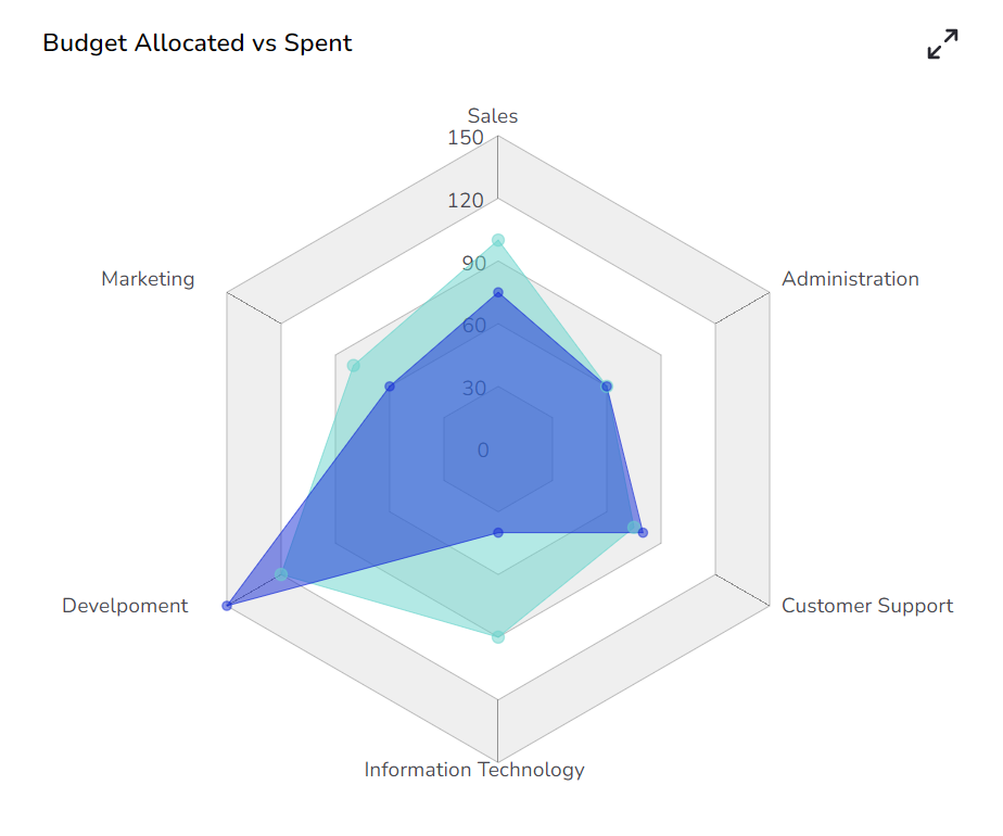
Different Variants of Spider Charts
Spider chart with Polygon Chart type and Web type Fill
Spider chart with Circle Chart type and Web type Stroke
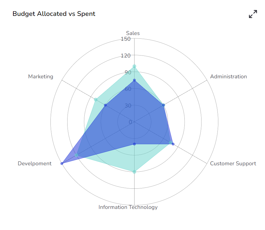
Please Note: The user needs to set the opacity for the series field to approximately 0.5 to get the proper plotting of the selected data.
Sample Data
Download the given sample data and map it as mentioned below to plot your Spider Plot chart.
Select the Department column as a Category field and Allocated_Budget as well as Actual_Spending columns as Series fields to plot the data.
Last updated