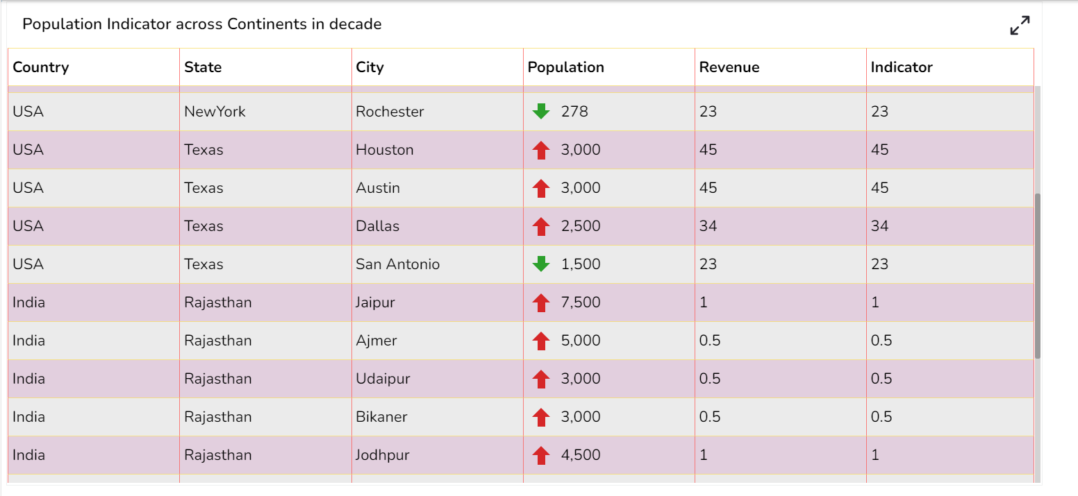
Data Grid
The Data Grid component is used to represent data in tabular form. Data Grid is also known as 'Grid View' as the data will be displayed within a grid.
Best Situation to Use Data Grid
To view data in numerical format.
To show alerts.
Default Data Grid Chart Image

Properties of the Data Grid Chart
General
Component Name: This field allows users to assign a unique name to the data grid component for easy identification and reference.
Left: Sets the horizontal position of the data grid component on the canvas.
Top: Sets the vertical position of the data grid component on the canvas.
Height: Adjusts the height of the data grid to fit the desired display area.
Width: Adjusts the width of the data grid to fit the desired display area.
Initial Visibility: Enable to ensure the Grid chart appears during the initial preview.
Max Button: Allows users to maximize the data grid view for better visualization and interaction.
Fit Columns: Automatically adjust the column sizes to fit the content by placing a checkmark.
Column Rearrange: Permits rearrangement of columns within the data grid for custom orders as per user preference.
Scroll View: Users can enable or disable this to manage the inclusion of scroll bars; 'Disable' is the default setting.

Check out the given illustration on how to use the Column Rearrange property in the Data Grid.
Background
Gradient Rotation: Modify the angle of the gradient to achieve the desired effect.
Opacity: Set the transparency level to balance visibility and aesthetics.
Gradient: Choose and customize the gradient colors to match your theme.
Click the Gradient icon to access the Background gradient colors dialog box.
Click the Add Color option to add multiple colors.
Click the Save option to apply the selected background colors.

Border: Add a border around the chart for a defined perimeter.
Border Color: Alter the border color to complement or contrast with the chart.
Border Radius: Round the corners of the chart border for a smoother look.
Shadow: Enable shadows to create depth and a 3D-like effect.
Shadow Color: Customize the shadow color to blend naturally with the chart.
Shadow Transparency: Adjust the transparency level to control the intensity of the shadow effect.

Title
Title Box Color: Set the color of the title box to complement your chart's overall design.
Show Title Box: Toggle this option to display or hide the title box around the title text.
Show Title: Enable or disable the title visibility on your chart.
Title Bar Height: Adjust the title bar height to fit your design specifications.
Description: Provide an additional description for the chart title to offer more context.
Font Color: Choose the font color for the title to ensure readability and match your theme.
Font Size: Set the title's font size for optimal visibility and aesthetics.
Font Style: Select the font style (e.g., italic, bold) to enhance the title's appearance.
Font Weight: Modify the font weight to make the title text lighter or bolder.
Font Family: Pick a font family that aligns with your design theme for the title.
Align: Align the title text to the left, center, or right according to your layout needs.
Text Decoration: Apply text decorations to the title for emphasis (E.g., Underline).
Show Dataset Description: Enable or disable the dataset description in the title.

Subtitle
Show Sub Title: Enable or disable the display of the sub-title text.
Description: Add a description text below the sub-title.
Font Color: Select the color of the sub-title text.
Font Size: Specify the size of the sub-title text.
Font Style: Choose the font style for the Sub-title (e.g., italic or normal).
Font Weight: Set the weight (boldness) of the font. The supported options are Normal, Bold, 300, 600, and 900.
Font Family: Choose the font family for the sub-title text from the given choices.
Align: Align the sub-title text (e.g., left, center, right).
Text Decoration: Apply text decorations (e.g., underline) to the sub-title text.

Header Style
The Header Style section allows for customization of the header in your design. You can modify the following fields:
Header Text Color: Set the color of the header text to align with your theme.
Font Size: Define the text size in the header for visibility and emphasis.
Font Style: Choose a style such as italic or normal to enhance the header's appearance.
Font Weight: Set the weight (boldness) of the font. The supported options are Normal, Bold, 300, 600, and 900.
Font Family: Select a font family for the header that complements your overall design.
Use Field Color: Enable this option to apply a specific field color to the header background.
Background Color: Change the header's background color to match or contrast with the text.
Text Decoration: Apply decorative elements like Underline to the header text for additional styling.

Access Check Boxes for the Multi-selection of the Rows
Enable the Show Checkbox property from the General section and provide the "allowmultipleselection = true" in the Dashboard script to avail the checkboxes in the preview mode of the Data Grid.
Check out the given illustration on accessing checkboxes for the multi-selection of the Grid Rows.
Row Style
Font Color: This property allows users to change the color of the text within a row, enabling better visibility and alignment with design aesthetics.
Font Size: Adjusts the size of the text, enhancing readability and fitting within the design requirements.
Font Style: Offers options such as italic or normal, providing stylistic flexibility for the text within the data grid.
Font Weight: Controls the thickness of the text, from normal to bold, helping users emphasize specific data points.
Font Family: Allows selection of different font families, ensuring the grid text aligns with overall design standards.
Text Decoration: Includes options such as underline, overline, or line-through, offering additional stylistic choices for the text.
Text Wrap: Enables text to wrap within the cell, ensuring complete visibility without affecting the row width.
Row Height: Users can increase or decrease the height of rows to accommodate more content or improve the grid's appearance.

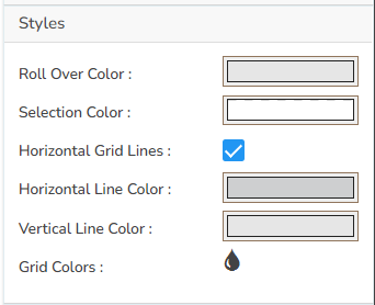
Styles
The users can set various display styles for the data grid using these fields.
Roll Over Color: The Roll Over Color property allows customization of the color change when a user hovers over an interface element. This provides visual feedback and helps highlight interactive components.
Selection Color: The Selection Color property determines the color displayed when an element or text is selected. It helps distinguish the selected items from the rest, facilitating easier navigation and interaction.
Horizontal Grid Lines: The Horizontal Grid Lines property allows users to enable or disable horizontal lines across the interface. These lines can aid in aligning and organizing content effectively, and their color can be customized to blend with the overall design.
Horizontal Line Color: The Horizontal Line Color refers to the color of the horizontal grid lines that can be displayed across the interface. This color can be customized to fit the design palette of the application seamlessly.
Vertical Line Color: The Vertical Line Color is the color assigned to the vertical grid lines. Users can adjust this color to help differentiate vertical separations on the interface, enhancing visual organization.
Grid Colors: Grid Colors encompass horizontal and vertical line colors, offering comprehensive customization options for both components. Adjusting these colors allows users to create a coordinated look that complements the interface design.
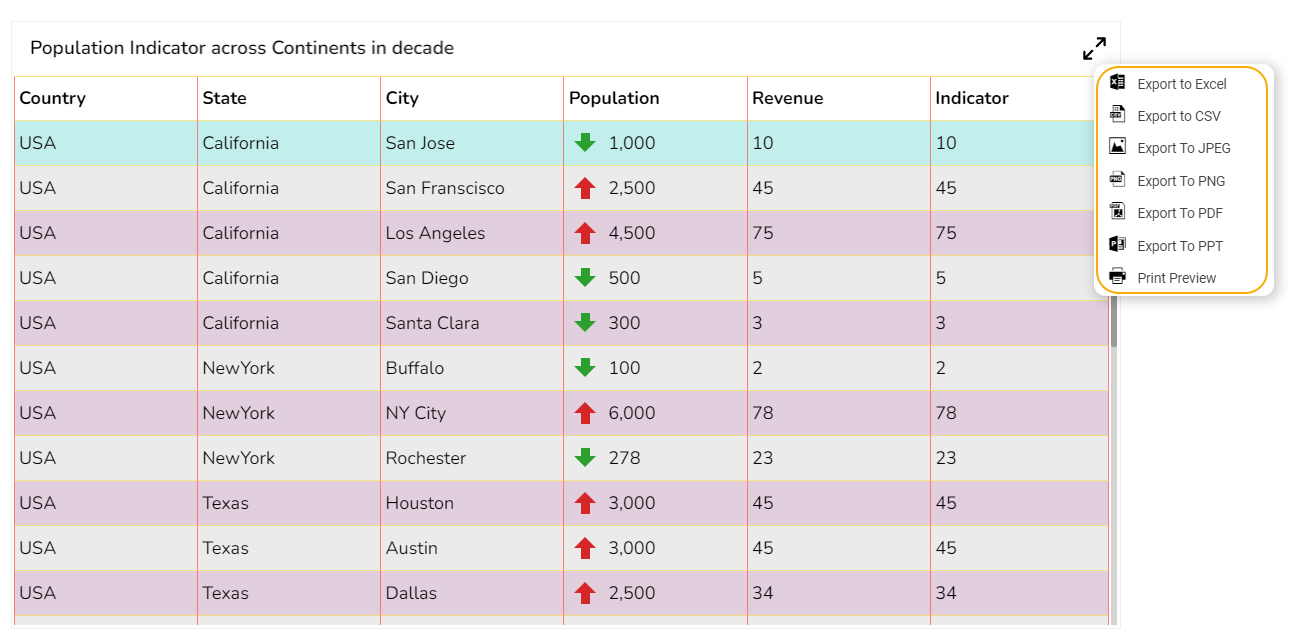
Export Options
Enable Context Menu: Activate a right-click context menu for quick access to export options in the preview mode of the chart.
Export Excel: Save the chart data in an Excel file format (.xlsx).
Export CSV: Export the chart data into a CSV file format (.csv).
Export JPEG: Export the chart as a JPEG image (.jpg).
Export PNG: Export the chart as a PNG image (.png).
Export PPT: Export the chart to a PowerPoint presentation (.pptx).
Export PDF: Export the chart as a PDF document (.pdf).
Show Print: Include an option to print the chart directly.
Export Heading: Add a custom heading to the exported file.
Export Sub Heading: Add a custom subheading to the exported file.
Export File Name: Specify the file name for the exported file/dashboard.
Global Export Type: Define the default export format using the drop-down (e.g., Screenshot, Tabular).

The user can get the Export Context Menu from the preview mode to download the reports in different export formats.
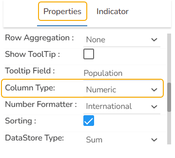
Properties Tab from the Dataset Pallet


Data Grid after changing the Properties
Supported Date-Time Formats
The Data Grid component supports the date columns with the following types of date-time formats:
a. YYYY-MM-DD HH:MM:SS
b. MM/DD/YYYY HH:MM:SS
c. DD-MM-YYYY HH:MM:SS
d. ISO 8601 format (e.g., 2023-08-23T14:30:00Z)
e. Time formats such as 12-hour and 24-hour clocks (HH:MM)
Check out the illustration displaying the support for the various date-time formats inside the Data Grid component.
Please Note:
The user needs to select the Column Type as Numeric for the selected Data Grid fields using the Properties tab provided for the Dataset, to make it responsive to the changes that the user sets using the Indicator tab.
Refer to the Alerts in Grids page under the Configurations section to understand how to insert Alerts in a Grid component.
Last updated