Pyramid Chart
Check out the walk-through on how to use the Pyramid chart component in the Designer module.

Pyramid charts are used when items need to be shown in a hierarchical structure. Generally, the chart will be a triangle sliced into no. of parts. The items and topics will be represented in a progressive order based on quantity and size.
Best Situations to Use a Pyramid Chart
Hierarchical Breakdown
To represent levels of hierarchy in an organization or a process.
Variations of this Chart
Inverted Funnel Chart & Funnel Chart: This is just a reversed format of the Pyramid chart.
Default Chart Image

Properties of the Pyramid Chart
General
Component Name: Set a unique name for the component identification. This field contains an auto-generated name indicating the sequence of the component in the dashboard.
Left: Adjust the horizontal positioning of the chart on the canvas.
Top: Set the vertical positioning of the chart from the top edge.
Height: Determine the height of the chart in the layout.
Width: Specify the width of the chart to resize it accordingly.
Initial Visibility: Control whether the chart is visible when the page loads.
Max Button: Enable a button to maximize the chart's view.
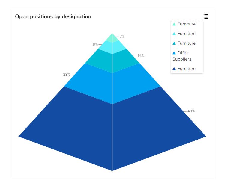
Show Percentage: Display the percentage of each segment in the pyramid chart.
Series Colors: Customize the colors used for different series within the chart to enhance visual distinction.

Background
Gradient Rotation: Adjust the angle of the gradient applied to the background, allowing for a dynamic visual transition between colors.
Opacity: Set the transparency level of the background, ranging from fully opaque to completely transparent.
Gradient: Enable or disable gradient colors in the background for depth and visual appeal.
Click the Gradient icon to access the Background gradient colors dialog box.
Click the Add Color option to add multiple colors.
Click the Save option to apply the selected background colors.

Border: Define the width of the border surrounding the pyramid chart.
Border Color: Select the color for the chart's border, enhancing its visibility and aesthetics.
Border Radius: Round the corners of the chart's border for a softer, more modern appearance.
Shadow: Enable a shadow effect for the background to add dimension and focus to the chart.
Shadow Color: Choose the color of the shadow cast by the chart background.
Shadow Transparency: Adjust the transparency level of the shadow to control its prominence and intensity.

Tooltip
Show Tool Tip: The user can show the series description and get the tooltip by clicking the Show Tool Tip option.
The Tool Tip Configuration window opens.
Select any Tool Tip option. The supported Tool Tip options are None and Default.
Click the Save option.

Background Color: Set the background color for the tooltip box to enhance readability.
Opacity: Adjust the transparency level of the tooltip background.
Border Color: Define the color of the border surrounding the tooltip box.
Tooltip Font Size: Specify the font size for the text displayed in the tooltip.
Box Width: Determine the width of the tooltip box for optimal presentation.
Precision: Set the number of decimal places to show in the tooltip for numerical values.
Highlighter: Use color indicators to highlight specific bars or data points within the tooltip, facilitating quick visual recognition.

Title
Title Box Color: Choose the background color for the title box.
Show Title Box: Enable or disable the display of the title box on the chart.
Show Title: Enable or disable the display of the title text.
Title Bar Height: Set the height of the title bar.
Description: Add the title text.
Font Color: Select the color of the title text.
Font Size: Specify the size of the title text.
Font Style: Choose the font style (e.g., italic or normal).
Font Weight: Set the weight (boldness) of the font. The supported options are Normal, Bold, 300, 600, and 900.
Font Family: Choose the font family for the title text from the given choices.
Align: Align the title text (e.g., left, center, right).
Text Decoration: Apply text decorations (e.g., underline) to the title text.
Show Dataset Description: Enable or disable the dataset description in the title.

Please Note: The Title will be added from the mapped dataset by enabling the Show Dataset Description option.
Subtitle
The user can customize the Subtitle properties which include:
Show Subtitle: Toggle this option to display or hide the subtitle.
Description: Add a custom description for the subtitle.
Font Color: Change the color of the subtitle text.
Font Size: Adjust the size of the subtitle text.
Font Style: Apply styles such as italics to the subtitle.
Font Weight: Modify the thickness of the subtitle text, e.g., bold.
Font Family: Select the font type for the subtitle.
Align: Align the subtitle text (left, center, or right).
Text Decoration: Add elements like underline or overline to the subtitle text.

Legend
Show Legend: Toggle the visibility of the chart legend.
Font Color: Choose the font color for the legend text.
Font Weight: Determine the weight (boldness) of the legend text.
Font Size: Specify the size of the font for the legend text.
Font Family: Select the font family for the legend text.
Font Style: Choose the font style (e.g., italic) for the legend text.
Text Decoration: Add text decorations (e.g., underline) to the legend text.
Hide on Load: Determine if the legend should be hidden when the chart initially loads.

Formatter
Unit: Specify the unit of measuring currency represented on the chart.
Precision: Define the number of decimal places to be displayed for numerical values to ensure accuracy and consistency.
Currency: Set the currency type for monetary values, allowing for consistent financial data representation.
Position: Determine the placement of the formatted value about the axis or chart element, such as Prefix or Suffix.
Number Formatter: Customize how numbers are displayed (International or Indian).

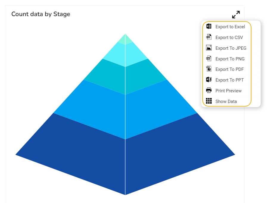
Export Options
The Export Options section allows users to easily export their chart data in various formats for reporting and presentation purposes. This feature supports seamless integration with common applications and file types.
Enable Context Menu: Activates a context menu on the chart, providing quick access to export functions directly from the chart interface.
Export Excel: Allows the data to be exported as an Excel file, suitable for further analysis or sharing in a tabular format.
Export CSV: Exports data in CSV format, ideal for importing into databases or other data processing tools.
Export JPEG: This option allows exporting the chart as a JPEG image to create static visual representations.
Export PNG: Similar to JPEG, but offers a lossless export option in PNG format for clearer image quality in visual presentations.
Export PPT: Facilitates exporting the chart directly into a PowerPoint file, streamlining the process of incorporating charts into slideshows.
Export PDF: Enables exporting the chart and its data in PDF format, which is suitable for creating shareable and print-ready documents.
Show Print: Displays a print button on the chart, allowing users to print the chart directly from the application.
Export Heading: Customizes the heading title for exported files, ensuring clarity and context when distributing chart data.
Export Sub Heading: Adds a secondary title or description to exported files, providing additional context or information.
Export File Name: Allows customization of the file name for the exported data, ensuring easy identification and organization.
Global Export Type: Sets a default export format for all charts, streamlining the export process across multiple datasets.

The user can get the Export Context Menu from the preview mode to download the reports in different export formats.
Pyramid Timeline chart by changing the Properties
Sample Data
Download the given sample data and map it as mentioned below to plot your Pyramid chart.
Use the Stage column as the Category field, and the Count column as the Series field to plot data.
Last updated