Mixed Chart
Check out the walk-through on how to use the Mixed chart component in the Designer module.

The mixed chart is a combination of a Line chart and a Column chart. It can plot a 3-series of data on the chart. Mainly used to emphasize a different series of information on the chart.
Best Situations to Use a Mixed Chart
To compare multiple categories Example: To analyze the company's budget v/s revenue.
Variations of this chart
Use stacked Column charts: Where multiple categories can be clubbed together on top of each other which makes addressing multiple questions easier.
Use columns side by side: Where comparison between multiple categories becomes easier instead of toggling between charts and data.
Add color for quick insight: Where displaying columns with colors will make users pay quick attention to important tasks.
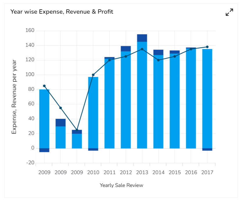
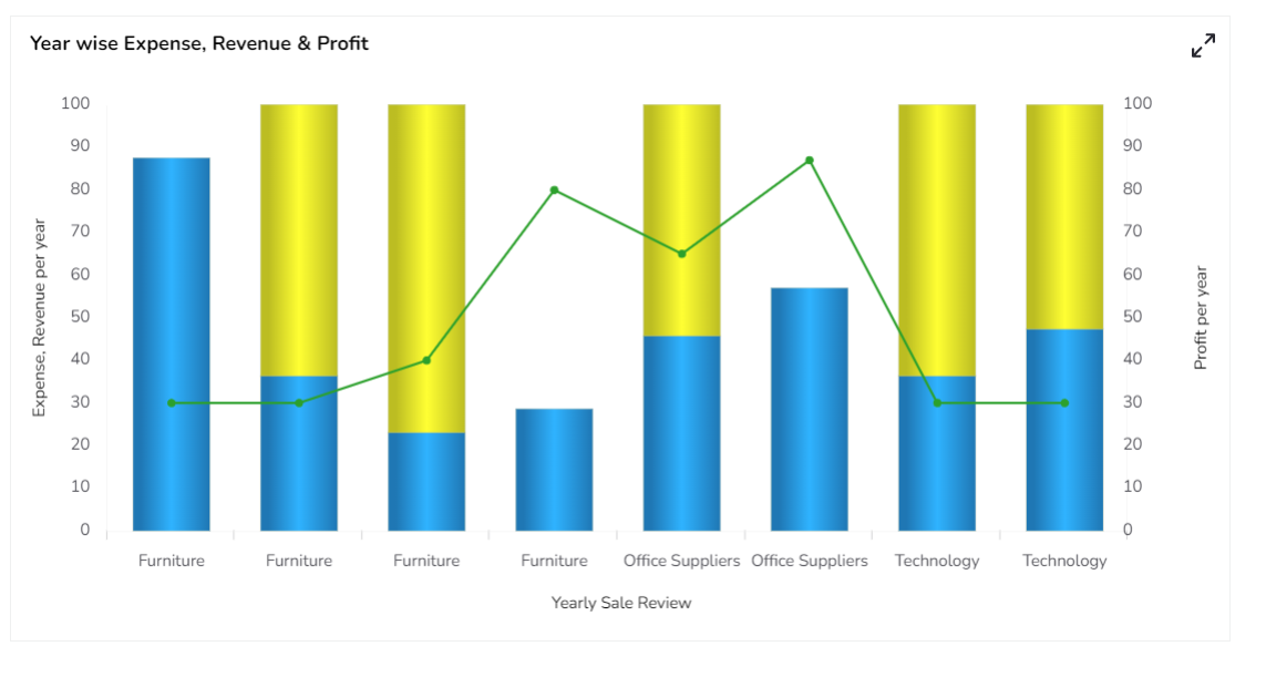
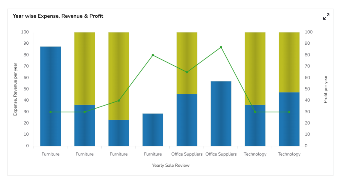
Default Mixed Chart Image

Properties of the Mixed chart
General
The Mixed chart offers a versatile way to represent data visually with the following configurable properties:
Component Name: Set a unique name for the component identification. This field contains an auto-generated name indicating the sequence of the component in the dashboard.
Left: Adjust this setting to position the chart horizontally on the canvas, ensuring it fits within your desired layout.
Top: Controls the vertical placement of the chart on the canvas, allowing for precise alignment with other components.
Height: Dictate the overall height of the chart, enabling you to tailor its size to match the visual context of your presentation.
Width: Modify this property to set the desired width of the chart, accommodating different amounts of data and emphasizing clarity.
Initial Visibility: Toggle this option to define whether the chart should be visible immediately upon display, aiding in managing viewability upon screen load.
Max Button: Includes an option to maximize the chart view, providing users with a focused layout for more detailed analysis.
Color From Drill: Activates color coding when drilling down within the data, offering a visual cue to assist in data navigation.
Points: Enable this feature to display distinct points on the chart's lines, highlighting specific data intervals or events.
Base Type: Choose the foundational chart type around which the mixed chart is built, determining the primary display format.
Chart Type: Select between different chart representations to best portray the data. Choose from Stacked, Clustered, Overlaid, and 100%.
Line Form: Offers a selector to decide on the line type for your chart, with options such as Curve or Segment to match the data trend.
Bar Size: Specify the dimensions of the bars in your chart, balancing between comprehensive display and clarity.
Each of these properties offers a degree of customization, enabling you to tailor the Mixed chart to best fit your presentation needs and aesthetic considerations.

Threshold Settings
Threshold properties allow users to set visual indicators within the Mixed chart to highlight specific data ranges. By configuring these properties, you can enhance data interpretation and visualization.
Show Threshold Line: Enable this to draw lines at threshold values, helping users identify critical data points at a glance.
Threshold 1: Define the upper-value limit, serving as the maximum critical point in the dataset.
Threshold 2: Specify the lower value limit, indicating the minimum important point for analysis.
Fill Threshold: Opt to fill the area between the threshold lines with color to emphasize this range.
Fill Color: Select the color used for filling the threshold area, ensuring it contrasts well for easy visibility.

Preview: Click the Preview icon to preview the updated Mixed chart. Check the updated mixed chart to verify that the threshold lines are correctly displayed. Adjust as necessary.

Displaying Fill Threshold in a Mixed chart
Access the Threshold Settings section using the Mixed chart properties.

Put a checkmark in the Show Threshold Line option.
Set the Threshold 1 and Threshold 2 values.
Put a checkmark in the given box to fill the threshold.
Click the Fill Colors icon.

The Threshold Fill window opens.
You may configure or modify the default information for the following options:
Level
Color
Opacity
Label
Label Color
Click the Save option to save the inserted details.

Preview: Click the Preview icon to preview the updated Mixed chart. Check the updated mixed chart to verify that the threshold lines are correctly displayed. Adjust as necessary.

Please Note: Click the Cancel option to remove the inserted details.
Annotation Settings
Annotation lines in a chart are used to highlight specific points or thresholds for easier analysis and interpretation. They typically represent key events, milestones, or significant values that help provide context or draw attention to important aspects of the data. Annotation Settings allow users to annotate important dates in a chart.
Steps to configure the Annotation Settings:
Open Annotation Settings: Go to the Mixed Chart Properties and locate the Annotation Settings section. Open it with a click.

Configure Annotation: By providing the following information.
Annotations: Put a checkmark in the given checkbox to enable the Annotations.
Manage Annotation: Click the Manage Annotation
 icon to manage the Annotation Dataset by setting Connection, Label Field, and Annotation Field.
Click the Save option to save the mapped Annotation details.
Click the Reset option to reset the filled information.

Line Color: Select a color for the annotation lines.
Dash Line: Put a checkmark in the checkbox to draw lines with a dash pattern.
Line Width: Set the width of the annotation lines.
Line Opacity: Set the opacity of the annotation lines.
Tooltip Title: Provide a title to be displayed in the tooltip.

Preview: Click the Preview icon to ensure the annotation appears correctly.

The user can make any necessary adjustments by re-opening the Annotation Settings.
Select a color for the annotation lines using the color menu and enable Dashlines.

Open the preview, the color of the annotation lines will be updated based on your selection in the chart.

Please Note: Annotation mapping can be done with only CSV and Excel data.
Tooltip
The tooltip properties allow customization of the information displayed when hovering over chart elements:
The user can show the series description and get the tooltip by clicking the Show Tool Tip option.
The Tool Tip Configuration window opens.
Select any Tool Tip option. The supported Tool Tip is None, Default, Custom.
Put a checkmark in the box to enable the component formatter.
Click the Save option.

The user can show the series description and get the tooltip by clicking the Show Tool Tip option.
The Tool Tip Configuration window opens.
Select any Tool Tip option. The supported Tool Tip is None, Default, Custom.
Click the Save option.
Background Color: Choose the background color of the tooltip.
Opacity: Adjust the transparency level of the tooltip background.
Border Color: Select the border color for the tooltip box.
Tooltip Font Size: Customize the font size of the tooltip text.
Box Width: Modify the width of the tooltip box.
Precision: Set the number of decimal places shown in the tooltip.
Highlighter: Enable highlighting of data points when hovering over them.

Please Note: To use the Custom option for the Tool Tip configuration, please refer to the Tooltip (Default & Custom) page.
Background
The background properties offer customization for the chart's appearance:
Gradient Rotation: Adjust the angle of the gradient color applied to the chart background.
Opacity: Control the overall transparency level of the chart background.
Gradient: Enable or disable the use of gradient colors for the chart background. By clicking the gradient option, a Background gradient colors window opens to add more colors.
Click the Gradient icon to access the Background gradient colors dialog box.
Click the Add Color option to add multiple colors.
Click the Save option to apply the selected background colors.

Border: Add a border around the chart for a defined perimeter.
Border Color: Select the color of the chart border.
Border Radius: Set the roundness of the chart border corners.
Shadow: Enable or disable the drop shadow effect for the chart.
Shadow Color: Choose the color of the shadow effect.
Shadow Transparency: Adjust the transparency level of the shadow effect.

Title
Title Box Color: Choose the background color for the title box.
Show Title Box: Enable or disable the display of the title box on the chart.
Show Title: Enable or disable the display of the title text.
Title Bar Height: Set the height of the title bar.
Description: Add a description text below the title.
Font Color: Select the color of the title text.
Font Size: Specify the size of the title text.
Font Style: Choose the font style (e.g., italic or normal).
Font Weight: Set the weight (boldness) of the font. The supported options are Normal, Bold, 300, 600, and 900.
Font Family: Choose the font family for the title text from the given choices.
Align: Align the title text (e.g., left, center, right).
Text Decoration: Apply text decorations (e.g., underline) to the title text.
Show Dataset Description: Enable or disable the dataset description in the title.

Please Note: By enabling the Show Dataset Description option the Title will get added from the mapped dataset.
Subtitle
Show Sub Title: Enable or disable the display of the subtitle text.
Description: Add descriptive text below the subtitle.
Font Color: Choose the color for the subtitle text.
Font Size: Set the size of the subtitle text.
Font Style: Select the style of the subtitle text (e.g., italic or normal).
Font Weight: Define the weight (boldness) of the subtitle font, with options such as Normal, Bold, 300, 600, and 900.
Font Family: Choose the font family for the subtitle text from the available options.
Align: Align the subtitle text (e.g., left, center, right).
Text Decoration: Apply decorations, such as underlining, to the subtitle text.

X-Axis
Show X-Axis Line: Enable or disable the visibility of the X-Axis line.
X-Axis Line Color: Select the color for the X-Axis line.
Label Font Color: Choose the color for the labels on the X-Axis.
Label Font Size: Set the font size of the X-Axis labels.
Label Font Style: Choose the style for the label text (e.g., italic or normal) on the X-Axis.
Label Font Weight: Define the boldness of the label text on the X-Axis, with options such as Normal, Bold, 300, 600, and 900.
Label Font Family: Select the font family for the X-Axis labels.
Label Decoration: Apply text decorations, such as underlining, to the X-Axis labels.
Label Rotation: Set the rotation angle for the X-Axis labels.
Tilted Label: Enable or disable tilted label orientation on the X-Axis.
Description: Add descriptive text related to the X-Axis.
Font Color: Choose the color for the additional description text on the X-Axis.
Font: Select the font family for the description text.
Size: Adjust the size of the description text related to the X-Axis.
Font Style: Choose the style for the description text (e.g., italic or normal).
Font Weight: Specify the boldness of the description text, with options such as Normal, Bold, 300, 600, and 900.
Font Family: Choose the font family for the description text on the X-Axis.
Text Decoration: Apply decorations, such as underlining, to the description text.
Category Tick Marks: Define the appearance of tick marks on the X-Axis for categories.
Marker Color: Select the color for markers on the X-Axis.
Show Dataset Description: Enable or disable the display of additional dataset descriptions on the X-Axis.

Y-Axis
Show Y-Axis Line: Enable or disable the visibility of the Y-Axis line.
Y-Axis Line Color: Select the color for the Y-Axis line.
Label Font Color: Choose the color for the labels on the Y-axis.
Label Font Size: Set the font size for the Y-Axis labels.
Label Font Style: Choose the style for the label text (e.g., italic or normal) on the Y-Axis.
Label Font Weight: Define the boldness of the label text on the Y-Axis, with options such as Normal, Bold, 300, 600, and 900.
Label Font Family: Select the font family for the Y-Axis labels.
Label Decoration: Apply text decorations, such as underlining, to the Y-Axis labels.
Description: Provide descriptive text related to the Y-Axis.
Font Color: Choose the color for the additional description text on the Y-Axis.
Font Size: Adjust the size of the description text related to the Y-axis.
Font Style: Choose the style for the description text (e.g., italic or normal).
Font Weight: Specify the boldness of the description text with various options.
Font Family: Choose the font family for the description text on the Y-Axis.
Text Decoration: Apply decorations, such as underlining, to the description text.
Show Dataset Description: Enable or disable the display of dataset descriptions on the Y-axis.

Legend
Show Legend: Toggle the visibility of the legend in the chart.
Font Color: Select the color of the text in the legend.
Font Weight: Determine the boldness of the legend text, offering options such as normal, bold, or numerical values like 300 or 600.
Font Size: Set the size of the text displayed in the legend.
Font Family: Choose the font family for the legend text.
Font Style: Decide the style of the legend text, such as italic or normal.
Text Decoration: Apply text decorations, like underlining, to the legend text.
Hide on Load: Choose whether the legend will be initially hidden upon loading the chart.

Formatter
Unit: Specify the unit of measuring currency represented on the chart.
Precision: Define the number of decimal places to be displayed for numerical values to ensure accuracy and consistency.
Currency: Set the currency type for monetary values, allowing for consistent representation of financial data.
Position: Determine the placement of the formatted value about the axis or chart element, such as Prefix or Suffix.
Number Formatter: Customize how numbers are displayed (International or Indian).

Second Axis
The Second Axis provides enhanced control over your chart's data representation, allowing for dual-axis plotting and refined customization.
Second Axis: Put a checkmark in the box to get the Second Axis.
Unit: Specify the unit of measurement for data values on the second axis, ensuring clarity.
Precision: Set the number of decimal places for values on the second axis to maintain accuracy.
Currency: Define the currency type for monetary values, ensuring consistent financial representation.
Position: Choose how the values appear about the axis (as a Prefix or Suffix).
Number Formatter: Decide between International or Indian number formats for consistent display.
Auto Axis Setup: Enable automatic configuration of axis settings for convenience.
Base Zero: Option to start the second axis at zero, useful for certain data visualizations.
Min Value: Manually set the minimum values the second axis should display.
Max Value: Manually set the maximum values the second axis should display.
Second Axis Description: Provide a brief description to label the second axis, improving chart readability.
Font Color: Select the font color for labels and values on the second axis to match your design theme.
Font Size: Adjust the font for better visibility or stylistic purposes.
Font Style: Choose between normal or italicized text styles for axis labels.
Font Weight: Set the font weight (e.g., normal, bold, 300, 600, 900) to emphasize axis text.
Font Family: Choose a specific font family for a consistent look and feel.
Text Decoration: Apply decorations such as underlining for additional styling.

Axis Setup
The Axis Setup section provides tools for configuring the appearance and functionality of both axes in your chart. This includes options for automatic settings, value range, and marker lines for enhanced data interpretation.
Auto Axis Setup: Automatically configures axis settings to best fit the data, saving time and ensuring optimal display.
Base Zero: Sets the starting point of the axis at zero, which can help in certain visualizations by providing a standard baseline.
Min Value: Allows manual specification of the minimum value displayed on the axis, giving control over the lower limit of the data range.
Max Value: Enables manual setting of the maximum value on the axis, ensuring all key data points are visible.
Horizontal Marker Line: Draws a horizontal line across the chart, used to indicate specific values or thresholds along the axis.
Vertical Marker Line: Adds a vertical line on the chart, useful for marking events or specific time points in the data.
Zero Marker Line: Emphasizes the zero value line on the axis, providing a visual reference for positive and negative values.
Zero Marker Color: Customize the color of the zero marker line to match your design theme or to highlight the zero threshold.
Second Axis Zero Marker: Similar to the primary axis zero marker, this is used to highlight the zero line on the secondary axis.
Second Axis Zero Marker Color: Sets the color for the secondary axis zero marker line, allowing differentiation from the primary axis.
Color: Defines the color of axis lines, aiding in visual consistency with the chart's overall theme.
Opacity: Adjusts the transparency of axis lines and markers, offering another layer of visual sophistication and focus.

Export Options
The Export Options section allows users to easily export their chart data in various formats for reporting and presentation purposes. This feature supports seamless integration with common applications and file types.
Enable Context Menu: Activates a context menu on the chart, providing quick access to export functions directly from the chart interface.
Export Excel: Allows the data to be exported as an Excel file, suitable for further analysis or sharing in a tabular format.
Export CSV: Exports data in CSV format, ideal for importing into databases or other data processing tools.
Export JPEG: Provides the option to export the chart as a JPEG image, useful for creating static visual representations.
Export PNG: Similar to JPEG, but offers a lossless export option in PNG format for clearer image quality in visual presentations.
Export PPT: Facilitates exporting the chart directly into a PowerPoint file, streamlining the process of incorporating charts into slideshows.
Export PDF: Enables exporting the chart and its data in PDF format, suitable for creating shareable and print-ready documents.
Show Print: Displays a print button on the chart, allowing users to print the chart directly from the application.
Export Heading: Customizes the heading title for exported files, ensuring clarity and context when distributing chart data.
Export Sub Heading: Adds a secondary title or description to exported files, providing additional context or information.
Export File Name: Allows customization of the file name for the exported data, ensuring easy identification and organization.
Global Export Type: Sets a default export format for all charts, streamlining the export process across multiple datasets.

The user can get the Export Context Menu from the preview mode to download the reports in different export formats.

Properties Tab from the Dataset Pallet
Users can access a Properties tab under the Dataset pallet. This tab is accessible after mapping a data connection to the chart. Refer to the Dataset Properties section for more details.
Dataset Series Properties

The Series field in the Dataset palette includes a Properties tab to configure key details like Field Name, Display Name, and Axis, along with options for Color, Chart Type (Line or Column), and Point Shape. If the Line chart type is selected, it also allows setting Line Width and Line Type.

Variants of the Mixed chart by changing the Properties
Various Stacked Chart & Segment Line
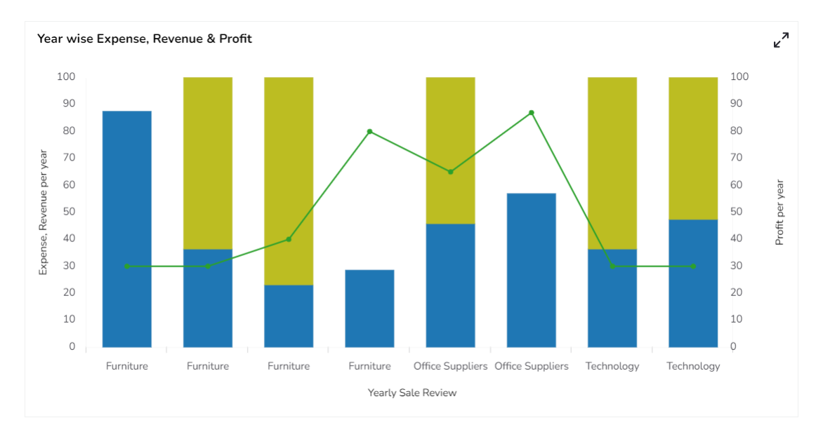
Mixed Chart with Plain base Stacked Chart & Segment line

Mixed Chart with Plain base Stacked Chart & Curve line

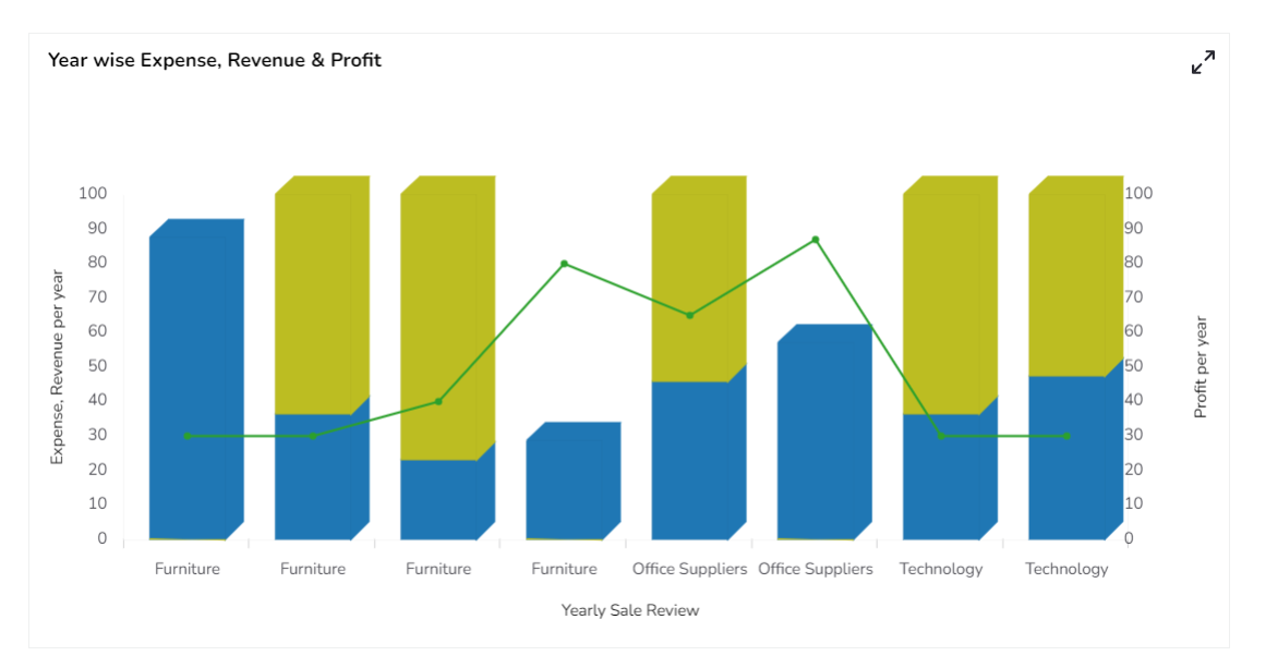
Mixed Chart with Rectangle base Stacked Chart & Segment line

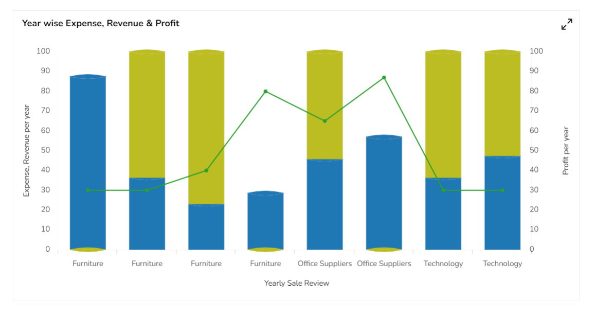
Mixed Chart with Cylinder base Stacked Chart & Segment line

Mixed Chart with Gradient1 base Stacked Chart & Segment line

Mixed Chart with Gradient2 base Stacked Chart & Segment line

Mixed Chart with Gradient3 base Stacked Chart & Segment line

Clustered Chart & Segment Line
Mixed Chart with Rectangle base Clustered Chart & Segment line

Mixed Chart with Cylinder base Clustered Chart & Segment line

Mixed Chart with Pain base Clustered Chart & Segment line

Mixed Chart with Gradient1 base Clustered Chart & Segment line

Mixed Chart with Gradient2 base Clustered Chart & Segment line

Mixed Chart with Gradient3 base Clustered Chart & Segment line

Overlaid Chart & Segment Line
Mixed Chart with Rectangle base Overlaid Chart & Segment line

Mixed Chart with Cylinder base Overlaid Chart & Segment line

Mixed Chart with Plain base Overlaid Chart & Segment line

Mixed Chart with Gradient1 base Overlaid Chart & Segment line

Mixed Chart with Gradient2 base Overlaid Chart & Segment line

Mixed Chart with Gradient3 base Overlaid Chart & Segment line

100% Chart & Segment Line
Mixed Chart with Rectangle base 100% Chart & Segment line
Mixed Chart with Cylinder base 100% Chart & Segment line
Mixed Chart with Plain base 100% Chart & Segment line
Mixed Chart with Gradient1 base 100% Chart & Segment line
Mixed Chart with Gradient2 base 100% Chart & Segment line
Mixed Chart with Gradient3 base 100% Chart & Segment line

Sample Data
Download the given sample data and map it as mentioned below to plot your Mixed chart.
Use the Year column as Category field, and other columns as Series to plot data.
Last updated