# Data Sheet
Data Sheets are used to capturing various process, mechanical, electrical, technical, and control requirements for equipment and instruments. The sheets incorporate information about the selected components, usually with input from multiple users.
## **Best Situation to use Data Sheet Grid**
To collect information from various users. To bring the collected information from the various users to one place. To search, filter, and compare the collected data.
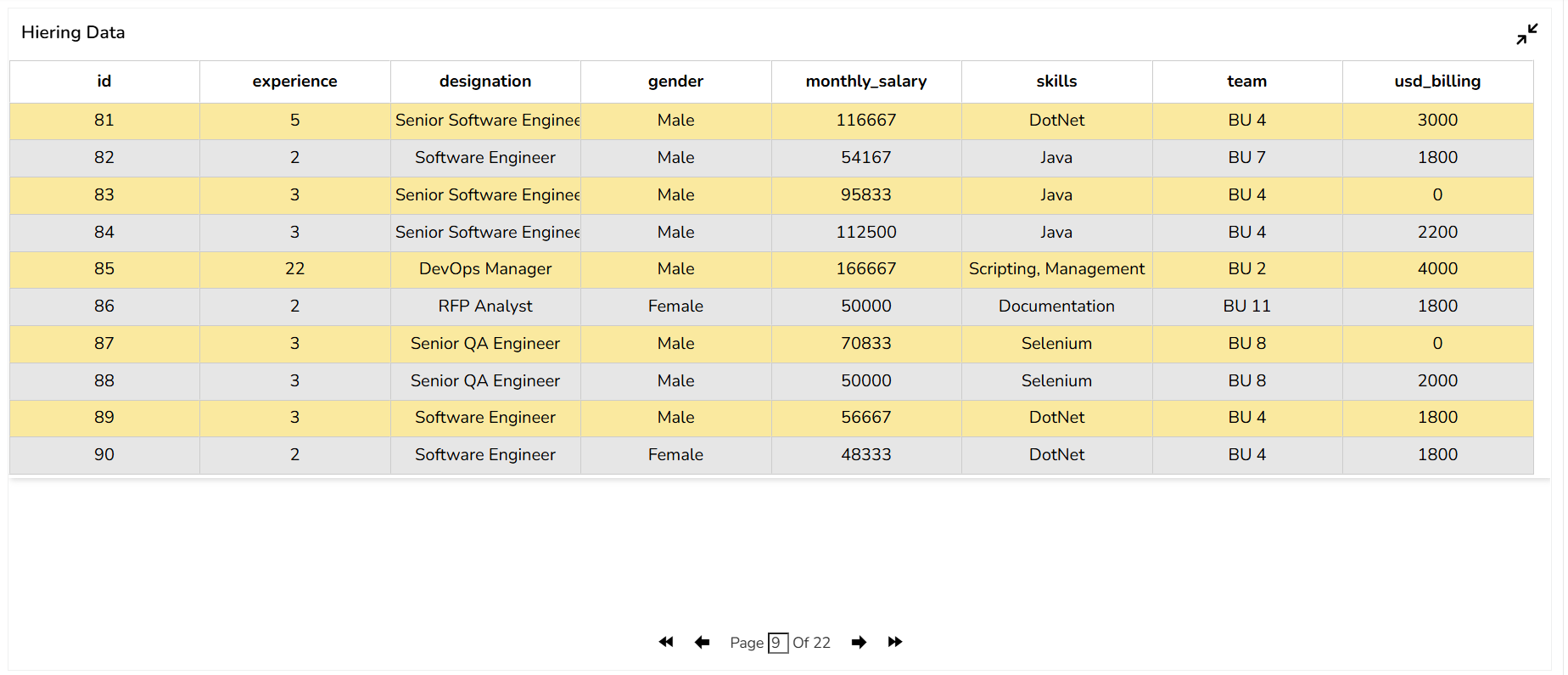
## **Default Data Sheet Chart Image**
## **Properties of the Data Sheet component:**
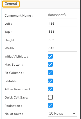
### **General**
* **Component Name**: The unique identifier for the Paging Grid Component.
* **Left**: Determines the horizontal position of the component on the page.
* **Top**: Sets the vertical position of the component within the layout.
* **Height**: Specifies the vertical size of the component.
* **Width**: Defines the horizontal size of the component.
* **Initial Visibility**: Controls whether the component is visible when the page first loads.
* **Max Button**: Allows users to maximize the component to full screen.
* **Fit Columns**: Adjusts the column widths automatically to fit the content or available space.
* **Editable**: Allows users to modify the data within the grid cells directly.
* **Allow Row Insert**: Enables the insertion of new rows, facilitating dynamic data entry.
* **Quick Cell Save**: Provides an option to save changes in a cell immediately after editing, ensuring data is rapidly updated.
* **Pagination**: Controls the division of data into pages, enhancing navigation and performance for large datasets.
* **No. of Rows**: Specifies how many rows are displayed per page, allowing for customization according to user preference or screen size.
### **Background**
* **Gradient Rotation**: Defines the angle at which the gradient is applied across the component.
* **Opacity**: Controls the transparency level of the background, where 0 is completely transparent and 1 is fully opaque.
* **Gradient**: Specifies the transition between colors used in the background.
* **Border**: Determines the presence and thickness of the border surrounding the component.
* **Border Color**: Sets the color of the component’s border.
* **Border Radius**: Rounds the corners of the component’s border.
* **Shadow**: Adds a shadow effect beneath the component.
* **Shadow Color**: Defines the color of the shadow.
* **Shadow Transparency**: Adjusts the visibility of the shadow, affecting how pronounced it appears.
{% hint style="info" %}
*Please Note: The users will be redirected to the **Background gradient colors** window by clicking the **Gradient** icon**.***
{% endhint %}
### **Title**
* **Title Box Color:** Set the color of the title box to complement your chart's overall design.
* **Show Title Box:** Toggle this option to display or hide the title box around the title text.
* **Show Title:** Enable or disable the title visibility on your chart.
* **Title Bar Height:** Adjust the title bar height to fit your design specifications.
* **Description:** Provide an additional description for the chart title to offer more context.
* **Font Color:** Choose the font color for the title to ensure readability and match your theme.
* **Font Size:** Set the title's font size for optimal visibility and aesthetics.
* **Font Style:** Select the font style (e.g., italic, bold) to enhance the title's appearance.
* **Font Weight:** Modify the font weight to make the title text lighter or bolder.
* **Font Family:** Pick a font family that aligns with your design theme for the title.
* **Align:** Align the title text to the left, center, or right according to your layout needs.
* **Text Decoration:** Apply text decorations to the title for emphasis (E.g., Underline).
* **Show Dataset Description**: Enable or disable the dataset description in the title. 
### **Subtitle**
* **Show Sub Title**: Enable or disable the display of the sub-title text.
* **Description**: Add a description text below the sub-title.
* **Font Color**: Select the color of the sub-title text.
* **Font Size**: Specify the size of the sub-title text.
* **Font Style**: Choose the font style for the Sub-title (e.g., italic or normal).
* **Font Weight**: Set the weight (boldness) of the font. The supported options are Normal, Bold, 300, 600, and 900.
* **Font Family**: Choose the font family for the sub-title text from the given choices.
* **Align**: Align the sub-title text (e.g., left, center, right).
* **Text Decoration**: Apply text decorations (e.g., underline) to the sub-title text. 
### **Header Style**
The Header Style section allows for customization of the header in your design. You can modify the following fields:
* **Header Text Color:** Set the color of the header text to align with your theme.
* **Font Size:** Define the text size in the header for visibility and emphasis.
* **Font Style:** Choose a style such as italic or normal to enhance the header's appearance.
* **Font Weight:** Set the weight (boldness) of the font. The supported options are Normal, Bold, 300, 600, and 900.
* **Font Family:** Select a font family for the header that complements your overall design.
* **Use Field Color:** Enable this option to apply a specific field color to the header background.
* **Background Color:** Change the header's background color to match or contrast with the text.
* **Text Decoration:** Apply decorative elements like Underline to the header text for additional styling. 
### **Row Style**
* **Font Color**: This property allows users to change the color of the text within a row, enabling better visibility and alignment with design aesthetics.
* **Font Size**: Adjusts the size of the text, enhancing readability and fitting within the design requirements.
* **Font Style**: Offers options such as italic or normal, providing stylistic flexibility for the text within the data grid.
* **Font Weight**: Controls the thickness of the text, from normal to bold, helping users emphasize specific data points.
* **Font Family**: Allows selection of different font families, ensuring the grid text aligns with overall design standards.
* **Text Decoration**: Includes options such as underline, overline, or line-through, offering additional stylistic choices for the text.
* **Text Wrap**: Enables text to wrap within the cell, ensuring complete visibility without affecting the row width.
* **Row Height**: Users can increase or decrease the height of rows to accommodate more content or improve the grid's appearance.

### **Styles**
* **Border Color**: Set the color of the border for visual separation and clarity in your data grid.
* **Measure Color**: Define the color for measuring indicators, helping in data differentiation.
* **Target Color**: Choose a color for target indicators to enhance the visibility of target values.
* **Marker Color**: Select the color for markers to distinguish data points effectively.
* **Marker Font Color**: Adjust the font color of marker labels for better readability.
* **Font Color**: Allows customization of text color for consistency with design themes.
* **Actual Meter Size**: Specify the size of the actual meter for a clear representation of data.
* **Target Meter Size**: Define the size of the target meter to emphasize target goals.
* **Font Size**: Set the size of the text to ensure readability and emphasis.
* **Font Family**: Choose a font family that aligns with your overall design aesthetics.
### Grid Colors
This properties option helps to set colors for the rows in the Data Sheet. The user can apply the following steps to set the grid colors for the rows.
* Click the ***Grid Colors*** icon.

* The ***Grid Colors*** window opens.
* Select a color using the ***Row Color*** color pallet option.
* Set a color for the alternate rows using the ***Alternate Row Color*** option.
* Click the ***Save*** option.

* The selected row colors will be applied to the Data Sheet.
## **Data Sheet variants by changing the Properties**
{% hint style="info" %}
*Please Note:*
* *The user needs to select the **Column Type** as **Numeric** for the selected Data Grid fields using the **Properties** tab provided for the Dataset, so they become responsive to the changes that the user sets using the **Indicator** tab.*

* *Refer to the* [***Alerts in Grids***](https://docs.bdb.ai/governed-dashboards-6/configurations/alerts-in-grids) *page under the* [***Configurations*** ](https://docs.bdb.ai/governed-dashboards-6/configurations)*section to understand how to insert **Alerts** in a Grid component.*
{% endhint %}