Circumplex Chart
The Circumplex chart, also known as the Polar Area or Nightingale Rose chart, combines the Bar chart and Pie chart. The Circumplex chart can be drawn on a polar coordinate grid. Each category or interval in data is divided into equal segments on the radial chart. As per the denoted values, the distance of each segment from the center depends on a polar axis. Therefore, each ring from the center of the polar grid can be used as a scale to plot the segment size and represent a higher value. Each category can contain multiple sub-categories, with each sub-category represented by some angle of a disc section. The value of the corresponding sub-category is shown through the area. Users can adjust the area of each segment (based on data) by changing the radius in a Circumplex chart.
Best Situation to Use a Circumplex Chart
To display manifold data in the form of a two-dimensional chart of three or more measurable variables represented on axes starting from the same point.
Default Chart Image

The Properties of Circumplex Chart
General
Component Name: Sets the unique identifier for the chart component. This field contains an auto-generated name indicating the sequence of the component in the dashboard.
Left: Specifies the horizontal offset of the chart within the display area.
Top: Specifies the vertical offset of the chart within the display area.
Height: Determines the height of the chart in the display.
Width: Determines the width of the chart in the display.
Initial Visibility: Controls whether the chart is visible on the initial load.
Max Button: Enables or disables the button for maximizing the chart.
Color From Drill: Option to use colors derived from drilled-down data.
Use Series Colors: Allows the use of predefined series colors for the chart.
Series Colors: Specifies the color palette for series data representation.
Animation: Configures animation effects for displaying data transitions.
Clock Wise Direction: Sets the direction for chart data to be plotted clockwise.
Chart Type: Defines the type of chart to display (e.g., pie, radar).
Doughnut Width: Determines the width of the doughnut hole in related chart types.
Web Type: Chooses the structure style for web-like visuals.
Web Stroke Color: Specifies the outline color for web-like structures.
Category Stroke Color: Determines the color for category borders.

Tooltip
Tooltips enhance user interaction by displaying additional information about chart elements.
Show Tool Tip: Enable this option to display tooltips for the chart series, providing descriptions or data insights.
Click the Show Tool Tip icon to access the Tool Tip Configuration window.
Select the Default option.
Put a checkmark in the box to enable the component farmatter.
Click the Save option to display Tool Tip in the default display.

Background Color: Choose a background color for the tooltip to enhance visibility and match your visual theme.
Opacity: Adjust the tooltip's transparency to ensure it doesn't obstruct important chart elements while remaining readable.
Border Color: Select a border color that complements the tooltip, ensuring clarity and contrast against the chart background.
Tooltip Font Size: Customize the font size to maintain readability, adapting it to the overall chart presentation.
Box Width: Define the width of the tooltip box to ensure it fits the content appropriately and maintains a neat appearance.
Precision: Set the numerical precision for data values displayed in the tooltip, aiding in clearer data interpretation.
Highlighter: Toggle the highlighter to emphasize specific data points on the chart, drawing user attention to crucial information.

Please Note: To use the Custom option for the Tool Tip configuration, please refer to the Tooltip (Default & Custom) page.
Background
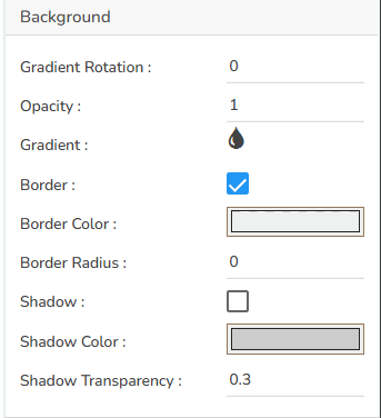
Gradient Rotation: Modify the angle of the gradient to achieve the desired effect.
Opacity: Set the transparency level to balance visibility and aesthetics.
Gradient: Choose and customize the gradient colors to match your theme.
Click the Gradient icon to access the Background gradient colors dialog box.
Click the Add Color option to add multiple colors.
Click the Save option to apply the selected background colors.

Border: Add a border around the chart for a defined perimeter.
Border Color: Alter the border color to complement or contrast with the chart.
Border Radius: Round the corners of the chart border for a smoother look.
Shadow: Enable shadows to create depth and a 3D-like effect.
Shadow Color: Customize the shadow color to blend naturally with the chart.
Shadow Transparency: Adjust the transparency level to control the intensity of the shadow effect.
Title
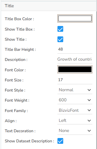
Title Box Color: Choose the background color for the title box.
Show Title Box: Enable or disable the display of the title box on the chart.
Show Title: Enable or disable the display of the title text.
Title Bar Height: Set the height of the title bar.
Description: Add a description text below the title.
Font Color: Select the color of the title text.
Font Size: Specify the size of the title text.
Font Style: Choose a Font style using the drop-down menu (e.g., italic or normal).
Font Weight: Set the weight (boldness) of the font. The supported options are Normal, Bold, 300, 600, and 900.
Font Family: Choose the font family for the title text from the given choices.
Align: Align the title text (e.g., left, center, right).
Text Decoration: Apply text decorations (e.g., underline) to the title text.
Show Dataset Description: Enable or disable the dataset description in the title.
Please Note: By enabling the Show Dataset Description option the Title will get added from the mapped dataset.
Subtitle
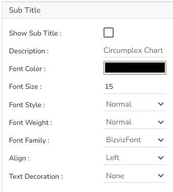
Show Sub Title: Enable or disable the display of the sub-title text.
Description: Add a description text below the sub-title.
Font Color: Select the color of the sub-title text.
Font Size: Specify the size of the sub-title text.
Font Style: Choose the font style for the Sub-title (e.g., italic or normal).
Font Weight: Set the weight (boldness) of the font. The supported options are Normal, Bold, 300, 600, and 900.
Font Family: Choose the font family for the sub-title text from the given choices.
Align: Align the sub-title text (e.g., left, center, right).
Text Decoration: Apply text decorations (e.g., underline) to the sub-title text.
Legend
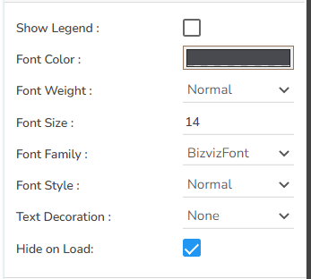
Show Legend: Toggle the visibility of the chart legend.
Font Color: Choose the font color for the legend text.
Font Weight: Determine the weight (boldness) of the legend text.
Font Size: Specify the size of the font for the legend text.
Font Family: Select the font family for the legend text.
Font Style: Choose the font style (e.g., italic) for the legend text.
Text Decoration: Add text decorations (e.g., underline) to the legend text.
Hide on Load: Determine if the legend should be hidden when the chart initially loads.
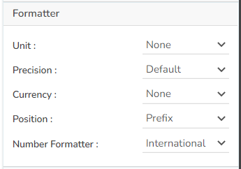
Formatter
Unit: Define the unit of measurement for the values displayed in the chart.
Precision: Set the number of decimal places to display for numerical values.
Currency: Format the numbers as a currency with the appropriate symbol.
Position: Determine the position of the formatted value (e.g., before or after the number).
Number Formatter: Apply a specific notation or style to the numbers (e.g., Indian, International).
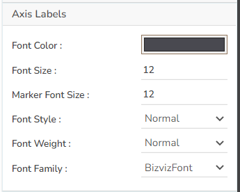
Axis Labels
Font Color: Choose the color for the text of your axis labels to ensure readability and match the chart's design.
Font Size: Set the size of the font for axis labels to maintain clarity and legibility.
Marker Font Size: Determine the size of the font for any markers on the axis, ensuring they are consistent with the overall font scheme.
Font Style: Select the style of the font (e.g., normal, italic) to align with the design aesthetics.
Font Weight: Adjust the thickness of the font (e.g., normal, bold) to enhance visibility and emphasis.
Font Family: Choose the typeface for the axis labels to maintain consistency with the chart's theme.
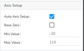
Axis Setup
Auto Axis Setup: Automatically adjust the axis settings based on the dataset.
Base Zero: Ensure the axis starts at zero for better data comparison.
Min Value: Define the minimum value displayed on the axis.
Max Value: Set the maximum value for the axis range.
Export Options
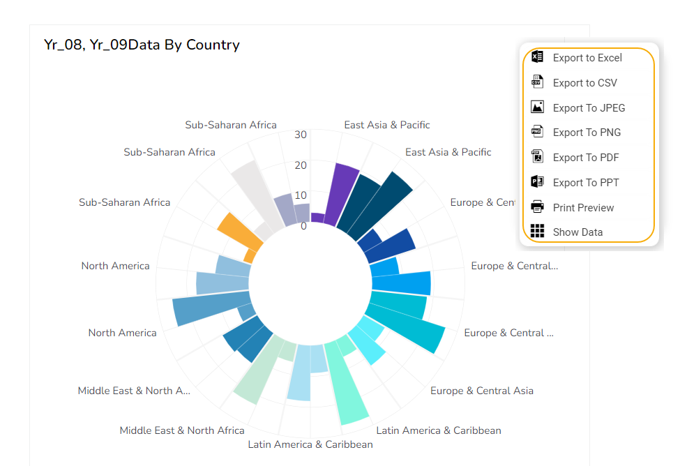
Enable Context Menu: Activate a right-click context menu for quick access to export options in the preview mode of the chart.
Export Excel: Save the chart data in an Excel file format (.xlsx).
Export CSV: Export the chart data into a CSV file format (.csv).
Export JPEG: Export the chart as a JPEG image (.jpg).
Export PNG: Export the chart as a PNG image (.png).
Export PPT: Export the chart to a PowerPoint presentation (.pptx).
Export PDF: Export the chart as a PDF document (.pdf).
Show Print: Include an option to print the chart directly.
Export Heading: Add a custom heading to the exported file.
Export Sub Heading: Add a custom subheading to the exported file.
Export File Name: Specify the file name for the exported file/dashboard.
Global Export Type: Define the default export format using the drop-down (e.g., Screenshot, Tabular).

The user can get the Export Context Menu from the preview mode to download the reports in different export formats.
Variants of Circumplex chart
After modifying the chart properties the user can the following variants of the Circumplex chart.
Clustered Circumplex with Polygon Web Type (using Series Colors)

Overlaid Circumplex with Circular Web Type (not using Series Colors)
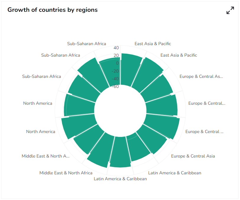
Sample Data
Download the given sample data and map it as mentioned below to plot your Circumplex chart:
Use the Country column as a Category field, Region as a Sub Category, and the other columns as Series to plot data.
Please Note: The Category field can be any data type line, string, or numeric. But, Series fields can be only numeric data type.
Last updated