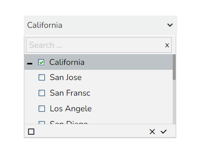
Hierarchical Combobox
Hierarchical Combo Box is similar to Check Box and Combo Box but here the list will be arranged hierarchically and users will be allowed to select multiple items simultaneously.
The Best Situation to Use Hierarchical Combobox
When users should be given the option to select 1 or more cities that will be used in the table/chart (instead of displaying data for all cities)
Default Component Image

Properties of the Hierarchical Combo Box Filter
Background
General
The General Properties help tailor the component behavior and appearance to suit specific requirements, improving user interaction and data visibility control.
Component Name: Specifies the identifier for the component, allowing for easy reference.
Left, Top: Sets the position of the component on the chart by adjusting its coordinates.
Height, Width: Determines the size of the component, enabling customization of its dimensions.
Initial Visibility: Controls whether the component is visible at the initial load of the chart.
Hierarchy Level: Allows selection between a Multiple or Single level hierarchy for data display.
Multiple Selection: Enables the capability to select multiple items at once within the component.
Controlled Selection: Manages how selections are controlled within the component, often working with external factors.
Custom Selection: Offers the option to define specific selection criteria or methods beyond default settings.
Selection Limit: Sets the maximum number of items to be selected.
Show Selection Limit: Option to display a notice or indicator when the selection limit is reached.
Auto Update GV: Automatically updates the Global Variable when changes occur within the component.
Notify GV Update: Alerts or indicates when a Global Variable has been updated due to user actions.
Public Filter: Determines whether the filter settings used in the component are accessible publicly or restricted.

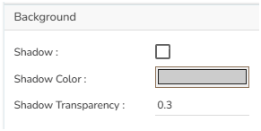
Background
The Background Properties panel offers options to enhance the visual layout of the component through the following fields:
Shadow: Enables a shadow effect for the component, creating a sense of depth and focus.
Shadow Color: Sets the color of the shadow, allowing for customization to match the overall design theme.
Shadow Transparency: Adjusts the transparency of the shadow, providing control over how prominent or subtle the shadow appears.

Style
The Style properties panel provides various fields to customize the appearance of the component:
Rollover Color: Defines the color that appears when hovering over a cell, enhancing interactive feedback.
Selection Color: Sets the color for highlighting selected cells, making them visually distinct.
Background Color: Allows setting a specific color for the component's background.
Panel Background Color: Customizes the background color of the panel area for a cohesive look.
Border Radius: Specifies the curvature of the component's corners for a rounded effect.
Panel Border Radius: Adjusts the corner curvature of the panel specifically.
Font Size: Determines the size of the text, enabling readability adjustments.
Font Style: Offers style options such as italic or normal for text appearance.
Font Weight: Controls the thickness of the text, ranging from light to bold.
Font Family: Selects the typeface to align with branding or design preferences.
Font Color: Sets the color of the text for clarity and aesthetic cohesion.
Panel Font Color: Defines the text color specifically within the panel.
Text Decoration: Applies effects like underlines or strikethroughs to the text.
Advance Theme: Enables advanced theming options for comprehensive stylistic control.

Hierarchical Combo box filter variant after changing its properties
Last updated