Map Chart
The Map chart is used to position data in a geographical context. Multiple layers are included to cover various information. The users can specify which layer to be marked as an interactive layer as it is the only layer wherein items can be marked.
Best Situations to Use a Map Chart
To display widely spread data or processes in the geographical setup.
Default Chart Image

Properties of the Map chart
General
Component Name: Assign a unique name to the map chart component. This field contains an auto-generated name indicating the sequence of the component in the dashboard.
Left & Top: Set the chart's position on the canvas by specifying the left and top margins.
Height & Width: Adjust the chart's dimensions to fit within the desired space on the canvas.
Initial Visibility: Check this option to ensure the chart is visible on the initial view.
Max Button: Use this to maximize the chart view independently.
Map Type: Choose between SVG and Leaflet map types.
Select Map: Pick a specific map, such as a continent like Asia, from the available options.
Geometry Type: Choose from Marker, Line, Polygon, Clustered, Trail, and Trip.
Line Type: Select the form of line representation such as Curve, Segment, Step, Reverse Step, Horizontal, and Vertical.
Line Thickness: Specify the thickness of the line in the chart.
Default Color: Select a default color for the map elements.
Roll Over Color: Define a color change when hovering over map elements.
Outline Color: Set the color for the outline of map areas or lines.
Color Ranges: Apply a range of colors for different values or sections on the map.
Solid Color: Choose a single color to fill specific map regions.
Opacity: Adjust the transparency level of the map elements.
Random Color: Enable random color assignment to map segments for a varied appearance.

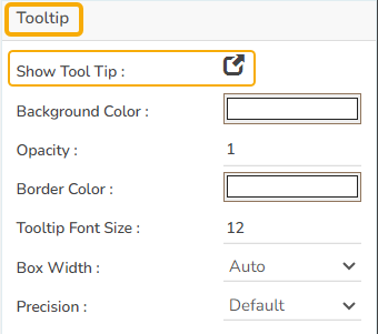
Tooltip
Configure the tooltip for enhanced map chart interaction.
Show Tool Tip: Enable this to display tooltips with information upon hovering over map elements. The user can show the series description and get the tooltip by clicking the Show Tool Tip option.
The Tool Tip Configuration window opens.
Select any Tool Tip option. The supported Tool Tip is None, Default, Custom.
Put a checkmark in the given box to enable the component formatter.
Click the Save option.

Background Color: Set the background color for the tooltip box to enhance visibility.
Opacity: Adjust the transparency level of the tooltip for better presentation over the map.
Border Color: Define the color of the tooltip's border to contrast or complement the background.
Tooltip Font Size: Specify the font size for the text within the tooltip to ensure readability.
Box Width: Determine the tooltip box width to fit content appropriately.
Precision: Set the number of decimal places displayed for numeric data within the tooltip.

Please Note: To use the Custom option for the Tool Tip configuration, please refer to the Tooltip (Default & Custom) page.
Configuring Tooltip for the Map Chart
The user can show the series description and get a tooltip by enabling it.
Open the Tooltip properties.
Click the Show Tool Tip icon.
The Tool Tip Configuration dialog box appears.
Select the Custom option using the checkbox.
Enter the description you want to display for the Tooltip.
Click the Save option.
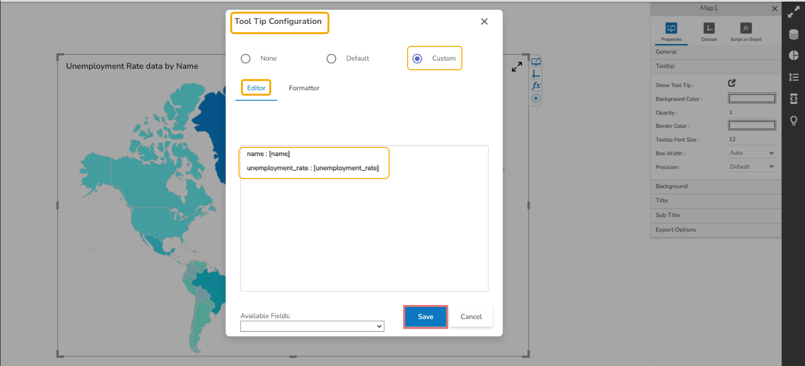
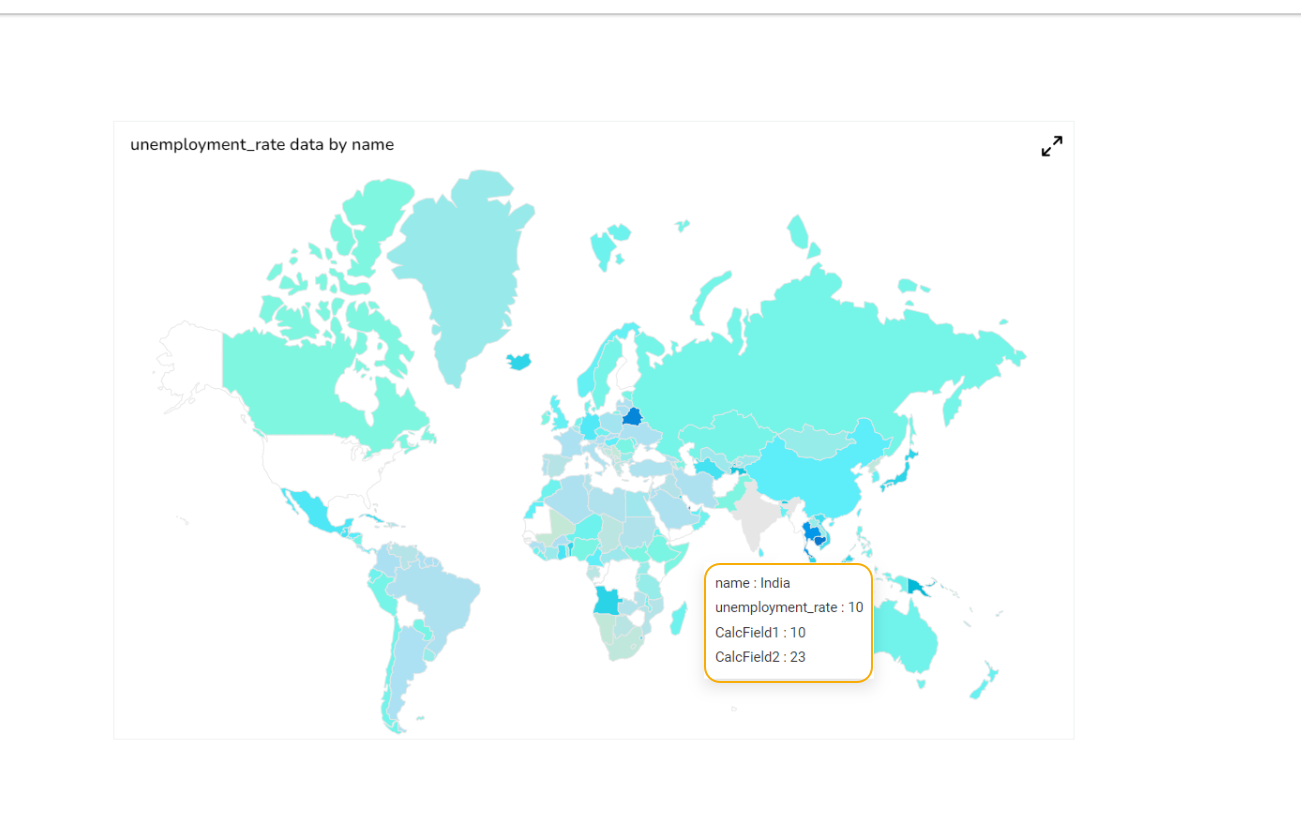
The customized tooltip appears for the Map chart.
Background
Gradient Rotation: Modify the angle of the gradient to achieve the desired effect.
Opacity: Set the transparency level to balance visibility and aesthetics.
Gradient: Choose and customize the gradient colors to match your theme.
Click the Gradient icon to access the Background gradient colors dialog box.
Click the Add Color option to add multiple colors.
Click the Save option to apply the selected background colors.

Border: Add a border around the chart for a defined perimeter.
Border Color: Alter the border color to complement or contrast with the chart.
Border Radius: Round the corners of the chart border for a smoother look.
Shadow: Enable shadows to create depth and a 3D-like effect.
Shadow Color: Customize the shadow color to blend naturally with the chart.
Shadow Transparency: Adjust the transparency level to control the intensity of the shadow effect.

Title
Title Box Color: Choose the background color for the title box.
Show Title Box: Enable or disable the display of the title box on the chart.
Show Title: Enable or disable the display of the title text.
Title Bar Height: Set the height of the title bar.
Description: Add a description text below the title.
Font Color: Select the color of the title text.
Font Size: Specify the size of the title text.
Font Style: Choose a Font style using the drop-down menu (e.g., italic or normal).
Font Weight: Set the weight (boldness) of the font. The supported options are Normal, Bold, 300, 600, and 900.
Font Family: Choose the font family for the title text from the given choices.
Align: Align the title text (e.g., left, center, right).
Text Decoration: Apply text decorations (e.g., underline) to the title text.
Show Dataset Description: Enable or disable the dataset description in the title.

Please Note: By enabling the Show Dataset Description option, the Title will be added from the mapped dataset with the charting component.
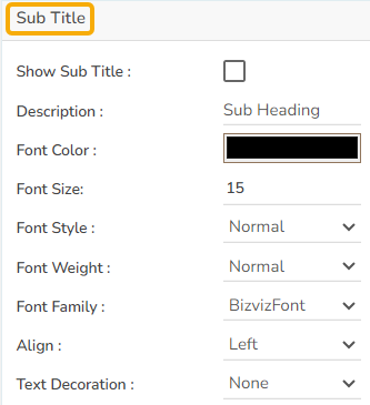
Subtitle
The Subtitle properties allow customization of the subtitle within the chart. Here's a breakdown of each field:
Show Sub Title: Toggle this option to display or hide the subtitle on the chart.
Description: Enter a desired subtitle text to be displayed when enabled.
Font Color: Choose a color for the subtitle text.
Font Size: Adjust the size of the subtitle text for better readability.
Font Style: Select between normal, or italic font style for the subtitle.
Font Weight: Modify the thickness of the subtitle text, such as Bold or Normal.
Font Family: Pick a font family that suits the design of your chart.
Align: Set the alignment of the subtitle text (left, center, right).
Text Decoration: Apply decoration options (e.g., underline) to the subtitle text.
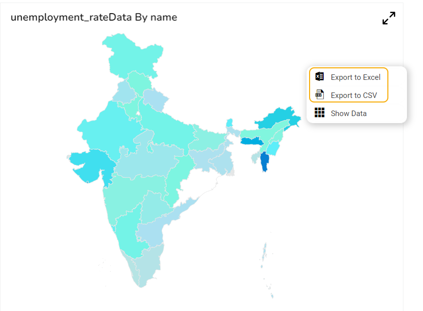
Export Options
Enable Context Menu: Toggle this option to provide users with a context menu in the Preview mode, allowing various export functionalities.
Export Excel: Select this option to export the map chart data in Excel format, providing a structured spreadsheet for analysis.
Export CSV: Choose this option to export the map chart data in CSV format, facilitating easy data import and manipulation.
Export File Name: Specify a custom name for the exported file, ensuring it is easily identifiable.
Global Export Type: Define a default export format for all charts to streamline the export process and maintain consistency.

The user can get the Export Context Menu from the preview mode to download the reports in different export formats.
Map Chart with SVG Type

Map Chart with Leaflet Type

Leaflet Auto Zoom
The user can use the Auto-zoom functionality to cover all the markers in the map component. This functionality is available in the zoom-in map (Leaflet) based on the number of markers and their placed positions so that all markers must be visible at that zoom-in level.

Leaflet Trip/Trail – Property - Line Type
The Line Type property is provided in the General tab for the Trip and Trail Geometry type Leaflet maps. The user can show Trip/ Trail map lines in any of the following three categories:
Straight Line
Dotted Line
Dashed Line

Leaflet Trip Type Straight Line Map

Leaflet Trip Type with Dash Line Map

Leaflet Trip Type Dotted Line Map

Please Note:
This feature has been provided to the Leaflet Trip/Trail Geometry Type maps only.
The width of the line or dot is fixed for all the supported line types.
Leaflet support for the Glyph and Maki Marker Icons
The Glyph and Maki marker icons are supported in the Leaflet map type chart. The user needs to set the m_svgicons variable to false using the SDK script. The following three types of icons are supported in the Leaflet map with the Trip Geometry Type:
1. For Markers with custom icons we use Maki Icons. Please click to check out the link https://labs.mapbox.com/maki-icons/
2. For custom markers we can use Glyph Icons. Please click to check out the link https://getbootstrap.com/docs/3.3/components/#glyphicons
3. For custom markers we can also use font icons like bd-filter, bd-
Please Note:
Currently, we provide support for Leaflet Trip Type Non SVG.
To get these icons, we must set the m_svgicons variable to 'false' using the SDK script.
A sample script with m_svgicons variable to false is given below:


Display Circle Data Points in the Leaflet Charts
The Circle data points in Leaflet charts likely refer to markers displayed on the map in a circle shape. These markers can indicate a specific location or set of coordinates on the map and can be customized in terms of color, size, and other visual properties. BDB Designer draws circles considering the first data point as the center, provided with an option to configure at which data point circle should render.
Steps to Configure Circle Data Points & Show Marker through Script
Add a variable to control geometry type as a circle.
Draw marker for other data points when Geometry type is circle.
Configure Circle as a Data Point
By default, it draws a circle considering the first point.

The user can control the circle data point through a script. The script is given below.
Series Indicator
The Map chart supports Series Color based on the conditions.
Open the Dataset properties for the Map component.
Select a Series.
Open the Indicator tab.
Click the Add New Condition icon.
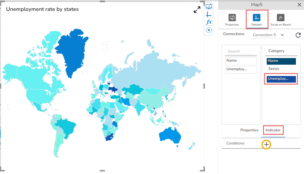
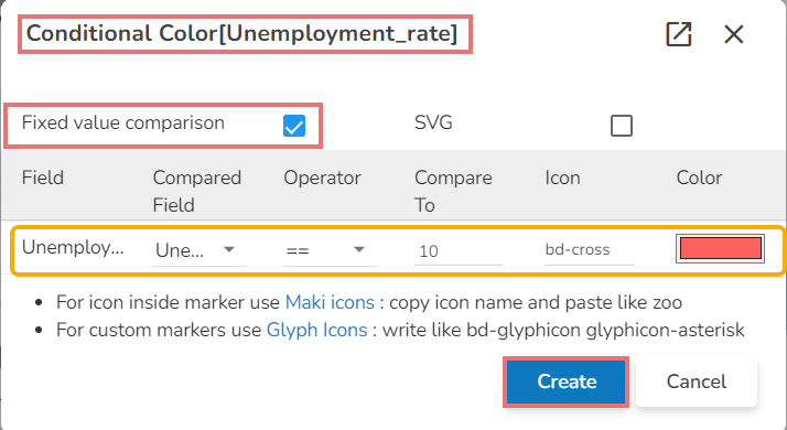
The Conditional Color dialog box opens for the selected series field.
Select one option out of the Fixed Value Comparison or SVG.
Complete the required configuration.
Click the Create option.
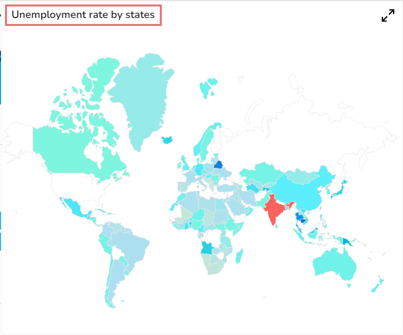
Open the preview of the Map chart to view the conditional color for the set value.
Sample Data
Download the given sample data and map it as mentioned below to plot your Map chart.
Use the Name column as a Category field, and the Unemployment-rate column as a Series to plot data.
Last updated