Self-Service Visualization
  • What is a Report?
  • Creating a new Report
    • Accessing the Report Module
    • Create New Report
      • Creating a new Report with an Existing Data Store
        • Creating and Updating Instance
      • Creating a new Report by Uploading a File
        • Creating a new Report by Uploading a CSV File
        • Creating a new Report by Uploading an Excel File
      • Creating a new Report with Data Preparation
        • Create a Report with Data Preparation - Inside the Report UI
        • Create a Report with Data Preparation- Partly from Data Center
    • Designing a View
    • Saving Multiple Views
  • Design Canvas
    • Dimension Profiling
    • View Summary
    • Customized Category Color for Dimension
    • Series Properties
    • Create Calculated Field
      • Creating a Formula
        • Record Level Option
        • Summary Level Option
      • Creating Range
    • Order by and Limit
    • Adding a Slicer
  • Chart Gallery
    • Mixed chart
    • Area chart
    • Bar chart
    • Bubble chart
    • Column Stack chart
    • Line chart
    • Pie chart
    • Scattered Plot chart
    • TreeMap chart
    • Circumplex chart
    • Pareto chart
    • Semi Gauge
    • KPI Tile
    • KPI Tile: Comparative Tile
    • KPI Tile: Sparkline
    • Map
    • Data Grid
    • Metric Summary
    • Dissolution/Decomposition chart
    • Spider chart
    • Waterfall chart
    • Funnel chart
    • Inverted Funnel chart
    • Heat Map chart
    • Geo chart
    • Sankey chart
    • Word Cloud
  • Report Final Screen
    • Tab
    • Search
    • Create New ML View
    • Shared Views
    • Live Refresh
    • Export
      • Export Properties
    • Alert Center
    • Change Theme
    • Data Store Information
    • Options Assigned to a View
      • Analyse
        • Timeline Play
        • Data Drills
          • Drill Into
          • Drill Through
      • Edit
      • Duplicate
      • Remove
  • Applying Filters
    • View Specific Filter
      • Dimension-based View Filter
      • Measure-based View Filter
      • Date-based View Filter
    • Global Filter
      • Exclude from the Global Filter
      • Saving a Global Filter
      • Custom View Filter
      • LOV Settings
  • Interactions
Powered by GitBook
On this page
  • Properties
  • General Settings
  • View Filter
  • Category Axis
  • Primary Value Axis
  • Secondary Value Axis
  • Insights
  1. Chart Gallery

Line chart

PreviousColumn Stack chartNextPie chart

Last updated 1 year ago

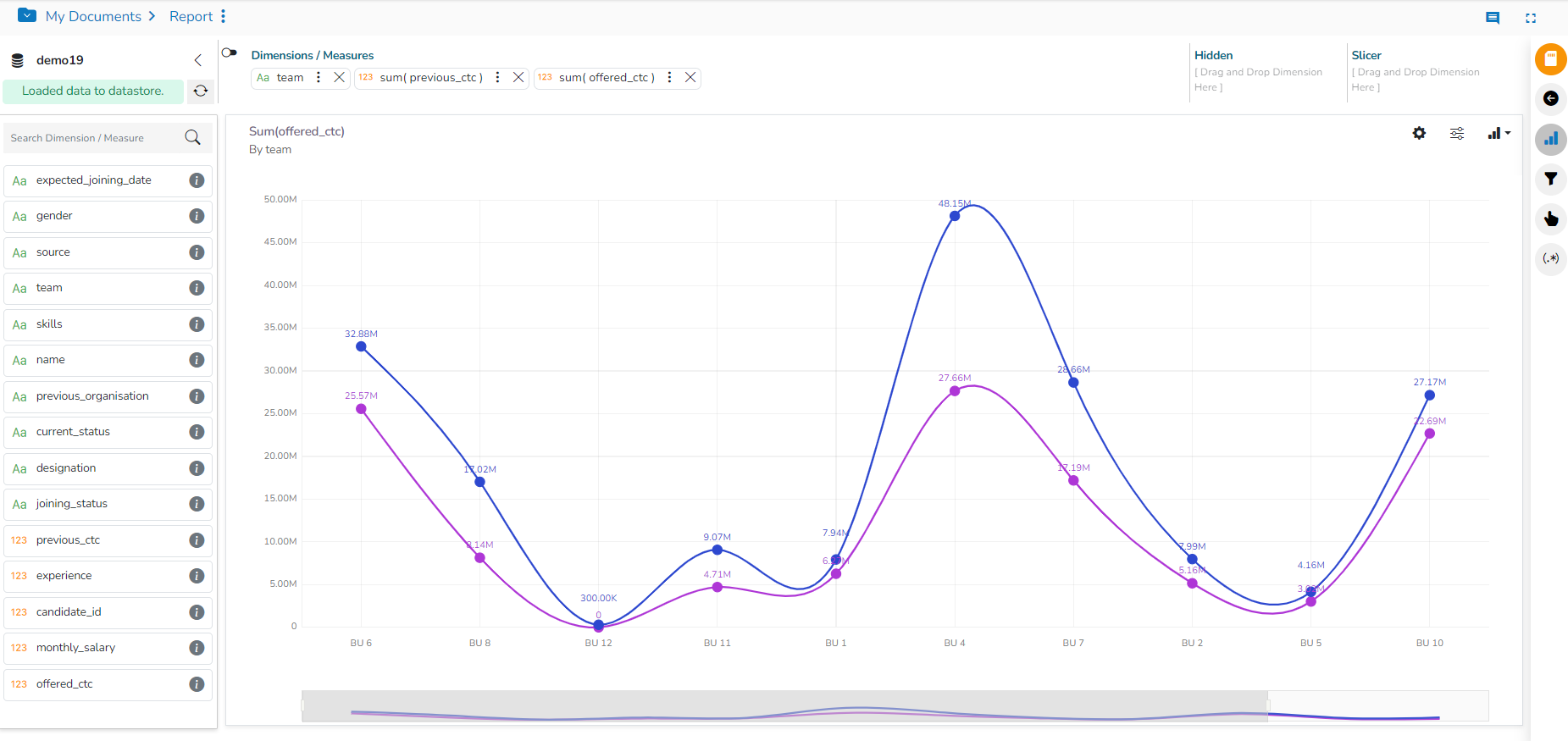
The line chart connects individual numeric data points to create a sequence of values. They are primarily used to display trends over a period.

  • Best Situation to use Line Charts: View trends in data over a period

  • Examples: To indicate increasing revenue or varying stock price

  • Variations of this chart

    • Mixed Chart- Combine a line graph with column charts to provide visual cues for further investigation

      • Example: A column chart representing the numeric score of students combined with the line chart corresponding proficiency score.

Properties

General Settings

  • Style: Select a style to display the data (the provided choices for this field are Cluster, Stack, Stack Percentage, Stack Overlaid)

  • Order: Select a sequence for displaying information

    • None (default option)

    • Ascending

    • Descending

    • Manual Sort (Users need to sort the dimensions by using the indicator signs manually)

      • (If the user selects the Manual Sort as the ordering option, they get an icon clicking which the Manual Sort window appears)

    • By selecting an order (ascending or descending), the user needs to configure the following fields:

      • Order By- Select a value option from the drop-down menu to order the sequence of the data.

      • Limit- Set a number to display the requested data by this limit.

  • Exclude Global Filter: The view gets excluded from the Global Filter condition by putting a checkmark in the box.

  • Show Data Label: Data label gets displayed by using a checkmark in the given box.

  • Enable Base Zero: Base value gets presented from Zero by using a checkmark in the given box.

  • Show Point: Enable the Show Point option by using a checkmark in the given box.

  • Line Form: Select a line format from the drop-down menu (the provided choices for this field are Curve and Segment)

  • Show Legend: Displays legend by turning on the radio button. After enabling ‘Show Legend,’ users need to select the following information:

  • Legend Style: Select one of the following options by using the drop-down menu.

    • Fixed

    • Floating

  • The following fields appear when the selected Legend Style option is Fixed.

    • Legend Font Size: This option allows to increase or decrease the font size of the legend.

    • Legend Orientation: This option appears when ‘Show Legend’ is enabled, and the selected ‘Legend Style’ is ‘Fixed.’ Users need to select an option out of the given choices using the drop-down menu.

      • Vertical

      • Horizontal

    • Legend Checkbox: Enable this option by a checkmark to add the checkbox beside the Legend.

  • Slider: Slider gets displayed by putting a checkmark in the box.

    • Fixed Slider Range: Enable the checkbox to get the fixed Slider range.

View Filter

  • Filter: Select a filter condition using the drop-down menu.

Please Note: The selected View Filter option will be reflected to customise the View data after adding the View to report.

Category Axis

  • Title: Provide a title for the axis.

  • Axis Label: Enable the category axis label by using a checkmark in the box.

  • Label Angle: Select a display angle for the axis label.

Primary Value Axis

  • Title: Provide a title for the Primary Value Axis.

  • Axis Label: Enable the Primary Value Axis label by using a checkmark in the box.

  • Format Type: Select a desired format type from the drop-down menu (the provided options for this field are: None, Auto, Percent, Thousand, Lacs, Crore, Million, Billion, Trillion, Quadrillion).

  • Currency Type: Select a currency symbol to be displayed in the view (the provided options for this field are: None, Rupees, Euro, Pound, USD, Yen, Cent).

  • Precision: Set the after-decimal value (It displays up to 5 precision).

Secondary Value Axis

Properties for the Secondary Value Axis gets displayed when two measures are dragged on the canvas.

  • Enable: Put a checkmark in the box to enable the Secondary Value Axis.

  • Title: Provide a title for the Secondary Value Axis.

  • Format Type: Select a desired format type from the drop-down menu (the provided options for this field are: None, Auto, Percent, Thousand, Lacs, Crore, Million, Billion, Trillion, Quadrillion).

  • Currency Type: Select a currency symbol to be displayed in the view (the provided options for this field are: None, Rupees, Euro, Pound, USD, Yen, Cent).

  • Precision: Set the after-decimal value (It displays up to 5 precision).

Please Note:

  1. When the selected Format Type is Percentage, you don’t get the Currency Type field.

Insights

  • Text: Provide any information regarding the chart. If any digit or character is required to be highlighted, put it inside two asterisks. (E.g., *70%* or *skills*).

  • Font Size: Set/modify Font Size of the Insights text.

  • Font Color: Select a Font color for the Insights Text.

  • Text align: There are three alignments to align the text.

    • Left

    • Right

    • Centre

  • Position: There are two options to position the text.

    • Bottom

    • Right

The users must configure the of the dragged measure after enabling the Secondary Value Axis to display the same in the chart.

Series Properties
Default View using the Line chart
General Properties for the Line chart
Modified Line chart after applying the General Properties as mentioned in the above-given image
Configuring View Filter, Category Axis, and Primary Value Axis
Modified View after applying the above-given View Filter, Category Axis, and Primary Value Axis Properties
The modified View after applying the Secondary Value Axis and Insights Properties