Self-Service Visualization
  • What is a Report?
  • Creating a new Report
    • Accessing the Report Module
    • Create New Report
      • Creating a new Report with an Existing Data Store
        • Creating and Updating Instance
      • Creating a new Report by Uploading a File
        • Creating a new Report by Uploading a CSV File
        • Creating a new Report by Uploading an Excel File
      • Creating a new Report with Data Preparation
        • Create a Report with Data Preparation - Inside the Report UI
        • Create a Report with Data Preparation- Partly from Data Center
    • Designing a View
    • Saving Multiple Views
  • Design Canvas
    • Dimension Profiling
    • View Summary
    • Customized Category Color for Dimension
    • Series Properties
    • Create Calculated Field
      • Creating a Formula
        • Record Level Option
        • Summary Level Option
      • Creating Range
    • Order by and Limit
    • Adding a Slicer
  • Chart Gallery
    • Mixed chart
    • Area chart
    • Bar chart
    • Bubble chart
    • Column Stack chart
    • Line chart
    • Pie chart
    • Scattered Plot chart
    • TreeMap chart
    • Circumplex chart
    • Pareto chart
    • Semi Gauge
    • KPI Tile
    • KPI Tile: Comparative Tile
    • KPI Tile: Sparkline
    • Map
    • Data Grid
    • Metric Summary
    • Dissolution/Decomposition chart
    • Spider chart
    • Waterfall chart
    • Funnel chart
    • Inverted Funnel chart
    • Heat Map chart
    • Geo chart
    • Sankey chart
    • Word Cloud
  • Report Final Screen
    • Tab
    • Search
    • Create New ML View
    • Shared Views
    • Live Refresh
    • Export
      • Export Properties
    • Alert Center
    • Change Theme
    • Data Store Information
    • Options Assigned to a View
      • Analyse
        • Timeline Play
        • Data Drills
          • Drill Into
          • Drill Through
      • Edit
      • Duplicate
      • Remove
  • Applying Filters
    • View Specific Filter
      • Dimension-based View Filter
      • Measure-based View Filter
      • Date-based View Filter
    • Global Filter
      • Exclude from the Global Filter
      • Saving a Global Filter
      • Custom View Filter
      • LOV Settings
  • Interactions
Powered by GitBook
On this page
  • Properties
  • General Settings
  • View Filter
  • Series Color
  • Chart Properties
  • Value Axis
  • Insights
  1. Chart Gallery

Circumplex chart

PreviousTreeMap chartNextPareto chart

Last updated 1 year ago

The Circumplex chart, also known as the Polar Area chart or Nightingale Rose chart, is a combination of the Bar chart and Pie chart. Each category may have more than one sub-category, where a section of the disc shows that each subcategory and each section have the same angle. The value of the corresponding sub-category is shown through the area. By changing the radius in a Circumplex chart, users can adjust the area of each segment (based on data).

  • Best Situations to Use a Circumplex chart: To display manifold data in the form of a two-dimensional chart of three or more measurable variables represented on axes starting from the same point.

Properties

General Settings

  • Exclude Global Filter: The view gets excluded from the Global Filter condition by putting a checkmark in the box.

  • Series Color: Select the color for the series using the available color menu.

  • Enable Base Zero: Base gets presented from Zero by using a checkmark in the provided box.

  • Clockwise Direction: the data values get displayed in a clockwise manner by enabling a checkmark in the given box.

  • Show Legend: Displays legend by turning on the radio button.

  • Legend Style: Select one of the following options by using the drop-down menu.

    • Fixed

    • Floating

  • The following fields appear when the selected Legend Style option is Fixed.

    • Legend Font Size: This option allows to increase or decrease the font size of the legend.

    • Legend Orientation: This option appears when ‘Show Legend’ is enabled, and the selected ‘Legend Style’ is ‘Fixed.’ Users need to select an option out of the given choices using the drop-down menu.

      • Vertical

      • Horizontal

View Filter

  • Filter: Select a filter condition using the drop-down menu.

Please Note: The selected View Filter option will be reflected to customise the View data after adding the View to report.

Series Color

  • Click the Add Color option to add a new series color.

    • Each added color field contains an auto-selected color to display a series.

    • The user can modify the auto-selected colors by using the color pallet.

Please Note: The selected View Filter option will be reflected to customise the View data after adding the View to report.

Chart Properties

  • Clockwise Direction: Enable the clockwise direction to display the data values in the clockwise pattern in the chart.

  • Web Stroke Color: Select a color from the given menu.

  • Category Stroke Color: Select a color using the given menu.

  • Category Label: Enable the given box to display the category labels.

  • Doughnut Width: Set (increase/decrease) the width of the doughnut.

  • Web Type: Select an option from the drop-down menu.

    • Polygon

    • Circle

Value Axis

  • Axis Label: Enable the Primary Value Axis label by using a checkmark in the box.

  • Format Type: Select a desired format type from the drop-down menu (the provided options for this field are: None, Auto, Percent, Thousand, Lacs, Crore, Million, Billion, Trillion, Quadrillion).

  • Currency Type: Select a currency symbol to be displayed in the view (the provided options for this field are: None, Rupees, Euro, Pound, USD, Yen, Cent).

  • Precision: Set the after-decimal value (It displays up to 5 precision).

Insights

  • Text: Provide any information regarding the chart. If any digit or character is required to be highlighted, put it inside two asterisks. (E.g., *70%* or *skills*).

  • Font Size: Set/modify Font Size of the Insights text.

  • Font Color: Select a Font color for the Insights Text.

  • Text align: There are three alignments to align the text.

    • Left

    • Right

    • Centre

  • Position: There are two options to position the text.

    • Bottom

    • Right​

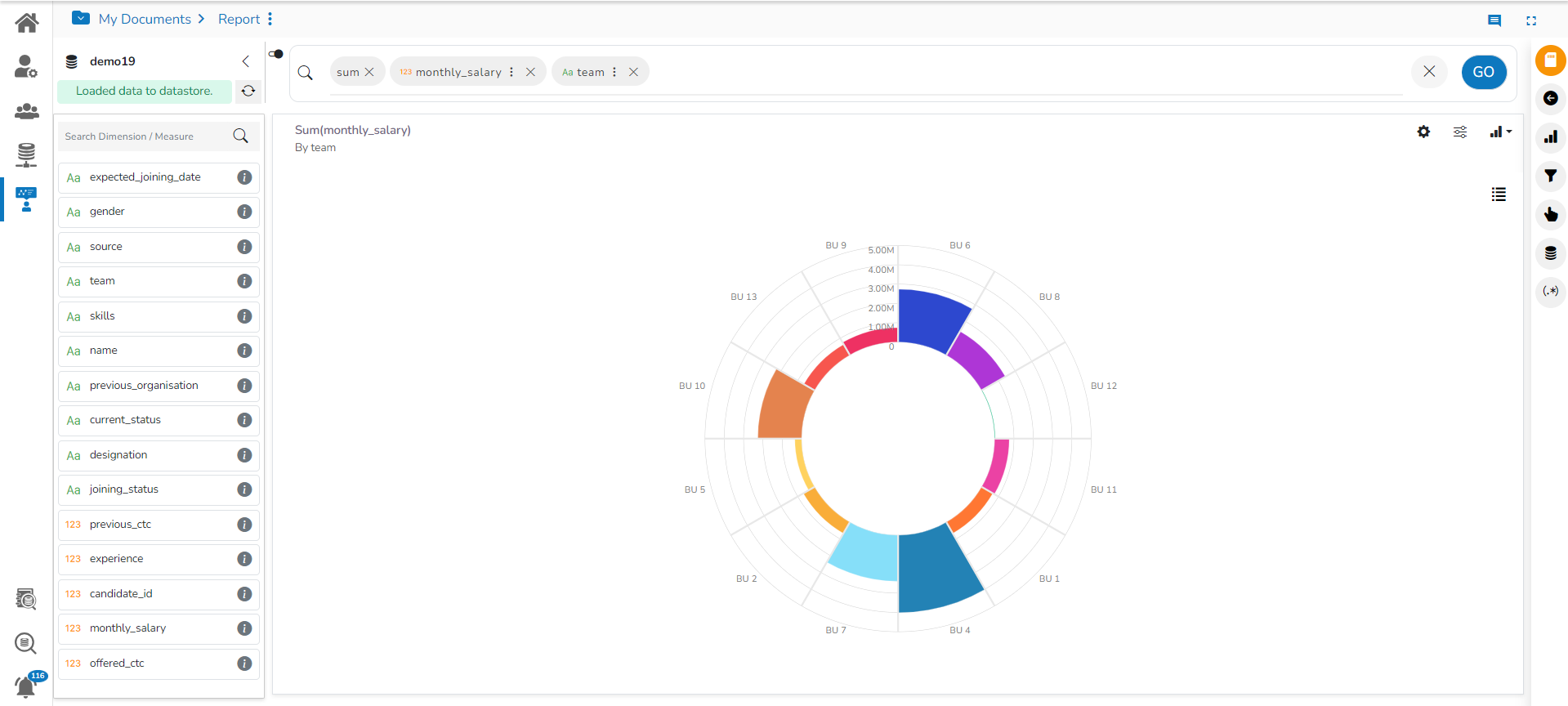
Default View of the Circumplex chart
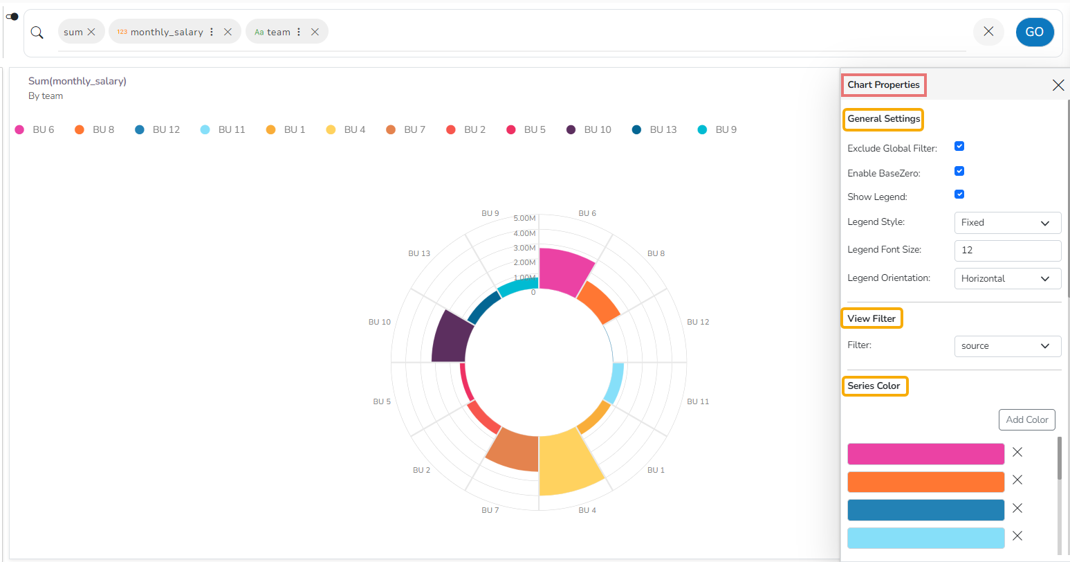
Circumplex chart after applying General Settings, View Filter, and Series Colors
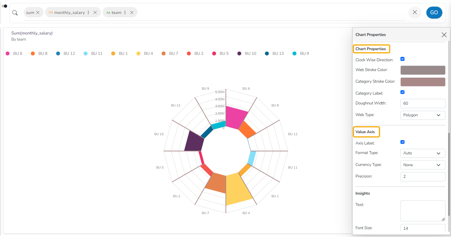
Circumplex chart after applying chart properties & Value Axis
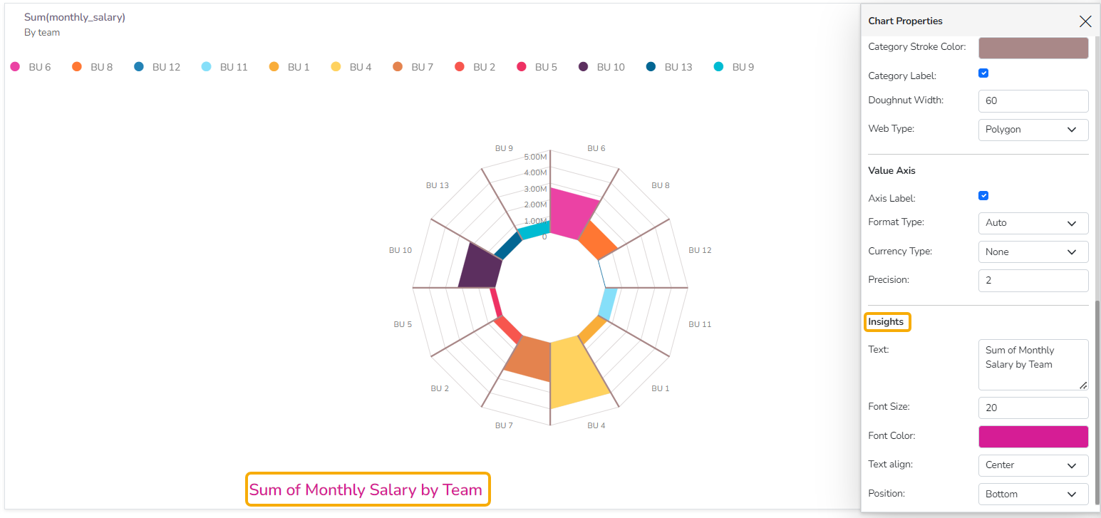
Circumplex chart after applying Insights properties