Data Grid

Properties
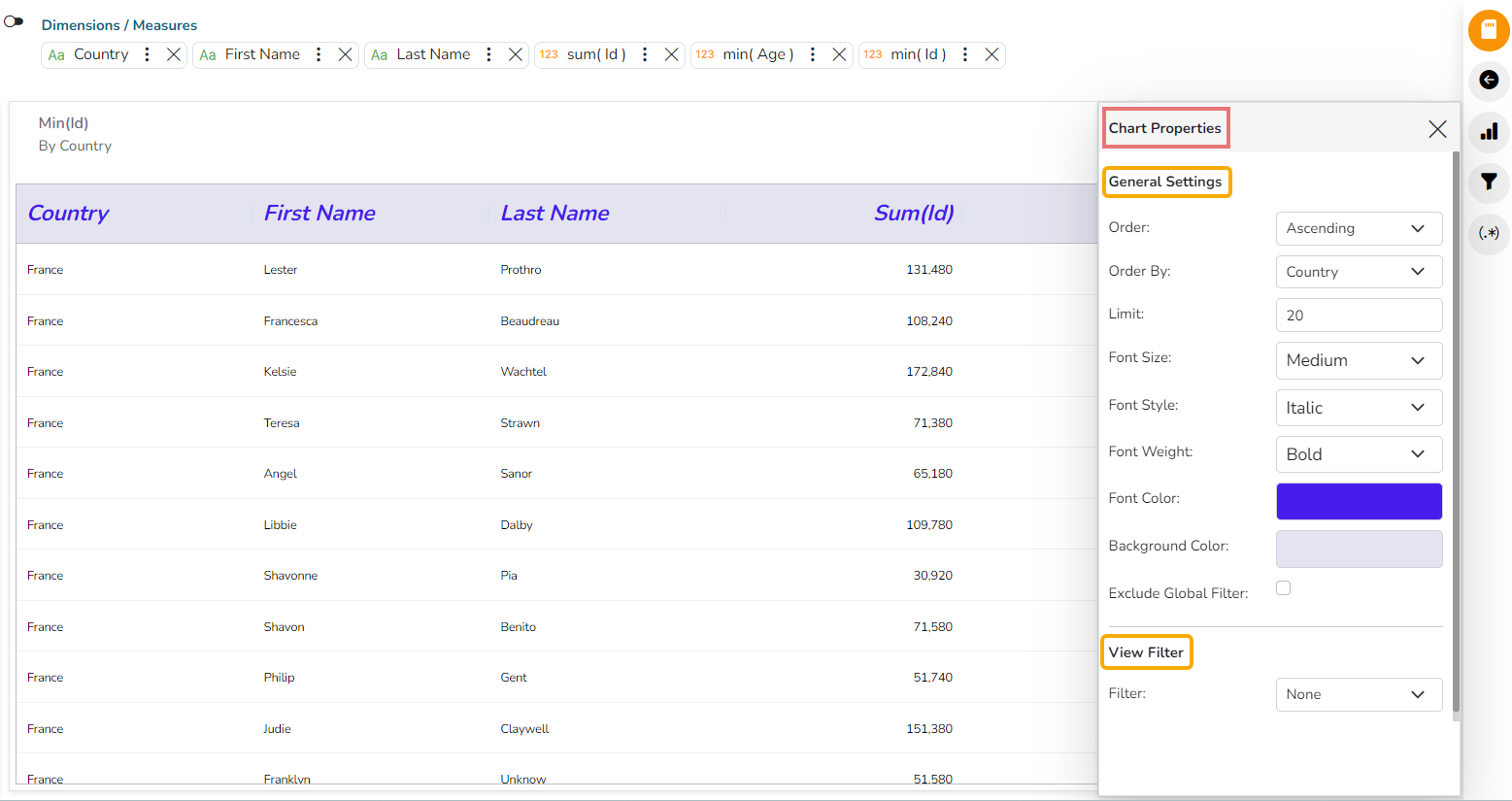
General Settings
View Filter
Category and Series Properties of Grid Chart
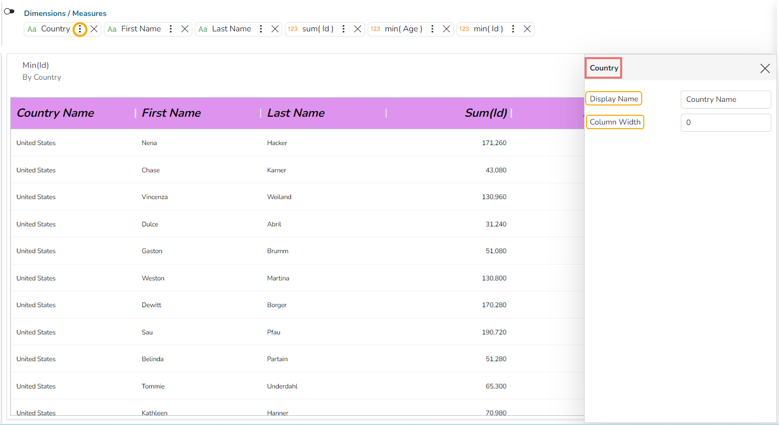
Click the
 icon given for a Dimension to open the Category Properties for a dragged Dimensions.
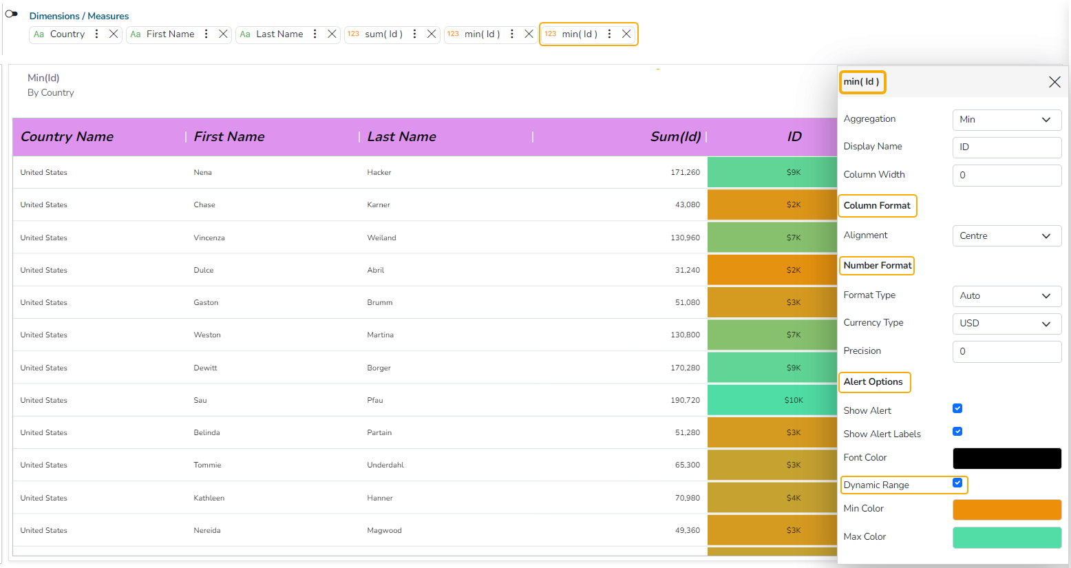
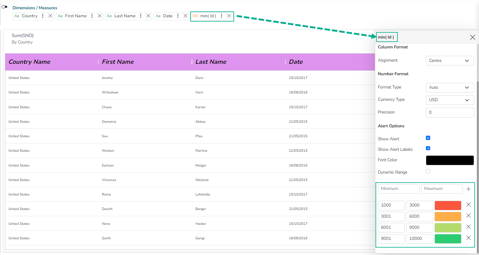
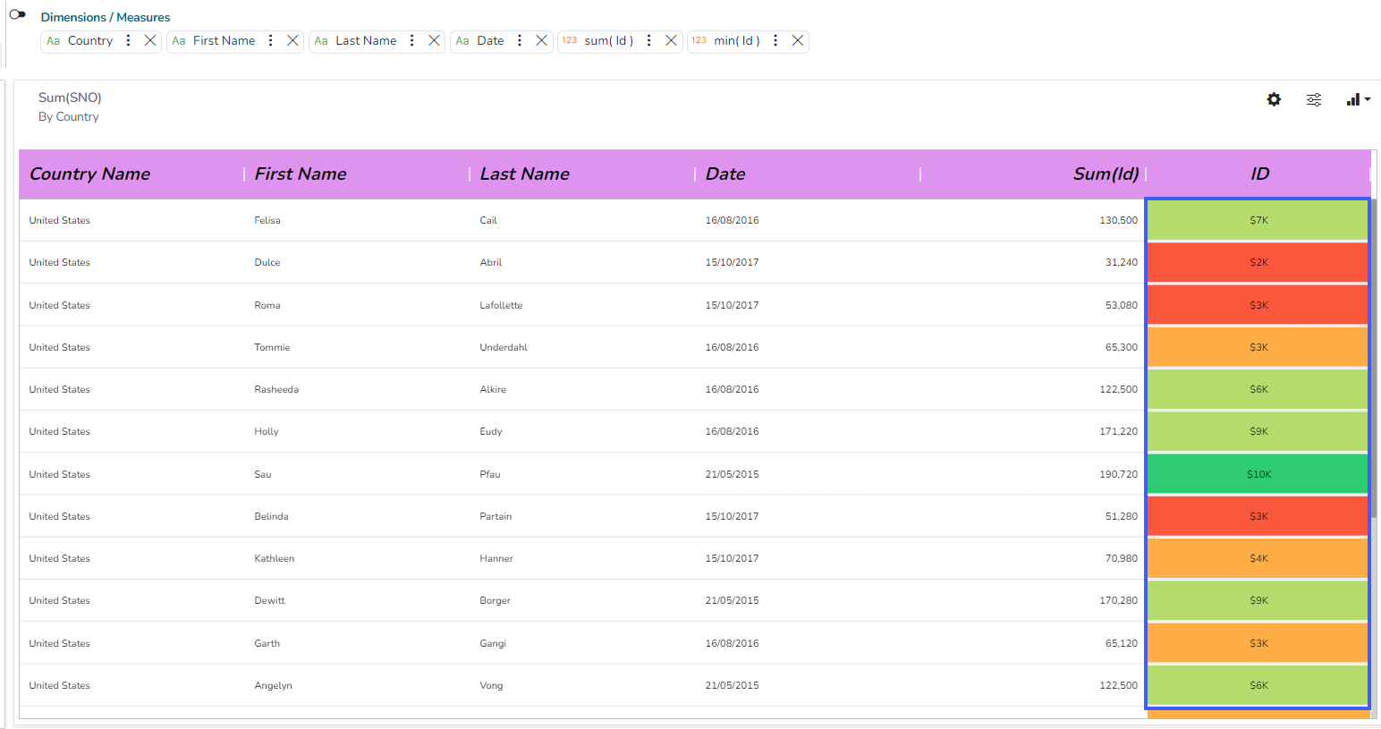
Click the
 icon given for a Measure to open the Series Properties for a dragged Measures.