
Bubble chart
A Bubble chart visualizes the data set in three of four dimensions. The first two aspects are used as coordinates like the x-axis and y-axis. The remaining two are used to represent the color and size of the bubbles. Mostly used to plot financial data.
The best situation to use a Bubble Chart:
Three Data Series: If your data has three series, each containing values, then you can use a bubble chart for better representation. The values determine the sizes of the bubble.
Properties
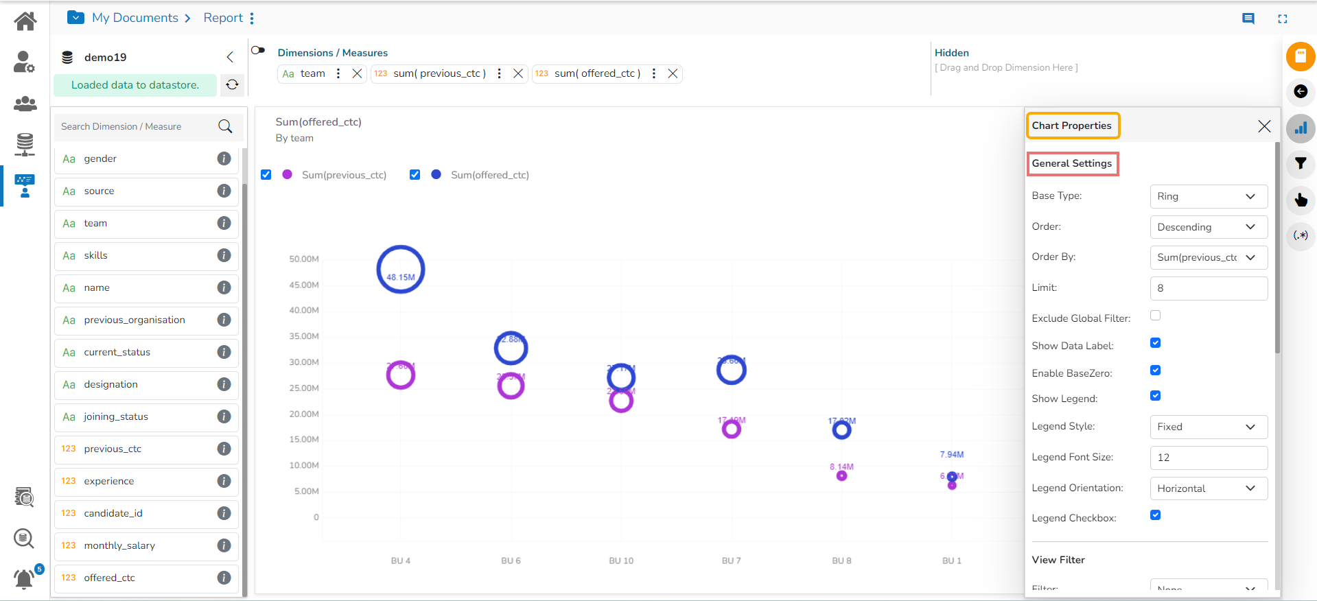
General Settings
Base Type: Select a base type to display the data (the provided choices for this field are: Plain, Gradient, Ring)
Order: Select a sequence for displaying information
None
Ascending
Descending
Manual Sort (Users can manually sort the dimensions by using the indicator signs)
By selecting an order(ascending or descending, the user needs to configure the following fields:
Order By- Select a value option from the drop-down menu to order the sequence of the data.
Limit- Set a number to display the requested data by this limit.
Exclude Global Filter: The view gets excluded from the Global Filter condition by putting a checkmark in the box.
Show Data Label: Data label gets displayed by using a checkmark in the given box.
Enable Base Zero: Base value gets presented from Zero by using a checkmark in the given box.
Show Legend: Displays legend by turning on the radio button. After enabling the Show Legend option, the users need to select the following information:
Legend Style: Select one of the following options by using the drop-down menu.
Fixed
Floating
The following fields appear when the selected Legend Style option is Fixed.
Legend Font Size: This option allows to increase or decrease the font size of the legend.
Legend Orientation: This option appears when ‘Show Legend’ is enabled, and the selected ‘Legend Style’ is ‘Fixed.’ Users need to select an option out of the given choices using the drop-down menu.
Vertical
Horizontal
Legend Checkbox: Enable this option by a checkmark to add the checkbox beside the Legend.

Applying the General Settings
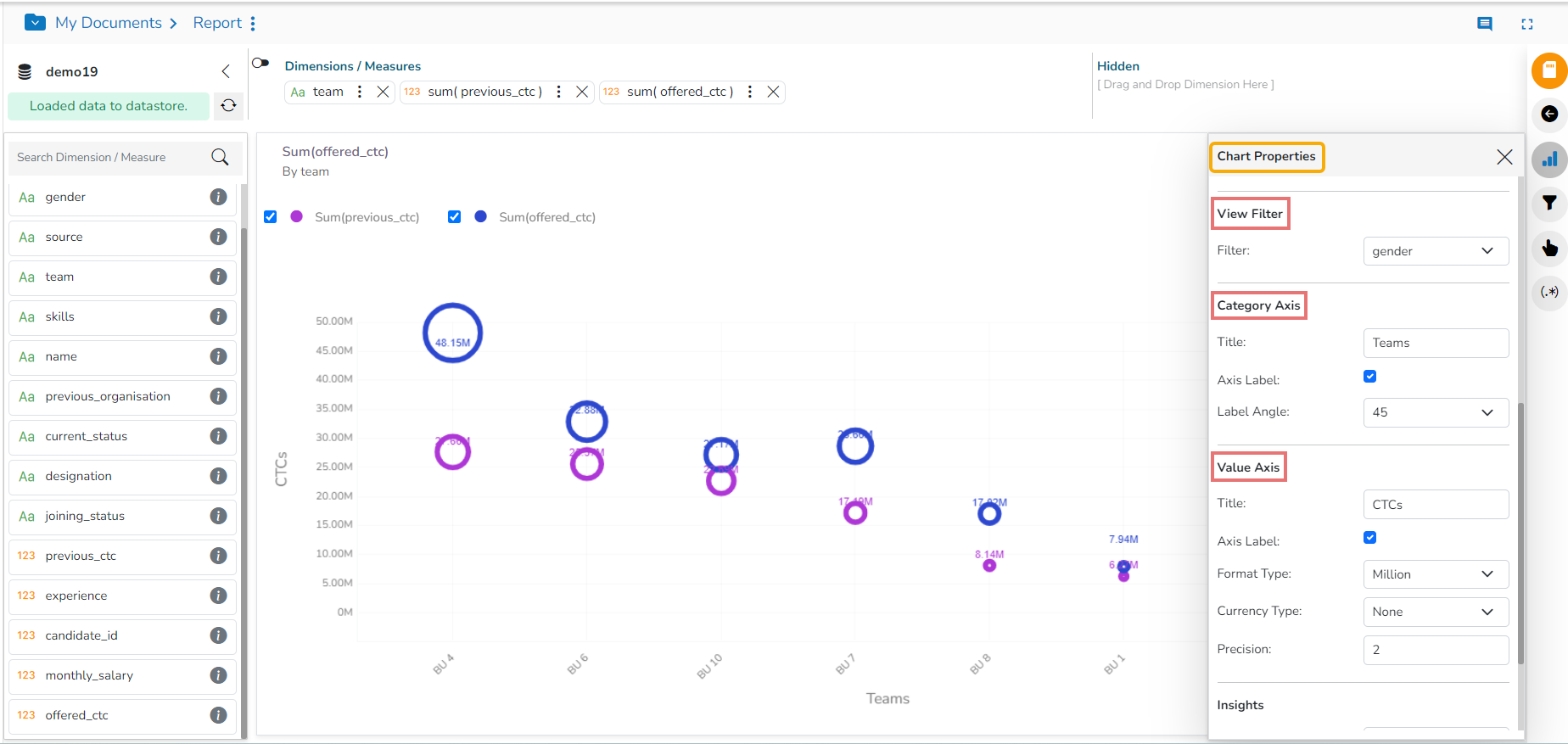
View Filter
Filter: Select a filter condition using the drop-down menu.
Please Note: The selected View Filter option will be reflected to customise the View data after adding the View to report.
Category Axis
Title: Provide a title for the axis
Axis Label: Enable the category axis label by using a checkmark in the box.
Label Angle: Select a display angle for the axis label.
Value Axis
Title: Provide a title for the Primary Value Axis.
Axis Label: Enable the Primary Value Axis label by using a checkmark in the box.
Format Type: Select a desired format type from the drop-down menu (the provided options for this field are: None, Auto, Percent, Thousand, Lacs, Crore, Million, Billion, Trillion, Quadrillion).
Currency Type: Select a currency symbol to be displayed in the view (the provided options for this field are: None, Rupees, Euro, Pound, USD, Yen, Cent).
Precision: Set the after-decimal value (It displays up to 5 precision).
Insights
Text: Provide any information regarding the chart. If any digit or character is required to be highlighted, put it inside two asterisks. (E.g., *70%* or *skills*).
Font Size: Set/modify Font Size of the Insights text.
Font Color: Select a Font color for the Insights Text.
Text align: There are three alignments to align the text.
Left
Right
Centre
Position: There are two options to position the text.
Bottom
Right

Last updated